April bullet journal ideas always make me feel like I’m opening the windows after a long winter and letting fresh air sweep through my creative space. There’s something about April—the soft rain, the first tulips, that gentle golden light—that makes me crave a brand-new spread and a clean page.
I don’t know about you, but by the time April rolls around, I’m usually itching for a reset. My winter pages feel heavy, my markers lean darker, and suddenly I just want pastels, florals, and something that feels hopeful. That’s exactly why I gathered these april bullet journal ideas—to help you refresh your notebook and fall in love with planning all over again.
If you’re new to bullet journaling or feeling stuck in a creative rut, I promise you’re not alone. I’ve had months where I stared at a blank page thinking, “What if I ruin it?” (Spoiler: you won’t. And even if you do, that’s part of the charm.)
If you want a deeper look into how this whole system works, I always recommend starting here:
And if daily pages are your favorite, this one will spark so many layout ideas:
Now grab your notebook, maybe a cup of tea, and let’s dive into these dreamy April spreads.
Why April Is My Favorite Month To Journal
April feels symbolic. It’s the “in-between” month. Not quite summer. Not quite winter. It’s muddy boots and blooming trees at the same time.
I remember one April afternoon when I sat by the window, rain tapping softly against the glass, and I started sketching tiny umbrellas in my mood tracker. The page wasn’t perfect. The lines wobbled. My pastel blue bled slightly through the paper. But when I looked at it later that night, I felt proud. Calm. Grounded.
That’s what good april bullet journal ideas do. They don’t just organize your life. They hold your feelings.
And if you want to combine journaling with reflection, I highly recommend pairing your spreads with prompts like these:
Adding reflection pages between decorative spreads completely changed how meaningful my journal feels.
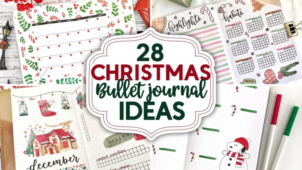
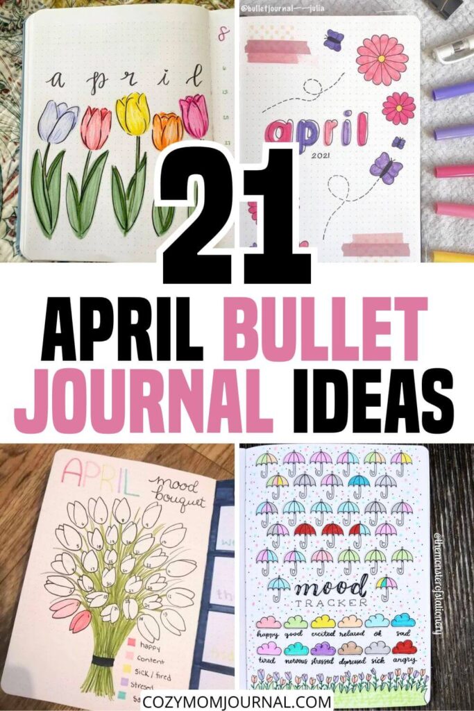
21 April Bullet Journal Ideas You’ll Love
Below you’ll find 21 creative april bullet journal ideas that blend functionality with that cozy spring energy.
April Mood Bouquet
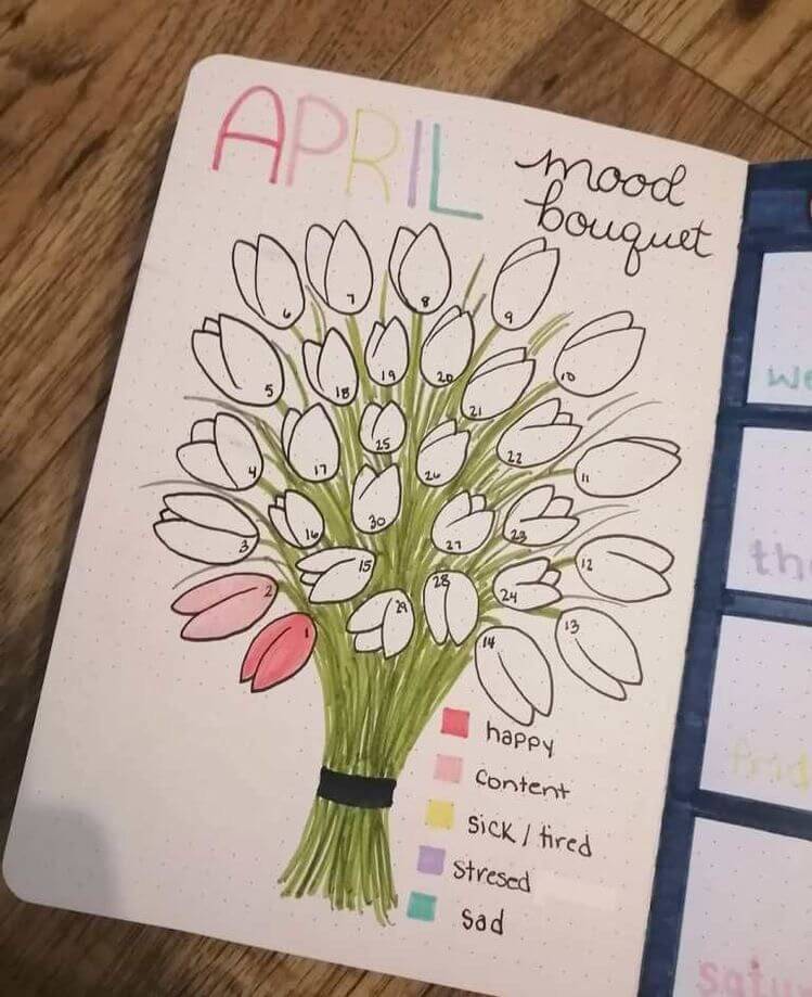
Source: Pinterest
Oh my goodness, this “April Mood Bouquet” spread is such a sweet way to track your month! I love how each tulip is numbered for the days, turning your mood log into a blooming bouquet.
The soft green stems, black outlines, and pastel color key (happy pinks, mellow yellows, gentle purples) make it feel fresh and springy.
It’s simple pen work with colored markers, but so impactful. I once did something similar and felt so proud watching my bouquet “grow” each day—like emotional gardening!
You could add gold gel pen accents or patterned washi for extra sparkle.
Carrot Patch Sleep Log
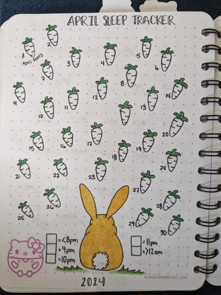
Source: Pinterest
Okay but how adorable is this April sleep tracker?! The little carrots numbered for each day make tracking bedtime feel way less serious and way more “cute spring vibes.”
I love the simple black pen outlines with soft green tops—so clean and satisfying on dotted paper.
Coloring each carrot based on your sleep time (like before 9pm or after midnight) is such a clever visual trick. And that bunny at the bottom? Precious. I swear, spreads like this almost make me want to go to bed earlier just to fill in a carrot!
Bunny Mood Parade
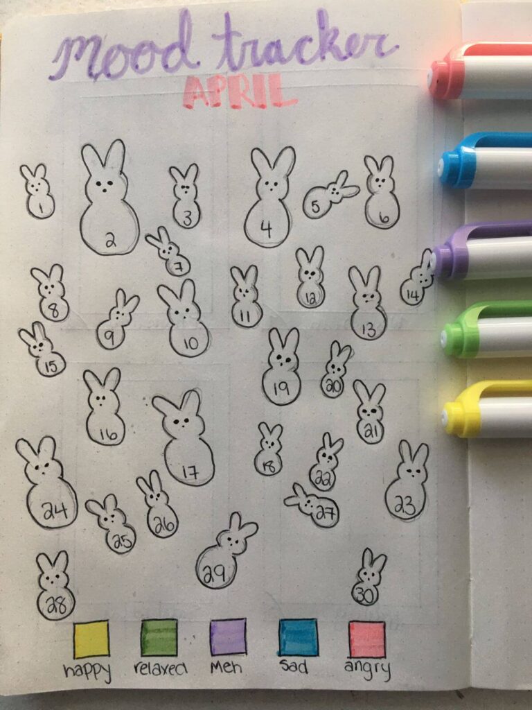
Source: Pinterest
This April mood tracker is just the cutest little bunny takeover, and I’m obsessed 🐰
The simple black pen outlines keep it clean and minimal, while the pops of pastel highlighter (yellow happy, leafy green relaxed, soft purple meh, blue sad, coral angry) bring it to life.
I love how each numbered bunny has its own personality—some tiny, some chubby, some flopped over! It feels playful and low-pressure.
Honestly, coloring these in at night would feel like a tiny therapy session. You could even add blush cheeks or washi grass at the bottom!
Rainy Day Reflections
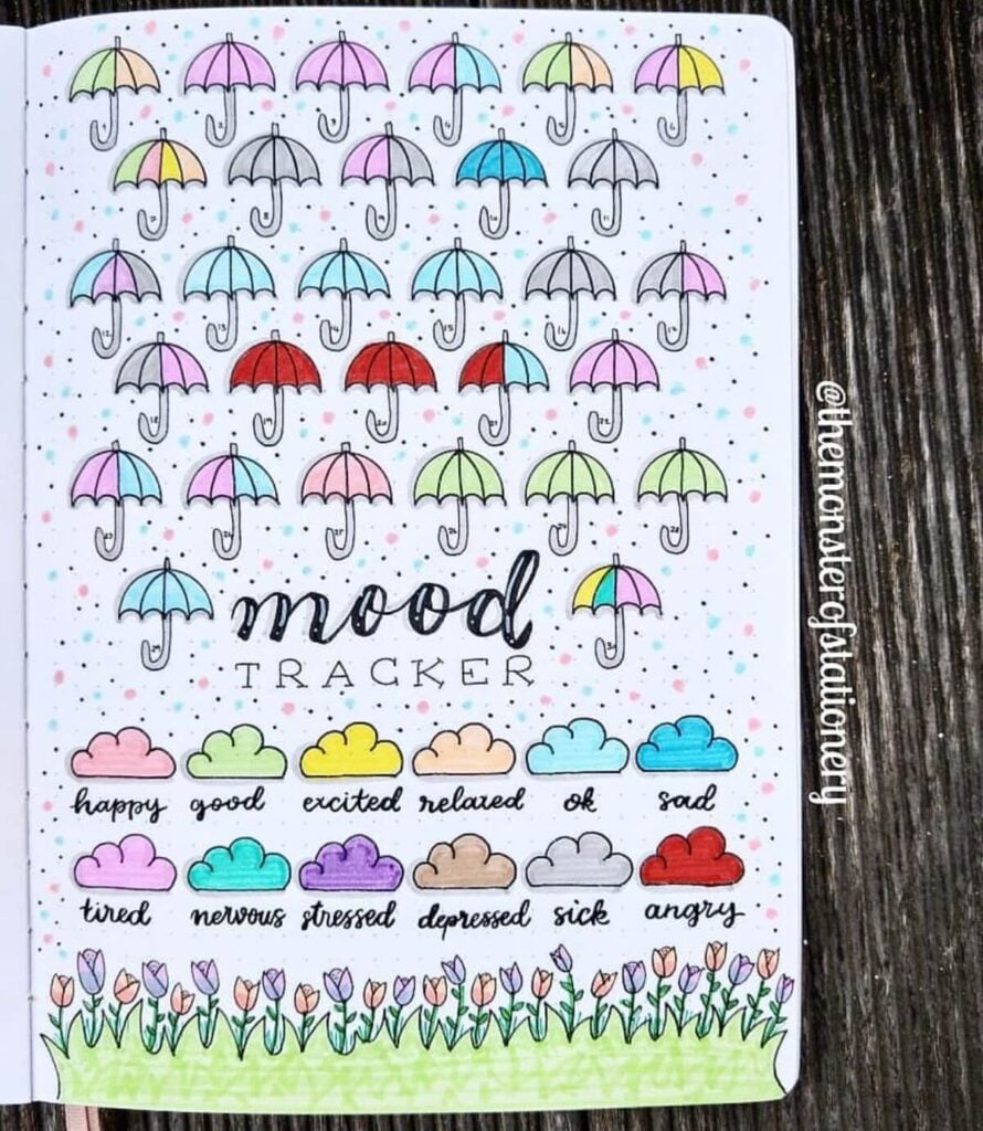
Source: Pinterest
Okay, this umbrella mood tracker is such a vibe! I love how each little umbrella is outlined in crisp black pen, then filled with soft pastels—lavender, mint, blush pink, sky blue—with a few bold pops of red for contrast.
The scattered dot “rain” in pink and teal makes the whole page feel playful and alive. And those tiny cloud icons as the color key? Adorable. It’s like your emotions are little weather reports.
I’d totally add a touch of glitter gel pen to the raindrops for extra sparkle—because even stormy days deserve a little shine.
April Showers Spread
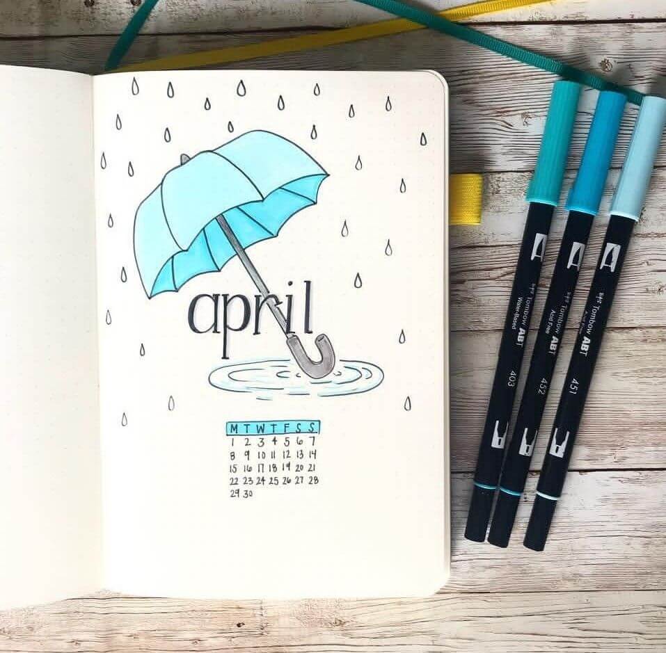
Source: Pinterest
This cover page is so clean and calming—I can practically hear the soft pitter-patter of rain.
The teal umbrella, shaded with cool blue markers and outlined in crisp black fineliner, feels fresh and simple against the dotted background.
I love how the tiny raindrops frame the page without overwhelming it. That little mini calendar at the bottom is such a neat touch, too!
Honestly, minimal spreads like this always make me feel organized and peaceful.
You could add silver gel pen ripples for a subtle rainy-day shimmer.
Purple Flutter April
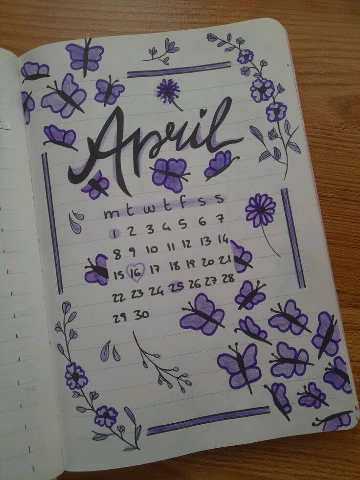
Source: Pinterest
Okay but this purple theme? Absolute main character energy. 💜
The bold brush-lettered “April” in black really pops against all those dreamy violet butterflies and delicate floral doodles.
I love how the deep purple marker is layered for dimension—some petals filled solid, others softly shaded.
The tiny calendar tucked in the center keeps it practical without stealing the spotlight. It feels whimsical but still structured with those clean border lines. I once did a monochrome spread like this and felt so put-together all month.
You could even add metallic purple accents for extra magic!
Blueberry Bliss April
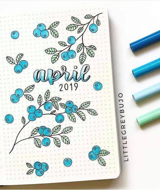
Source: Pinterest
Ohhh this one feels so fresh and juicy! 🫐 The delicate black fineliner branches paired with those bright blue berries are such a dreamy combo.
I love how the soft teal and sky-blue markers give the berries dimension, while the light green leaves keep everything airy and balanced.
The brush-lettered “april” blends perfectly into the palette—so cohesive! It feels like a quiet spring morning. I’d maybe add tiny white gel pen highlights on the berries for that glossy, just-picked sparkle.
Honestly, this spread makes me crave sunshine and fruit picking.
Moody Floral Frame
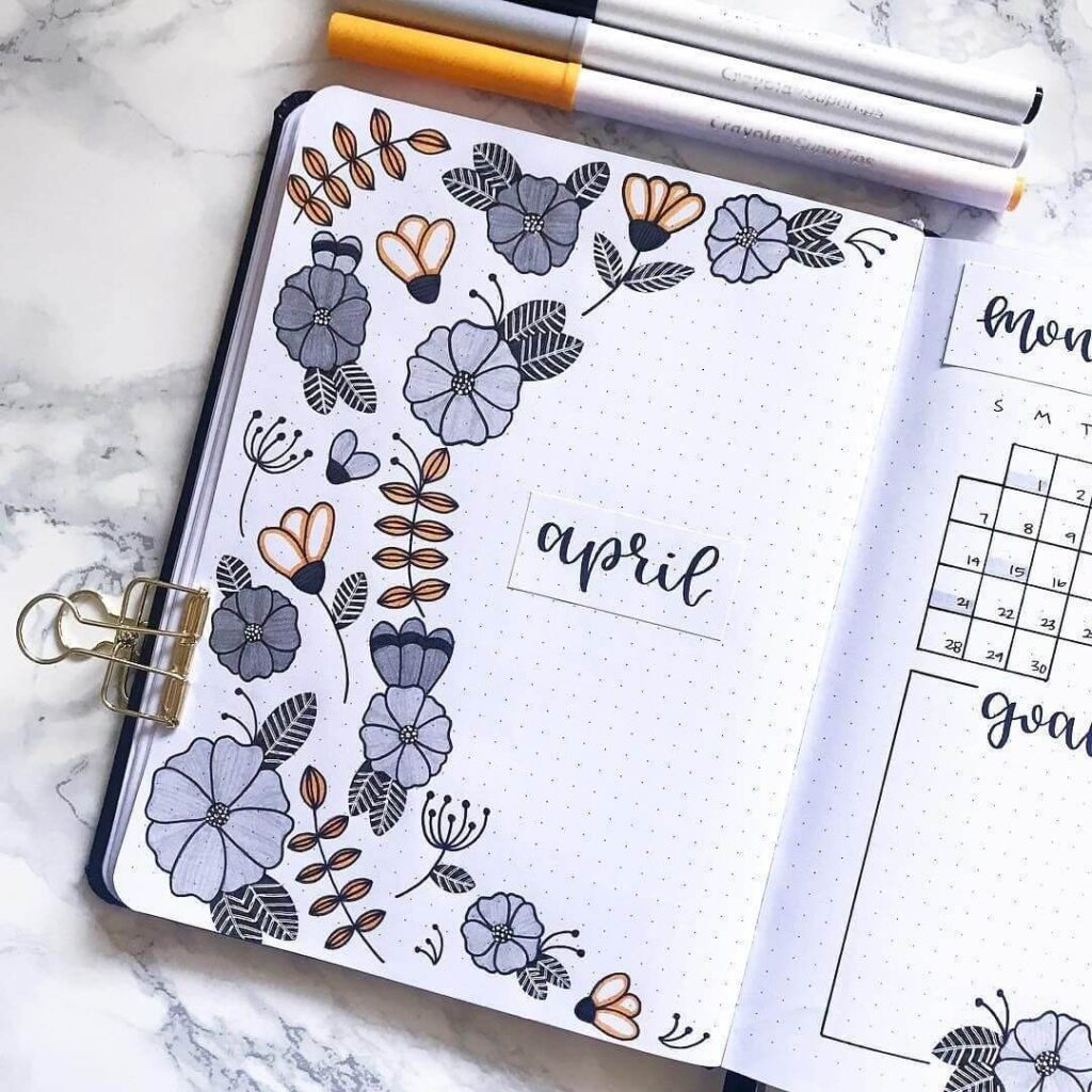
Source: Pinterest
Okay, this layout feels so chic and grown-up in the best way. The muted gray-blue flowers paired with those warm mustard accents? Such a dreamy contrast.
I love how the florals climb up the left side like a little garden border, keeping the center clean and breathable.
The crisp black fineliner details and dotted background make everything pop. It’s minimal but still cozy.
I’d totally add subtle white gel pen highlights to the petals for softness. Honestly, this spread feels like sipping tea on a rainy April afternoon.
Golden Garden April
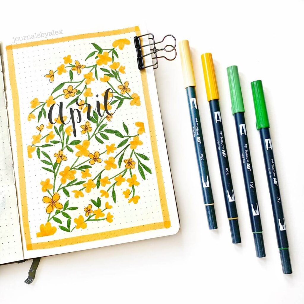
Source: Pinterest
Okay, this spread just radiates sunshine and I love it. 🌼
The bright yellow florals mixed with those fresh leafy greens feel so lively against the soft dotted background. Using brush markers for the petals gives them that juicy, slightly blended look, while the crisp black fineliner outlines keep everything polished.
The yellow border frames it perfectly—like a little window into a spring garden. It honestly makes me want to journal outside with iced tea.
You could add tiny white gel pen dots to the flower centers for extra glow!
Up, Up & April
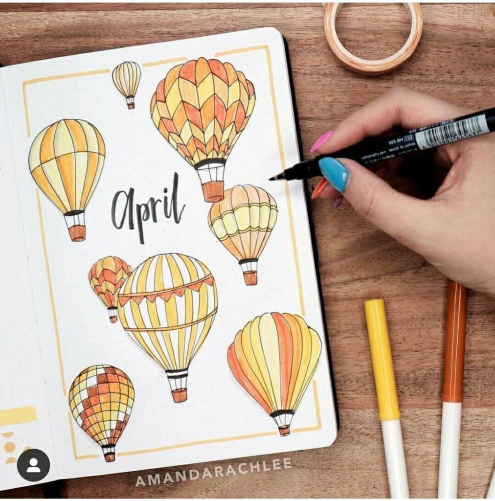
Source: Pinterest
Okay, this spread feels like pure golden-hour magic. 🎈
The warm yellows, soft peaches, and burnt oranges blended into each hot air balloon give such a cozy, glowy vibe. I love how each balloon has its own pattern—stripes, scallops, little checker details—outlined with crisp black fineliner for definition.
The thin yellow frame ties everything together so neatly. It honestly feels like April is lifting off into something new. I’d add tiny white gel pen highlights for that sun-kissed shine.
This one just makes my creative heart float.
April Rainy Calm
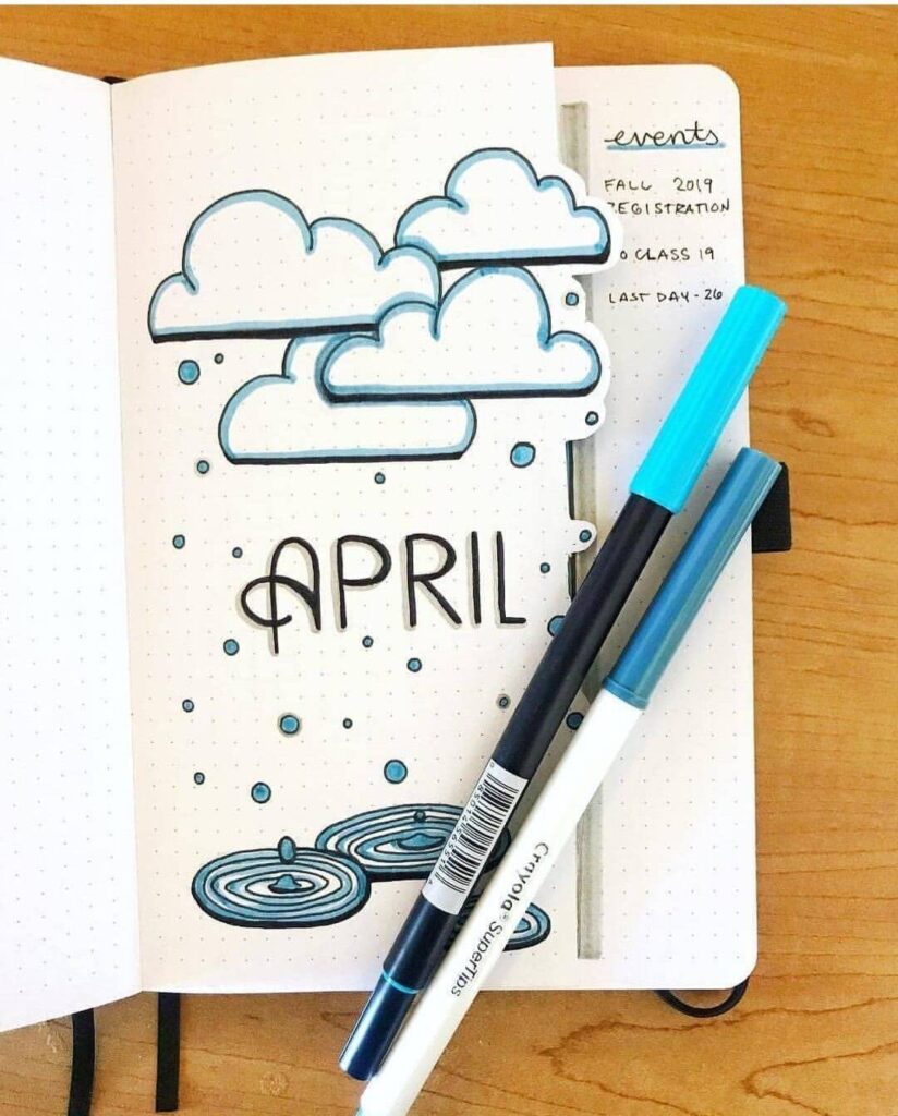
Source: Pinterest
This spread feels so soothing, like a quiet rainy afternoon with tea in hand. ☁️💙
The layered clouds outlined in bold black fineliner and shaded with cool blue markers create such a soft, cozy depth. I love the little raindrop dots scattered across the dotted page—they make everything feel gently in motion.
And those puddle ripples at the bottom? Such a thoughtful detail! The simple “APRIL” lettering keeps it balanced and clean.
I’d maybe add a touch of silver gel pen to the raindrops for a subtle shimmer. It’s minimal, peaceful, and beautifully atmospheric.
Rainbow Rain April
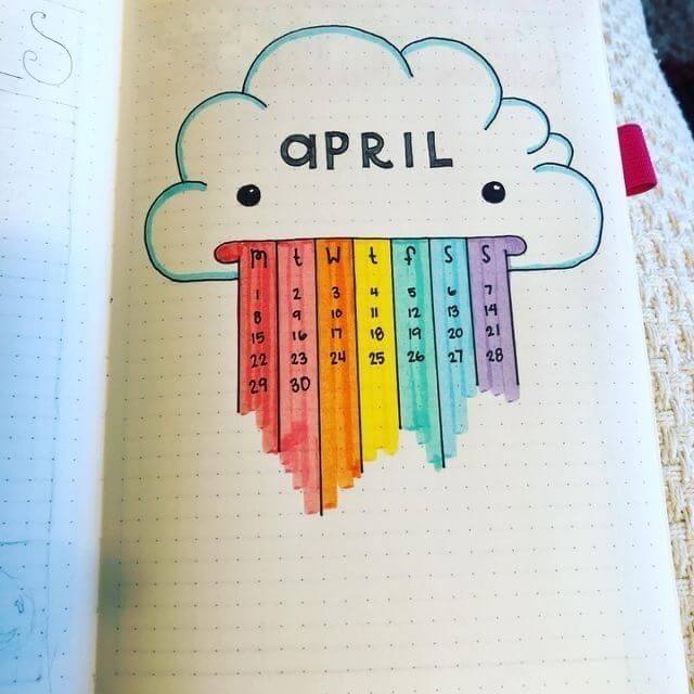
Source: Pinterest
Okay this is the cutest little storm cloud ever and I’m obsessed. ☁️🌈
The soft blue outline and those tiny dot eyes give it so much personality, and then boom—rainbow calendar rain! Each colorful strip (red to violet) doubles as your weekly columns, which is honestly genius.
The marker strokes feel slightly textured and juicy, especially where the colors deepen at the bottom. It’s playful but still super functional.
I’d maybe add tiny white gel pen highlights on the cloud for extra fluffiness. This one just feels happy, even on gray days.
Lily Pad Dreams
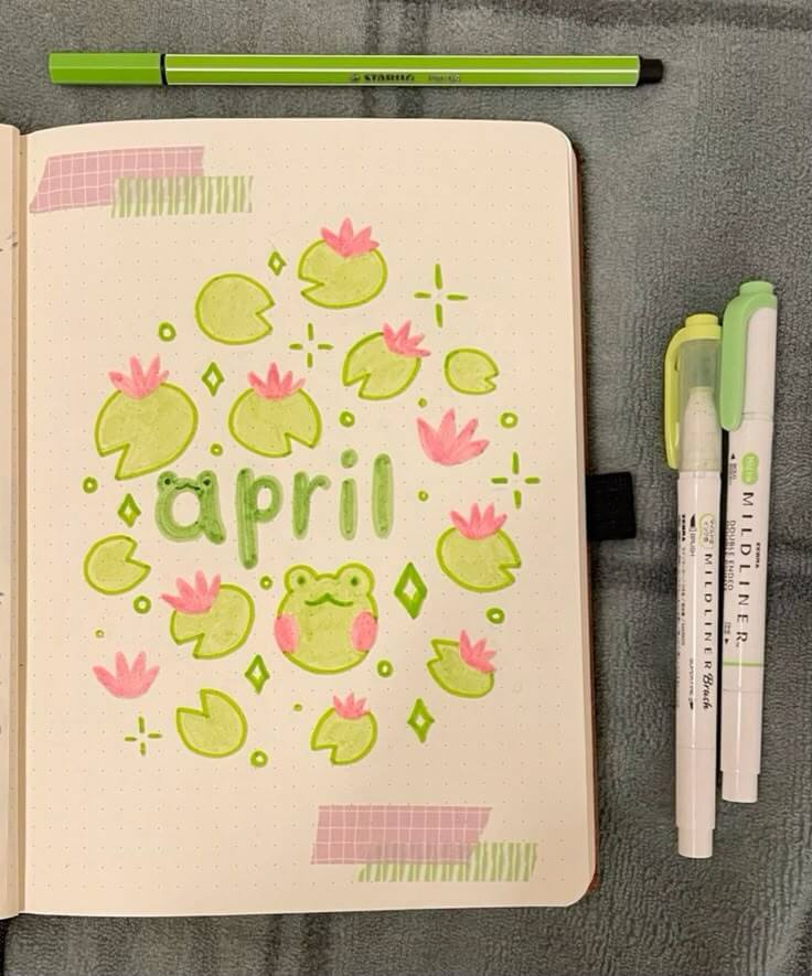
Source: Pinterest
Okay stoppp, this froggy April spread is the sweetest thing ever. 🐸💚
The soft lime lily pads with those bubblegum pink blossoms feel so playful and fresh. I love how the “april” lettering is rounded and shaded to match the vibe—everything feels squishy and cute!
The little sparkles and blush cheeks on the frog add so much personality. And that pastel washi tape detail? Chef’s kiss.
This totally gives cozy pond-at-sunset energy. I’d add tiny white gel pen highlights for extra glow. Honestly, this one just makes me smile.
Butterfly Bloom April
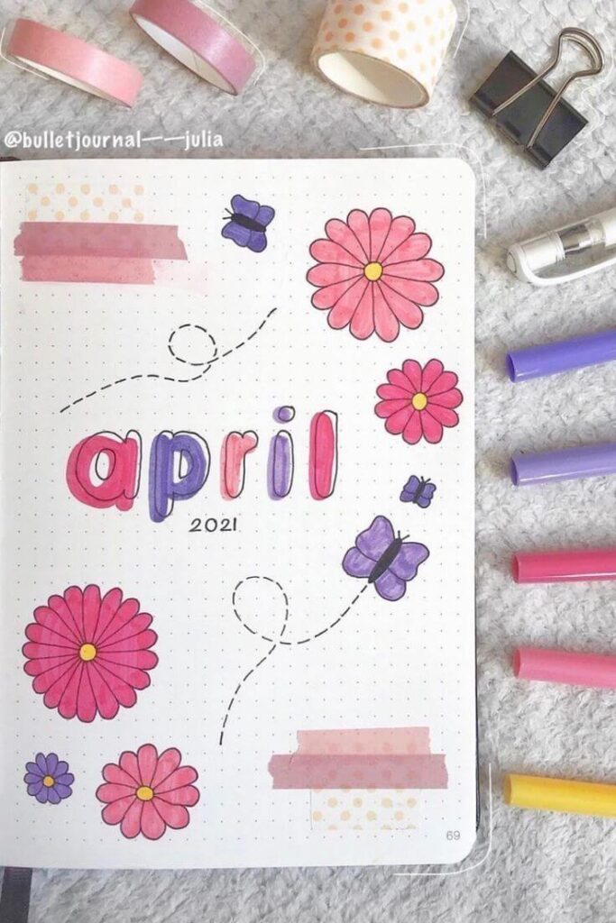
Source: Pinterest
Okay this one is giving total spring picnic vibes and I’m here for it. 🌸🦋
The bright pink daisies with sunny yellow centers pop so beautifully against the dotted page, and those soft purple butterflies add the sweetest contrast.
I love the playful bubble-style “april” lettering—blending pink and violet makes it feel fun and youthful. The dotted flight paths are such a cute touch, too! And that layered washi tape detail? It adds texture without overwhelming the page.
Honestly, this spread just feels happy and carefree—like the first warm day of spring.
Daisy Pop April
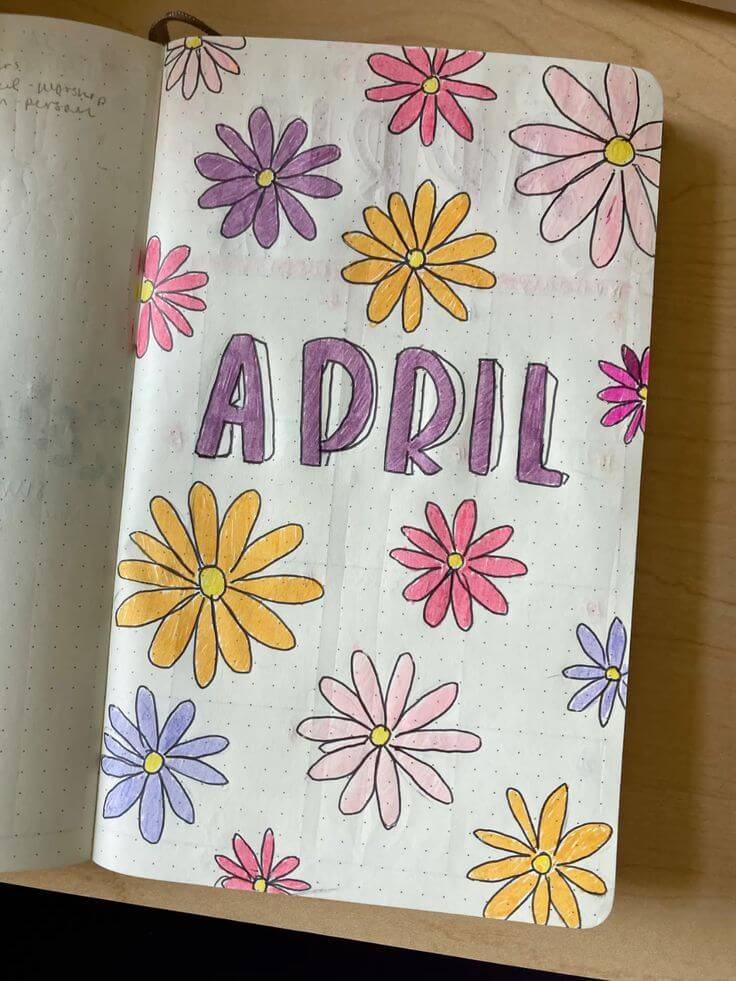
Source: Pinterest
This spread is such a joyful burst of color! 🌼 The bold black-outlined daisies in pinks, purples, buttery yellows, and soft lilacs feel so playful against the dotted background. I love how the chunky “APRIL” lettering in purple anchors the page right in the center—it’s simple but strong.
The marker strokes give the petals that slightly textured, hand-colored charm (which I secretly adore). It feels carefree and happy, like doodling flowers in the margins of a notebook.
You could even add tiny white gel pen dots for extra sparkle and dimension!
Tulip Row April
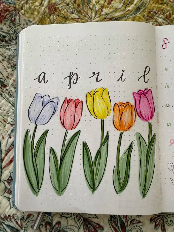
Source: Pinterest
Ohhh this one feels so classic spring and I love it. 🌷 The neat row of tulips in soft lavender, blush pink, sunshine yellow, warm orange, and bright magenta creates the prettiest rainbow lineup.
The subtle shading on the petals and those long, slightly curved green leaves give them such gentle movement. I adore the spaced-out cursive “a p r i l” across the top—it feels airy and elegant. It’s simple but so striking.
Honestly, sometimes a clean floral row like this is all you need to make your journal bloom.
Violet Calm April
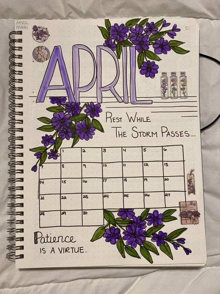
Source: Pinterest
This spread feels so rich and thoughtful, like a deep breath after rain. 💜
The bold, block-lettered “APRIL” shaded in soft lavender really anchors the page, while those lush clusters of deep purple flowers cascade beautifully around the calendar.
The layered greens give the leaves such depth—almost velvety! I love the little details too, like the tiny bottle doodles and the handwritten quote. It feels intentional and reflective.
Honestly, this is the kind of layout that makes planning feel peaceful instead of overwhelming.
Lavender Habit Garden
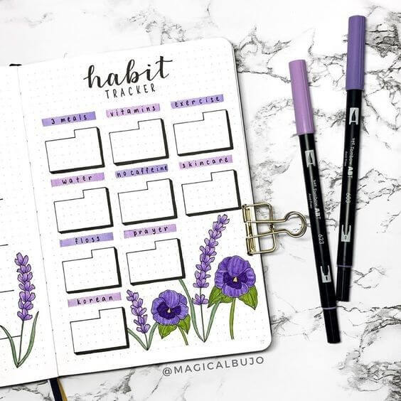
Source: Pinterest
Okay this is such a pretty way to make productivity feel soft and inviting. 💜 The neat little habit boxes outlined in black fineliner keep everything structured, but those pops of lavender headers tie it all together so beautifully.
I love how the purple florals at the bottom balance the page—tall sprigs and sweet pansy-like blooms with layered shading. It feels organized without being harsh. Honestly, I’d look forward to checking off habits here.
You could even add tiny sparkles or soft gray shadows behind the boxes for extra depth!
Wildflower Whisper April
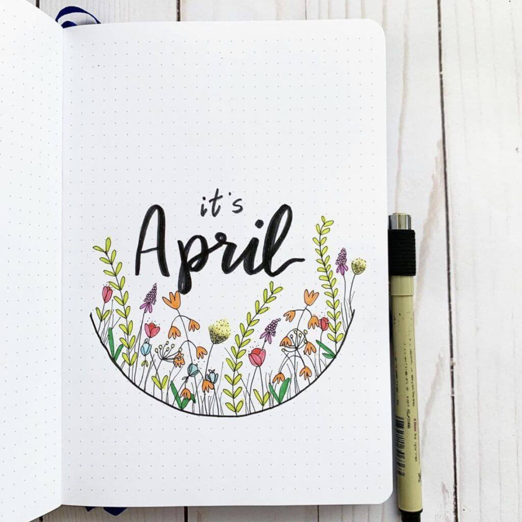
Source: Pinterest
Oh this one feels so soft and storybook-sweet. 🌿 The delicate black fineliner florals curving into that half-circle frame make the whole page feel cozy and intentional.
I love the tiny pops of peach, blush pink, lavender, and light green—so airy and fresh without overwhelming the page.
The bold brush-lettered “it’s April” contrasts beautifully against the dainty flowers. It’s minimal but full of charm.
Honestly, it feels like a quiet meadow moment. I’d maybe add subtle gold dots for a little sunshine sparkle.
Garden Frame April
Source: Pinterest
This layout feels so fresh and balanced, like a little floral window opening into spring. 🌿 I love how the greenery and soft pink flowers frame the top and bottom, almost hugging that elegant cursive “april” in the center.
The mix of leafy vines and tiny blossoms adds such sweet movement, especially with the gentle pops of mint and light olive.
The clean dotted background keeps it airy and calm. I’d maybe add subtle shading to a few leaves for depth. It’s simple, graceful, and quietly beautiful.
Pastel Floral Column
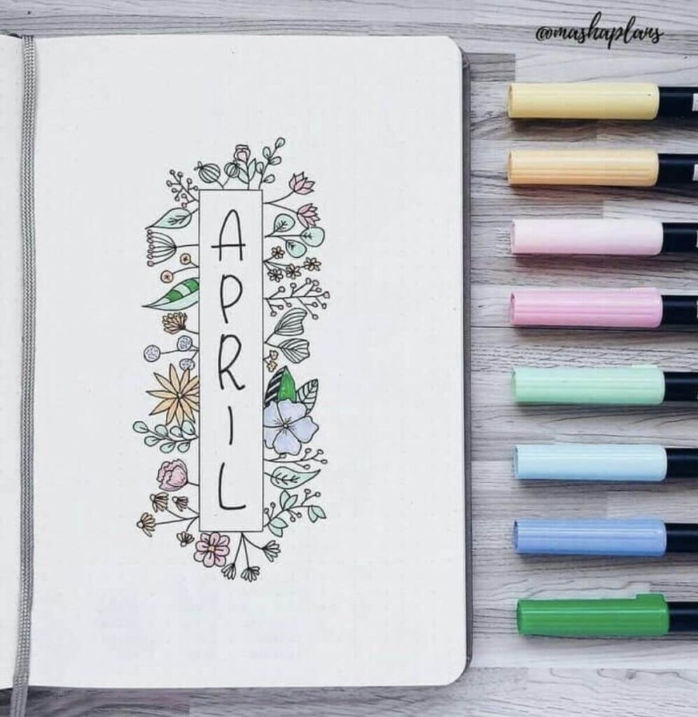
Source: Pinterest
This layout is giving soft, minimalist spring and I adore it. 🌸 The tall vertical “APRIL” framed in a simple rectangle feels so clean, and that delicate wreath of tiny florals around it? So charming.
The muted pastel palette—blush pinks, buttery yellows, mint, and baby blue—keeps everything light and airy against the dotted page.
I love how the black fineliner outlines make the soft colors pop. It feels calm, organized, and gently creative. Honestly, this is perfect if you want pretty without overwhelming your space.
Tools I Personally Use (And Recommend)
Let’s talk supplies—because yes, tools matter. But you don’t need a craft store explosion on your desk.
Here’s what I actually use for most of my april bullet journal ideas:
1. A Good Dotted Notebook
- 120–160 gsm paper if you love markers
- Lay-flat binding
- Soft cream pages (they feel warmer than bright white)
If you’re wondering how to choose the right journal, ask yourself:
- Do you prefer thick paper for heavy coloring?
- Or lighter pages for simple pen spreads?
I’ve tested both. Thick paper wins for me because I layer colors.
2. Black Fineliners
Crisp outlines make everything pop. I usually:
- Sketch lightly in pencil
- Outline in 0.3 or 0.5 fineliner
- Erase once dry
That clean black line is what makes even simple doodles look polished.
3. Mildliners & Brush Markers
For April themes, I gravitate toward:
- Lavender
- Blush pink
- Sage green
- Soft teal
- Butter yellow
Don’t stress about perfection. Slightly uneven coloring actually makes spreads feel handmade and cozy.
4. White Gel Pen
This is my secret weapon.
- Highlights on berries
- Raindrop shimmer
- Tiny sparkles in flowers
It instantly elevates a page.
5. Washi Tape & Stickers
If you’re short on time:
- Add floral washi to borders
- Use minimalist stickers for quick decoration
I’ve had weeks where washi tape saved my creativity.
Struggling With Layout? Let’s Solve That.
If you’re thinking:
“I’m not good at drawing.”
“I don’t have time for detailed spreads.”
“I mess up lettering every time.”
I’ve been there.
Here’s what helped me:
- Start with one focal element (like tulips or clouds).
- Keep the rest minimal.
- Use borders to frame your page.
- Trace inspiration loosely—never copy line for line.
- Embrace “imperfect but joyful.”
Your journal isn’t meant to compete with Pinterest. It’s meant to serve you.
Speaking of Pinterest, I share tons of fresh inspiration here:
If you recreate one of these april bullet journal ideas, tag me or leave a comment there. I genuinely love seeing your pages.
How I Make My April Spreads Feel Cohesive
One trick I swear by: choose a theme for the entire month.
For example:
- Rain + umbrellas
- Tulips + pastel palette
- Butterflies + lavender tones
- Carrots + soft orange & sage
Then repeat subtle elements throughout:
- Same color family
- Similar brush lettering style
- Matching borders
It makes your journal feel intentional instead of random.
And trust me, when you flip through your finished April pages at the end of the month, it feels magical.
A Little Creative Pep Talk
I know it’s easy to scroll through perfect spreads and feel behind.
But here’s the truth: your bullet journal doesn’t need to impress anyone.
It needs to:
- Help you track habits
- Capture memories
- Calm your mind
- Spark joy
That’s it.
Every time I sit down with my markers, I remind myself: this is play. This is therapy disguised as planning.
And honestly? The more I lean into that mindset, the better my spreads turn out.
Let’s Make April Bloom Together
These april bullet journal ideas are more than decoration. They’re little pockets of intention tucked between busy days.
So tell me:
- Which spread are you trying first?
- Are you team florals, team rain, or team bunnies?
- Do you prefer bold colors or soft pastels?
Leave a comment on Pinterest or message me your favorite layout. I truly love building this creative space with you.
April is about growth. Fresh starts. Gentle momentum.
Open your notebook. Draw the first line. Let it be messy. Let it be yours.
And if this post helped you, explore the related guides I linked above—they’ll take your journaling even deeper.
Now go make something beautiful.