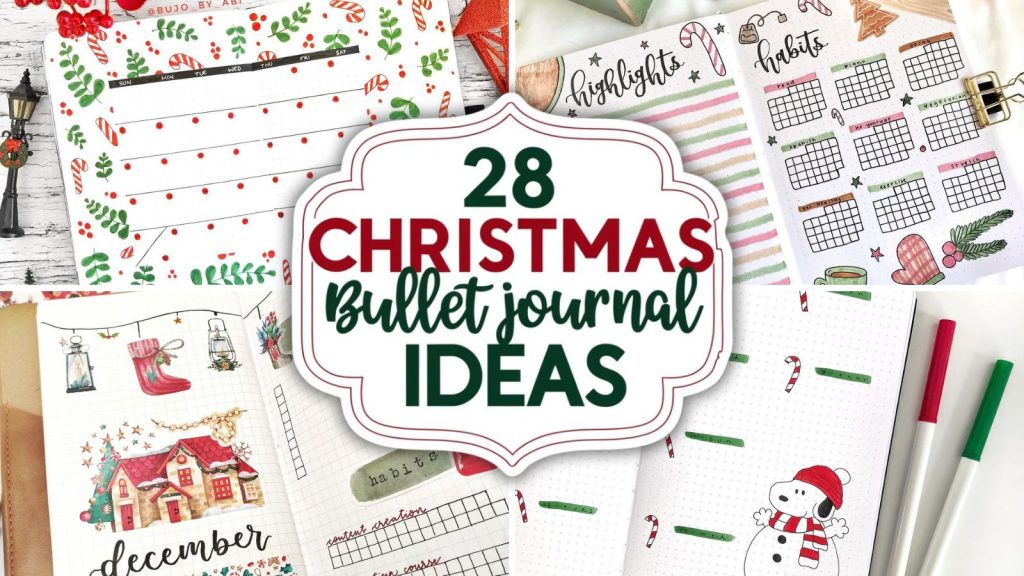
May bullet journal ideas always hit differently for me. There’s just something about this month—the soft sunlight, blooming flowers, that “fresh start but not overwhelming” energy—that makes me want to open a brand new page and start creating again.
I still remember one May when I completely fell off track with journaling. My pages felt boring, repetitive, and honestly… a little lifeless. I almost gave up. Then one afternoon, I grabbed a random yellow highlighter, doodled a few messy flowers, and suddenly everything changed. It wasn’t about perfection anymore—it was about enjoying the process again.
If you’ve ever felt stuck, uninspired, or just not in the mood to journal, I get it. That’s exactly why I put together these May bullet journal ideas—to help you fall back in love with your journal in a way that feels fun, personal, and actually doable.
And trust me… you don’t need to be “artsy” for this. You just need a pen, a little curiosity, and maybe a tiny bit of chaos.
Golden Honey Bloom
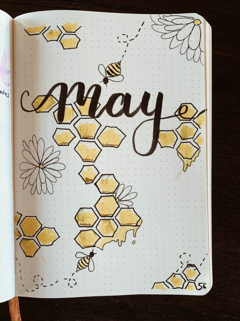
Source: Pinterest
Okay, I’m officially obsessed with this warm, honey-dripped vibe. The soft yellow watercolor inside those hexagon shapes feels so cozy, like sunshine melting on the page. I love how the loose daisies and tiny buzzing bees add a playful touch—those dotted flight paths? Adorable. It reminds me of lazy spring afternoons.
You could even add a touch of gold foil or washi for extra shimmer—because honestly, honey deserves to glow!
Blushing Tulip Letters
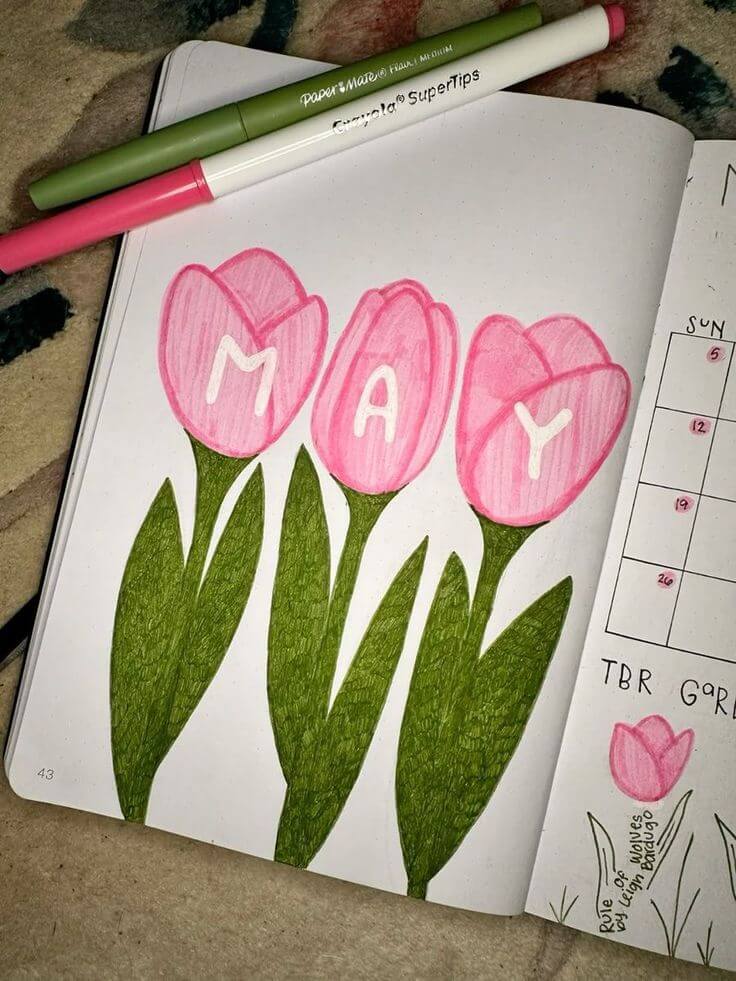
Source: Pinterest
This spread feels like a sweet little spring hug. The soft pink tulips with gentle shading give such a cozy, hand-colored charm—I can almost feel the pencil texture! Using each bloom to spell “May” is such a clever focal point, and those deep green leaves ground everything beautifully. It reminds me of doodling in notebooks as a kid.
You could add tiny dew drops or a pastel background wash for extra softness!
Lavender Flutter Mood
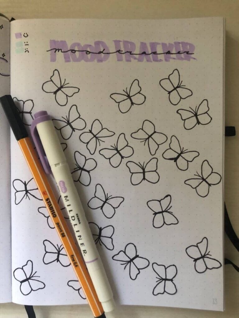
Source: Pinterest
This page feels like a soft, dreamy pause in your journal. The delicate black-outline butterflies scattered across the page give such a light, floating feeling, while that muted lavender “MOOD TRACKER” header adds the perfect calm glow. I love how minimal it is—it reminds me of those quiet moments where everything just feels… still.
To build on this, you could color each butterfly based on your daily mood (pastels would look gorgeous!), add tiny sparkles or dots for a whimsical sky effect, or even draw faint motion trails behind a few butterflies.
A soft watercolor wash in the background or subtle gradient could add depth without losing that airy vibe. You could also outline some butterflies in metallic gel pen for a little shimmer—because honestly, a bit of sparkle never hurts
Tulip Mood Circle
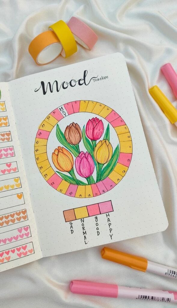
Source: Pinterest
This spread is such a burst of sunshine and soft spring joy. The bright pinks, yellows, and warm oranges wrapped around that circular tracker feel so cheerful, and those hand-drawn tulips in the center give it such a cozy, garden-in-bloom vibe. It honestly reminds me of flipping through a journal on a sunny morning with coffee in hand—just happy energy everywhere.
For ideas, you could try adding tiny details inside the circle sections like dots, stripes, or mini hearts to give each day more personality.
A light watercolor background behind the tulips would make them pop even more, or you could outline them with a white gel pen for that soft highlight effect. You might also experiment with blending colors in the ring instead of solid blocks for a gradient mood flow.
Adding little bees, sparkles, or even a faint vine wrapping around the circle could tie everything together beautifully.
Garden Letter Whimsy
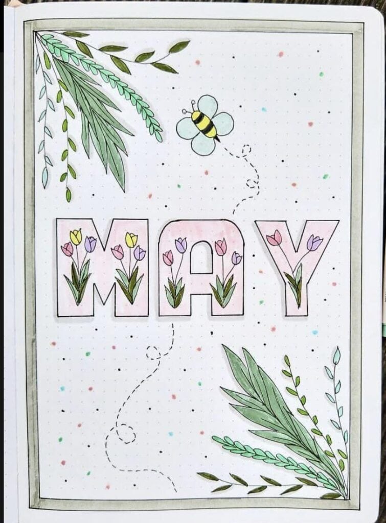
Source: Pinterest
This page feels like stepping into a tiny enchanted garden. The soft pastel florals tucked inside the bold “MAY” letters are such a sweet surprise, and those leafy corners frame everything so gently. I love the light paint splatters—they add that carefree, artsy touch that makes it feel alive. It reminds me of doodling outside on a breezy spring day.
For extra ideas, you could shade the letters with a subtle gradient or add a thin drop shadow to make them pop. Try outlining some leaves with a darker green for depth, or layering washi tape in the corners for texture.
Tiny details like more bees, butterflies, or even pressed flowers (or stickers!) would add dimension.
You could also turn each letter into a mini theme—different flowers or color palettes—to make it even more playful and personalized
Sweet Berry Garden
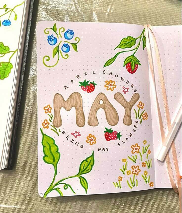
Source: Pinterest
This spread feels like a cheerful little fruit patch bursting to life. The soft, wood-textured “MAY” letters are such a cozy focal point, and I love how the strawberries and tiny flowers dance around them. Those bright greens and pops of red and blue feel so fresh—like a sunny morning at a garden market. It honestly makes me smile just looking at it.
For extra ideas, you could deepen the wood effect with darker grain lines or a slight shadow for dimension.
Try adding tiny white highlights on the berries to make them look juicy, or even doodle little seeds with a gel pen. A faint pastel background wash (like soft peach or mint) would warm it up beautifully.
You could also extend the theme with other fruits—like cherries or lemons—or add tiny insects (ladybugs would be adorable!). Layering a bit of washi tape or adding subtle gold accents around the circular text could give it that extra magical touch
Citrus Sunshine Spread
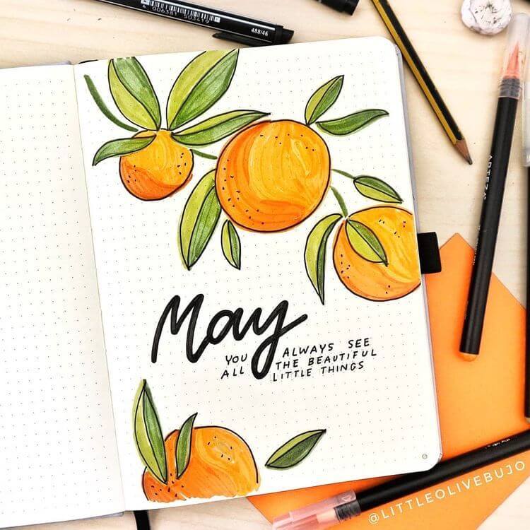
Source: Pinterest
This page feels like pure vitamin C for the soul. The juicy oranges with their soft gradient shading look so fresh, I can almost smell that zesty citrus! Paired with those flowing green leaves and bold “May” lettering, it gives such a bright, uplifting energy—like a sunny morning that just puts you in a good mood.
For extra ideas, you could add tiny white highlights on the oranges to make them look even more glossy and dimensional.
Try a light yellow or peach watercolor wash in the background for a warm glow, or add subtle shadows under the fruit for depth. Little details like bees, sparkles, or even handwritten quotes around the page would enhance the cheerful vibe.
You could also play with texture—maybe use colored pencils over marker for that soft, slightly grainy fruit look, or even add a dotted border to frame everything nicely.
Strawberry Picnic Pages
Source: Pinterest
This spread is giving the cutest picnic blanket vibes ever. The soft pink gingham background paired with those bright, juicy strawberries feels so fresh and playful—like a sunny day with snacks and no worries. I love the bold red borders framing everything, it makes the page pop while still feeling cozy and handmade.
For extra ideas, you could add tiny white highlights or seeds to the strawberries for more texture, or even use a gel pen to make them look glossy.
Try layering washi tape with gingham or lace patterns to enhance that picnic feel. Little doodles like ants, flowers, or sparkles would add personality, and you could even include mini journal prompts or notes inside the frames.
A soft shadow around the strawberries or a torn paper effect could give it that scrapbooky, dimensional charm.
Cozy Picnic Dreams
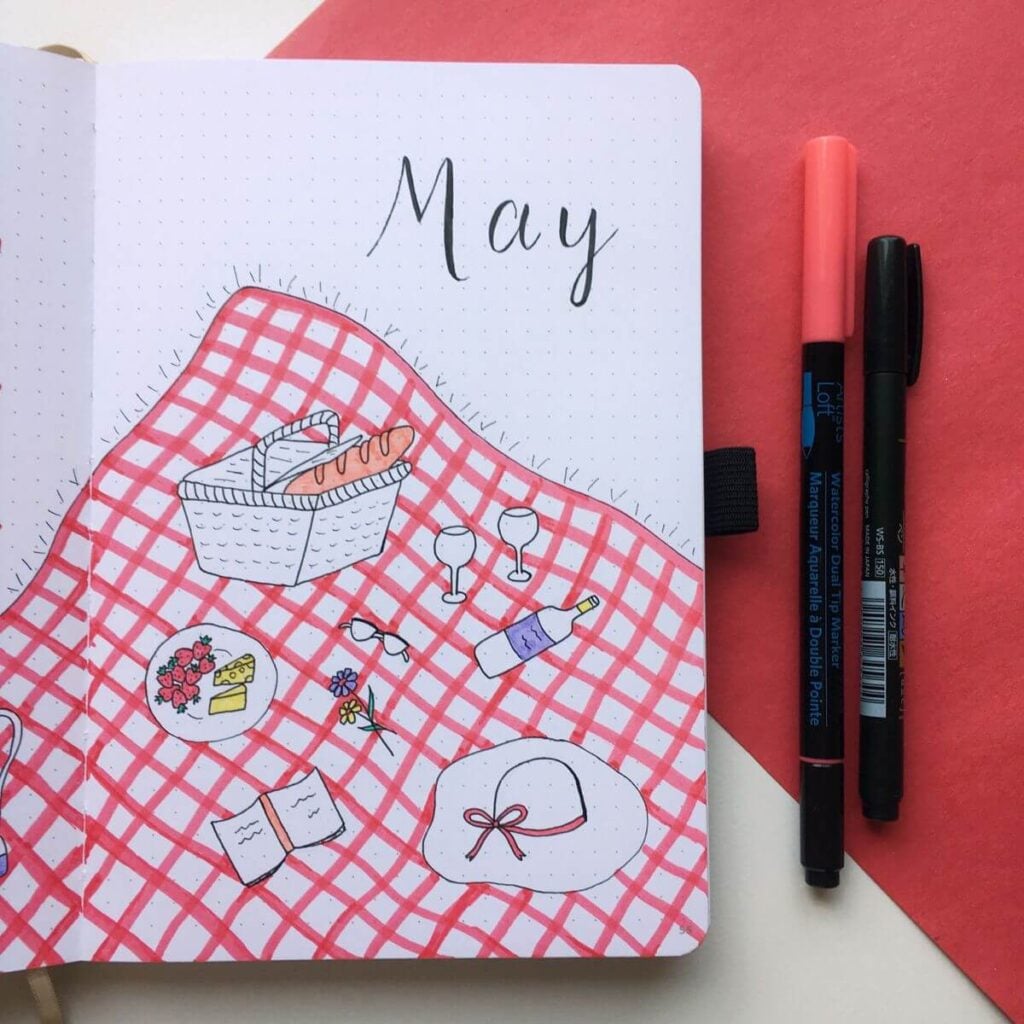
Source: Pinterest
This spread feels like a slow, sunny afternoon on a soft blanket. The red gingham instantly sets that picnic mood, and I love all the tiny details—the basket, little wine glasses, and that cute hat just casually placed there. It feels so personal, like a snapshot of a perfect spring day. I can almost hear birds and feel the warm breeze.
For extra ideas, you could add soft shadows under each object to give a slightly 3D effect, or use a white gel pen to add highlights on the glasses and bottle for a glossy look.
Try layering textures—like real fabric washi or torn paper—to enhance the blanket feel. You could also include handwritten journaling around the objects, like “what I’d pack for a perfect day,” or add tiny ants, petals, or sun rays for extra storytelling.
A faint sky-blue wash in the background could make everything feel even more open and airy.
Cherry Pop Calendar
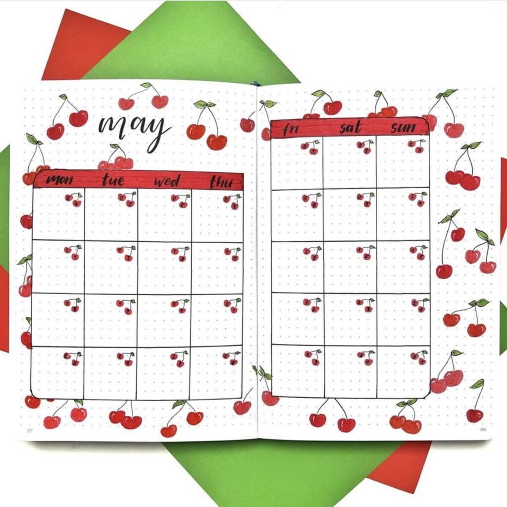
Source: Pinterest
This spread is such a juicy little burst of happiness. The bright red cherries scattered all around make the whole page feel playful and alive, and I love how they’re repeated inside each day box—such a cute, cohesive detail! The clean layout paired with that pop of color gives it a super satisfying balance between fun and functional.
For extra ideas, you could add tiny white highlights on each cherry to make them look glossy and dimensional, or vary the reds slightly for a more natural look.
Try adding a soft pink or blush watercolor wash behind the calendar for warmth, or even a subtle drop shadow around the boxes to lift them off the page.
You could also doodle little stems connecting some cherries across the page for movement, or add mini icons (like stars or hearts) inside certain days for events. A thin washi tape border or a green accent line could tie in the leaves beautifully.
Cherry Habit Garden
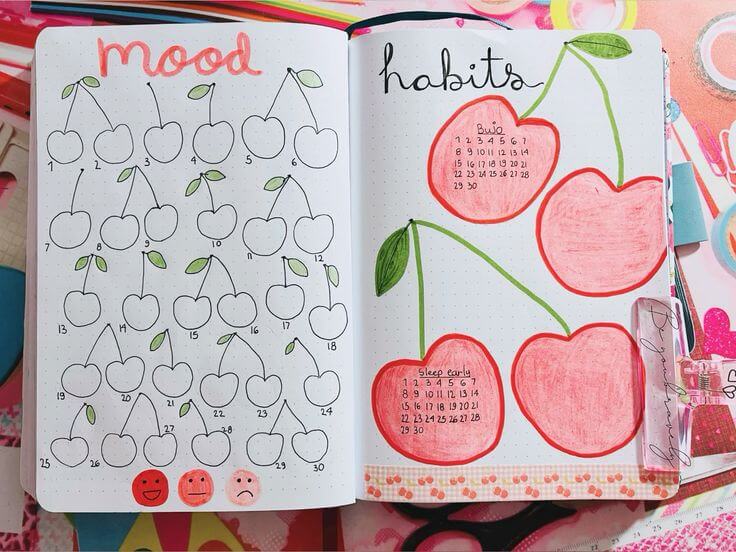
Source: Pinterest
This spread is such a soft, playful blend of structure and sweetness. The little cherry mood tracker feels so light and airy, while those larger, blush-colored cherries on the habit side add this cozy, hand-colored charm. I love how the green stems flow across the page—it ties everything together like a gentle vine. It honestly feels like a calm, happy routine in visual form.
For extra ideas, you could color in each small cherry based on mood or habit completion for a super satisfying visual payoff.
Try adding subtle shading to the big cherries to give them more depth, or use a white gel pen for highlights to make them pop.
You could also add tiny blossoms, bees, or even a soft pink watercolor background to enhance the spring vibe.
A thin washi strip at the bottom (like you have!) could be layered with lace or fruit patterns for extra texture, and maybe even add tiny labels or icons inside the cherries to represent different habits.
Bloom & Capture Week
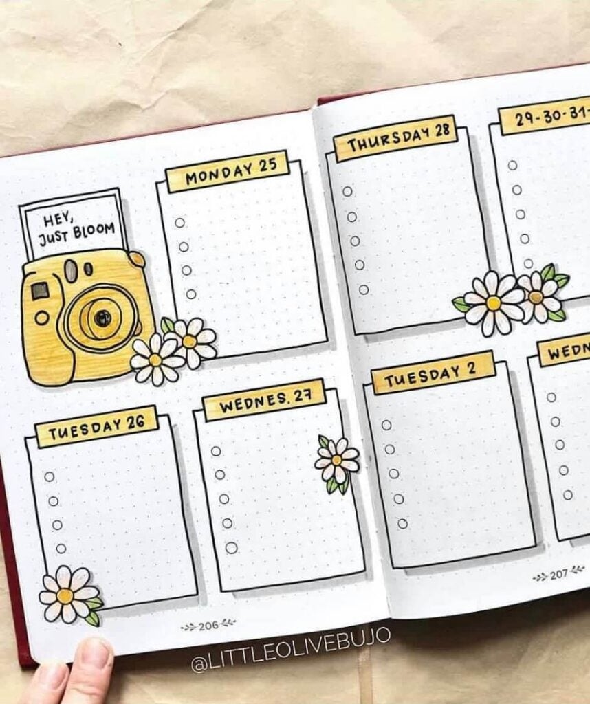
Source: Pinterest
This spread feels like a sweet little memory keeper. The soft yellow accents paired with those simple daisy doodles give it such a fresh, happy vibe, and that tiny camera with “hey, just bloom” is honestly the cutest touch—it feels like a reminder to notice the little moments. It’s clean, but still full of personality, which I love.
For extra ideas, you could add a soft shadow behind each daily box to give a subtle layered effect, or use a pale pastel wash (like light yellow or peach) behind some sections for warmth.
Try decorating a few boxes differently—maybe tiny icons for events or mini doodles that match your day. You could also expand the camera theme by adding faux “photo frames” or taping in small printed pictures for a scrapbook feel.
A bit of washi tape or torn paper edges could make it even cozier and more dimensional
Daisy Glow Moment
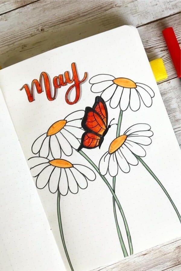
Source: Pinterest
This page feels so calm and softly radiant. The simple white daisies with those warm yellow centers are already dreamy, but that bold orange butterfly in the middle? It totally steals the show in the best way. And that matching “May” lettering ties everything together so beautifully—it’s like a golden hour garden scene.
For extra ideas, you could add gentle shading to the petals for more depth or use a light grey drop shadow behind the flowers to make them stand out.
Try adding tiny sparkles or dots around the butterfly for a magical touch, or even faint watercolor behind it to create a glowing effect.
You could also extend the stems off the page or layer in washi tape at the bottom for a soft, grounded finish.
A few handwritten quotes tucked between the stems would make it feel even more personal and peaceful.
Minimal Bloom Contrast
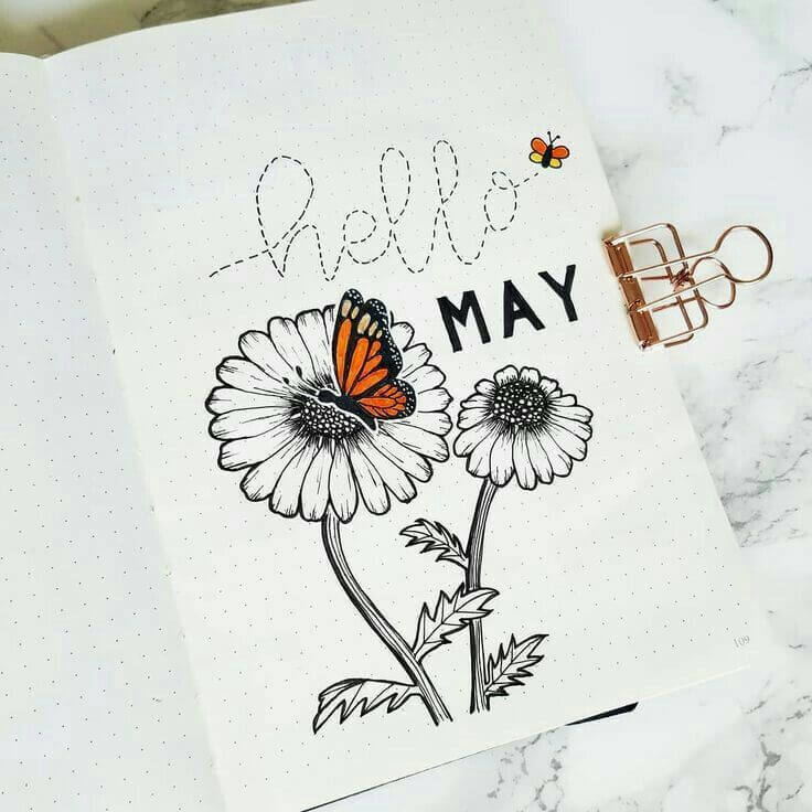
Source: Pinterest
This spread is such a perfect mix of bold and delicate 🖤🌼 The black ink florals feel almost vintage and sketch-like, while that pop of orange on the butterfly brings everything to life—it’s like the page suddenly breathes. And that dotted “hello” with the tiny flying bee? So simple, but so playful. It gives quiet confidence energy.
For extra ideas, you could add a very light watercolor wash behind the flowers (like pale grey, beige, or soft peach) to keep the minimal vibe but add warmth.
Try using a white gel pen on the butterfly for tiny highlights to make it feel more dimensional. You could also extend the dotted flight path across the page or into the next spread for continuity.
Adding a thin border or a few pressed flower stickers would enhance that botanical, slightly vintage feel without overcrowding it.
Pastel Party Pop
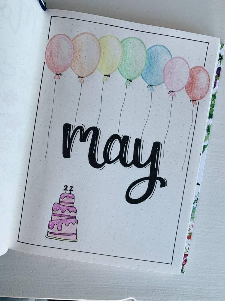
Source: Pinterest
This spread feels like a quiet little celebration floating on the page. The soft pastel balloons drifting above that bold, inky “May” create such a sweet contrast—light and playful meets confident and grounded. And that tiny cake at the bottom? It’s like a hidden birthday surprise, which I absolutely adore.
For extra ideas, you could add soft shadows under the balloons to give them that floating effect, or use a white gel pen for highlights to make them look slightly glossy.
Try blending two pastel shades in each balloon for a dreamy gradient, or add tiny sparkles and confetti around them for a party vibe. You could also turn each balloon string into a tracker (like habits or moods!) or write small words or intentions inside the balloons.
A light pastel background wash or a dotted confetti border would make everything feel even more festive and cohesive.
Sunflower Glow Pages
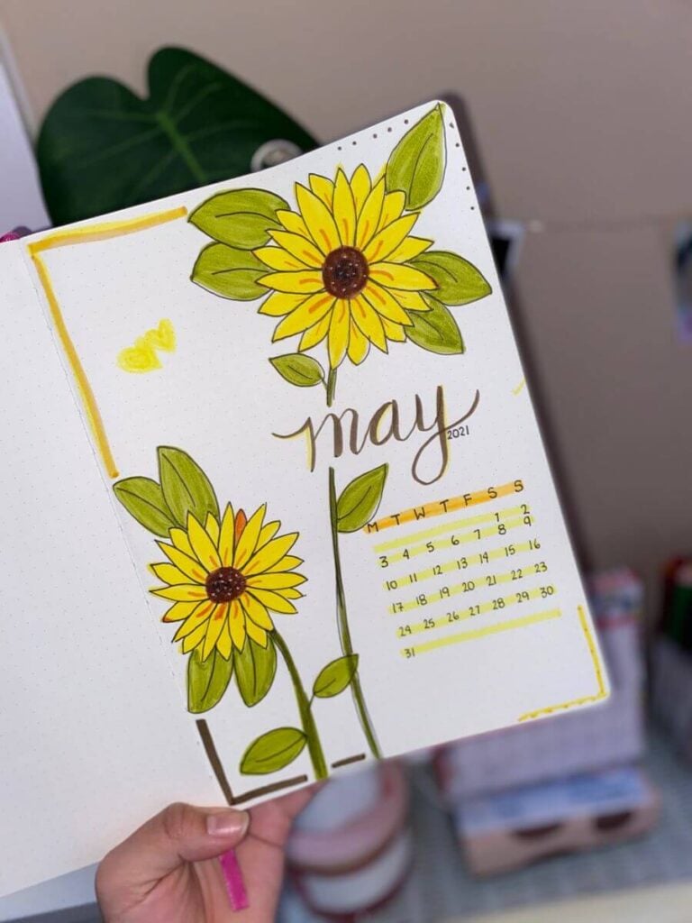
Source: Pinterest
This spread feels like pure sunshine captured on paper. The bright yellow sunflowers practically radiate warmth, and I love how the soft brown centers and layered green leaves give them that natural, slightly textured look. The delicate “May” lettering tied into the stem is such a pretty detail—it makes the whole page feel connected and intentional.
For extra ideas, you could deepen the petals with a bit of orange shading near the center for more dimension, or add tiny white highlights to give them that sunlit glow.
Try a soft yellow watercolor wash behind the flowers to enhance the warmth, or add subtle dots or sparkles around them for a dreamy effect.
You could also extend the stems into a weekly layout or use the leaves as little labels for goals or notes. A thin gold or mustard border would tie everything together beautifully.
Petal Confetti Dreams
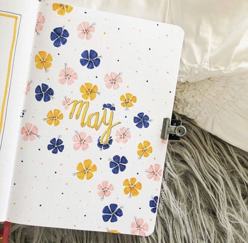
Source: Pinterest
This spread feels like petals dancing in the air on a warm spring day. The mix of soft blush pink, deep blue, and sunny yellow flowers scattered across the page gives it such a light, joyful rhythm. And that golden “May” in the center? It glows so softly, like it’s surrounded by tiny floral confetti.
For extra ideas, you could add subtle shadows under some petals to create depth, or layer a faint watercolor wash (like pale peach or cream) to warm up the background.
Try outlining a few flowers with a fine liner or metallic pen for contrast and sparkle. You could also turn some flowers into mini trackers—coloring petals for habits or moods.
Adding tiny dots, stars, or even a light splatter effect (like you have!) really enhances that airy, whimsical vibe.
Rosy Frame Elegance
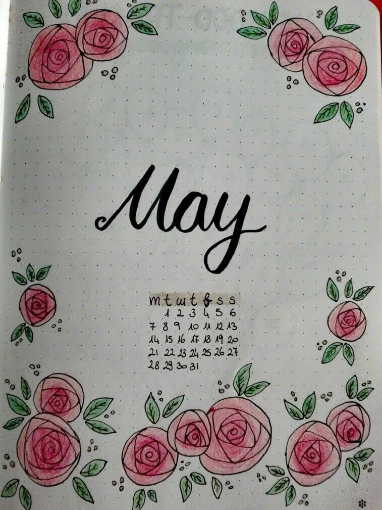
Source: Pinterest
This spread feels like a soft vintage love letter. The delicate pink roses framing the page create such a gentle, romantic border, and that bold “May” in the center balances everything beautifully. I love how the tiny leaves and dots fill the space without overwhelming it—it feels calm, intentional, and just a little bit dreamy.
For extra ideas, you could deepen the rose shading with layered pinks or even a hint of peach for dimension.
Try adding a faint watercolor wash (like blush or cream) in the center to warm it up, or outline a few petals with a slightly darker liner for definition.
You could also incorporate gold accents in the dots or leaves for a subtle glow. Turning the border into a functional frame—like adding tiny notes, quotes, or goals between the roses—would make it both pretty and practical
Floral Frame Flow
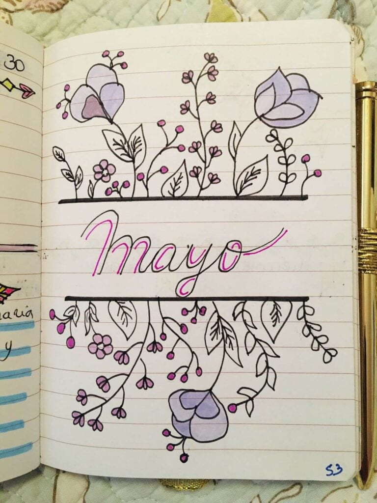
Source: Pinterest
This spread feels like a gentle little garden growing around your words. The way the flowers bloom above and cascade below the “May” creates such a lovely mirrored flow—it’s simple but so elegant. I especially love the soft purples and pinks; they give it that calm, dreamy notebook doodle vibe, like something you’d sketch while daydreaming.
For extra ideas, you could add a faint pastel wash behind the title to make it glow softly, or give the flowers a bit more depth with light shading near the petal edges.
Try adding tiny dots or sparkles around the vines to fill empty space, or even extend the florals slightly onto the next page for continuity.
You could also turn the top or bottom section into a header for notes or goals, or weave in small words (like intentions or quotes) between the leaves for a more personal, storytelling feel
Daisy Buzz Garden
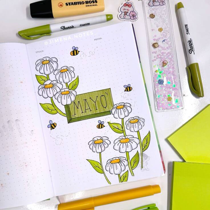
Source: Pinterest
This spread feels like a fresh spring morning with bees lazily buzzing around. The clean white daisies paired with that soft green label give such a calm, nature-inspired vibe, and I love how the little bees add movement—it makes the whole page feel alive. It’s simple, but in that effortlessly pretty way.
For extra ideas, you could add a light green or yellow watercolor wash behind the flowers to create a soft glow, or use a white gel pen on the petals for subtle highlights.
Try giving the green label a bit of texture (like crosshatching or wood grain) for depth. You could also extend the bee trails across the page or into other spreads for continuity.
Adding tiny dots, sparkles, or even a faint grid shadow behind the daisies would enhance that airy garden feel. You might even turn some flowers into mini trackers by coloring petals throughout the month.
Peachy Frame Bloom
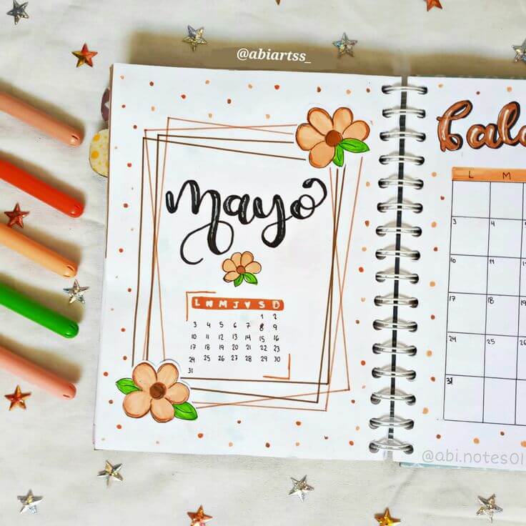
Source: Pinterest
This spread feels so warm and softly structured, like a gentle hug in planner form. The layered geometric frames give it a modern, slightly artsy vibe, while those peach-toned flowers keep everything sweet and playful. And those tiny scattered dots? They add just the right amount of sparkle without overwhelming the page.
For extra ideas, you could play with layering even more frames in different colors (like soft pink or beige) for depth, or add a faint shadow behind them to make it pop.
Try blending two shades in the flowers for a more dimensional look, or use a white gel pen for highlights. You could also turn the frames into sections—like goals, notes, or intentions—or add washi tape along the edges for texture.
A light watercolor wash behind the center would make the “Mayo” lettering stand out even more.
What To Use For These May Bullet Journal Ideas (My Go-To Tools)
Okay, let’s talk supplies—because I know this is where a lot of people get stuck.
You don’t need a drawer full of expensive tools. I’ve tried that route… and half of it just sat there looking pretty but unused.
Here’s what I actually reach for again and again:
My absolute essentials
- A simple dotted notebook (nothing fancy, just something that feels good to open)
- Black fineliner (for clean outlines and doodles)
- A few mild highlighters (perfect for soft May color palettes)
- One gel pen (white = instant magic, especially for highlights)
If you want to level it up a bit
- Brush pens (for those bold “May” headers)
- Washi tape (especially floral, gingham, or pastel tones)
- Colored pencils (amazing for soft shading—way more forgiving than markers)
Fun things to experiment with
- Watercolor (even just a light wash in the background changes everything)
- Stickers or pressed flowers (adds texture instantly)
- Metallic pens (tiny details = huge difference)
I always say this: the goal isn’t to have more tools—it’s to use what you already have in a more creative way.
Feeling Stuck? Try This Simple Trick
If you’re staring at a blank page and thinking “I have no idea what to do”… start messy.
- Draw one flower
- Add one color
- Write “May” in the center
- Build around it
That’s literally how most of my favorite spreads start.
Some of the best May bullet journal ideas come from those imperfect, unplanned pages. The ones where you stop overthinking and just let your hand move.
If You Want More Inspiration (Highly Recommended)
If you’re in that “I want to journal but don’t know what to write” phase, these helped me so much:
- Start with simple prompts:
→ 30 Day Daily Journaling Prompts For Beginners - If you’re still figuring out your system:
→ What Is A Bullet Journal? Creative Planning In One Notebook - And for layouts you can actually use daily:
→ Bullet Journal Daily Spread Ideas You Need To Try Now
I still go back to these when I feel stuck or bored with my pages.
Want Even More Ideas?
I save all my favorite inspiration (and honestly… way too many ideas I still want to try) here:
You’ll find tons of May bullet journal ideas, layouts, doodles, and little creative sparks you can steal and make your own.
Final Thoughts: Your Journal Doesn’t Have To Be Perfect
Here’s something I wish someone told me earlier:
Your bullet journal is not supposed to look like Pinterest.
It’s supposed to look like you.
Some pages will be messy.
Some will feel unfinished.
Some will turn out way better than expected.
That’s the whole point.
These May bullet journal ideas are here to inspire you—not pressure you. Take what you like, ignore what you don’t, and make it yours.
Let’s Make This Interactive
Now I’m curious:
- Which idea are you trying first?
- Do you prefer floral, minimal, or playful spreads?
- Have you ever created a page you ended up loving way more than expected?
Tell me on Pinterest—I genuinely love seeing your pages and how you bring these ideas to life.
Because honestly? That’s my favorite part of all of this.