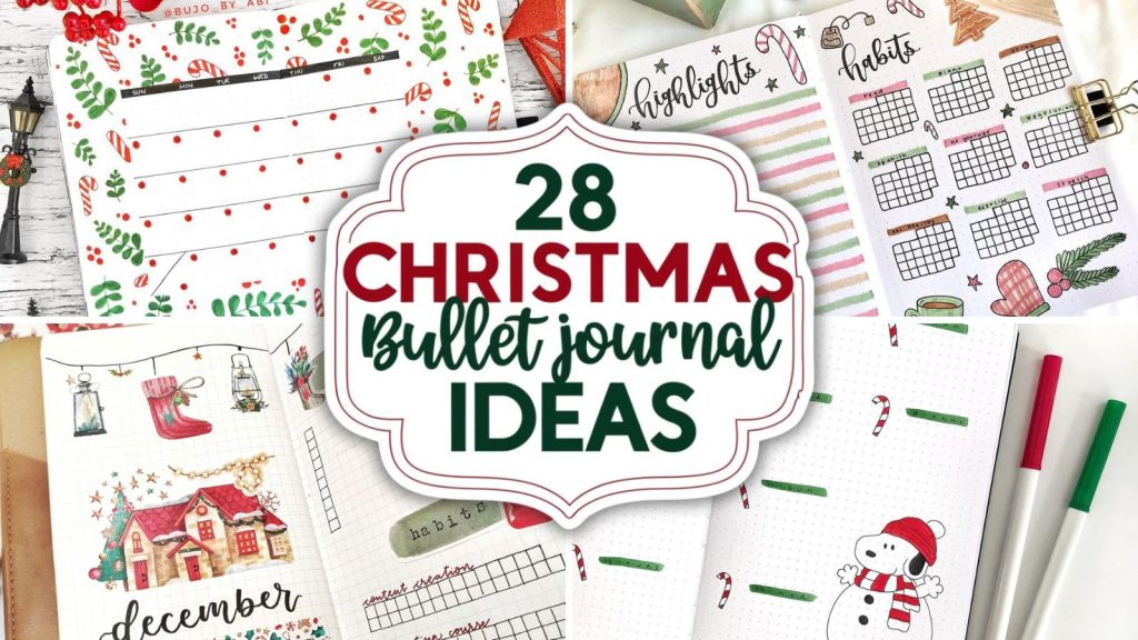
June bullet journal ideas always feel a little different to me compared to the rest of the year. There’s something about June that makes me want to slow down, open the windows, buy new stationery I absolutely do not need, and completely reinvent my journal for the summer season.
I always notice that my creativity changes around this time of year too. Spring spreads start feeling too soft, while full summer themes still feel a little early… and June ends up becoming this perfect mix of cozy florals, fruity doodles, cottagecore pages, bright colors, and peaceful slow-living aesthetics.
If you’ve been searching for fresh june bullet journal ideas that actually make you excited to journal again, I think you’re going to love this list.
Some of these spreads are minimal and calming, others are colorful and playful, and a few honestly made me want to immediately abandon my current setup and start an entirely new notebook at 11 PM. No regrets.
I collected these beautiful ideas from incredibly talented creators online, and every image includes the original source underneath. If a particular style inspires you, definitely visit their pages for even more amazing creativity and bullet journal inspiration.
And if you’re anything like me, don’t be surprised if this turns into a “just one more Pinterest save” situation.
If you want even more seasonal journal inspiration after this post, you might also love:
- 21 May Bullet Journal Ideas That Spark Creativity
- Stunning July Bullet Journal Ideas You Need This Month
- What Is A Bullet Journal? Creative Planning In One Notebook
You can also find even more cozy creative ideas on my Pinterest, where I constantly save new journaling inspiration, doodles, and creative layouts I’m obsessed with lately.
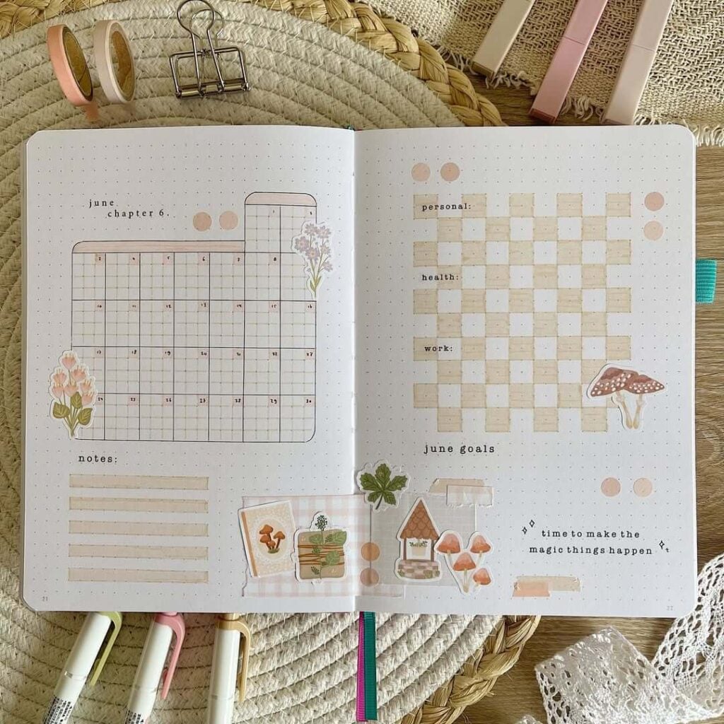
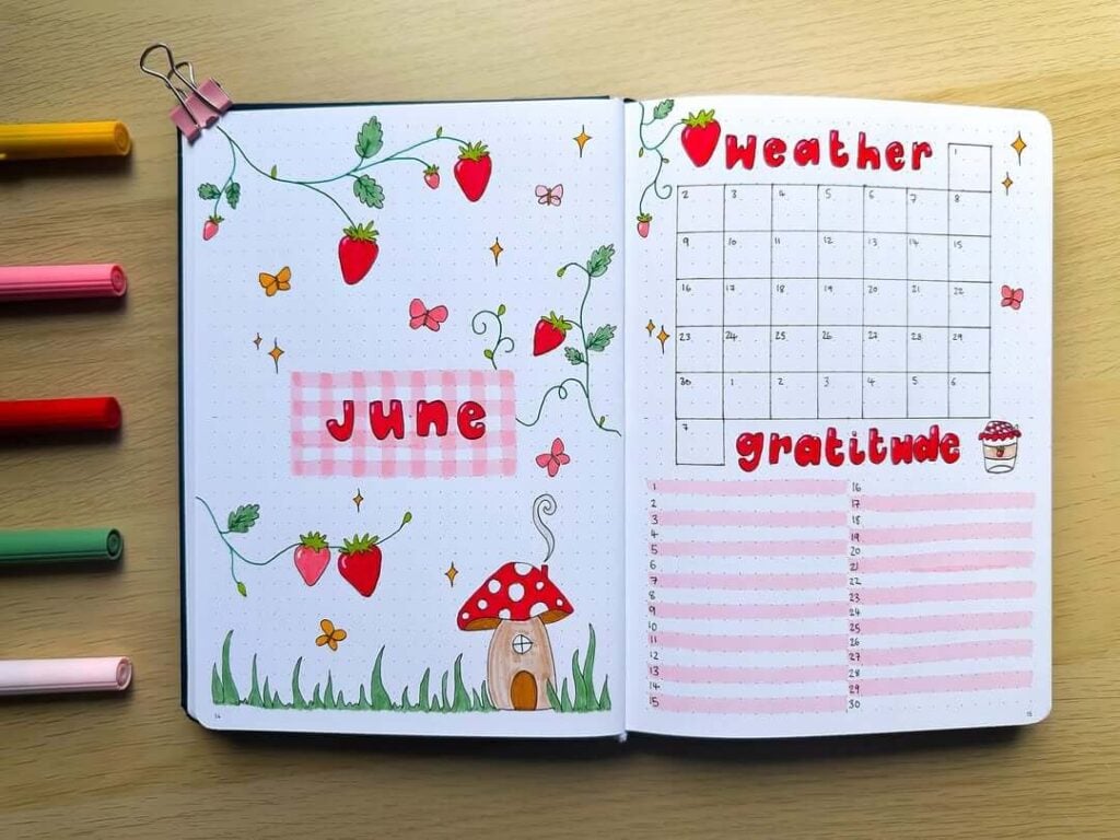
1. Mushroom Meadow June
Source: Instagram
This June bullet journal spread feels like a quiet cottage morning wrapped in soft beige tones and tiny woodland details. The muted checkerboard habit tracker adds such a calm, organized feel, while the mushroom and flower stickers bring in that cozy storybook charm. I really love how the layered washi tape and vellum-style scraps make the pages feel textured and lived-in, almost like little collected treasures from a forest walk. The tiny typewriter-style lettering keeps everything minimal but still playful.
To recreate this look, start with a dotted journal and sketch a rounded calendar layout using a light brown fineliner. Add neutral-toned washi tape, soft pastel stickers, and a few translucent paper layers for depth. The habit tracker works beautifully with alternating cream squares, and you can use mildliners or colored pencils for the subtle shading.
You could also add dried flower ephemera, tiny lace scraps, pressed leaf stickers, or even a small kraft paper pocket to hold June memories and notes. Gold gel pen accents or soft stamps would make the whole spread feel even more magical. And honestly… tiny mushrooms somehow make every page at least 37% cuter.
2. Sweet Strawberry June
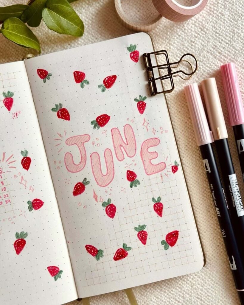
Source: Instagram
This June cover page has such a cheerful picnic-day energy with its scattered hand-drawn strawberries and soft pink lettering. The bright reds pop beautifully against the clean dotted background, while the sparkly doodles around the title make everything feel playful and dreamy at the same time. I love how simple the layout is, because the tiny strawberry illustrations completely steal the show without making the page feel crowded. It honestly feels like summer in journal form… and now I suddenly want strawberry shortcake.
To recreate this page, start by sketching bubble letters for “June” using a light pink marker or brush pen, then add soft shadowing or stripes inside the letters for extra dimension. Draw small strawberries with red markers, colored pencils, or fineliners, keeping them slightly imperfect for that cute handmade look. Tiny white gel pen highlights make the berries look glossy and extra adorable. The faint grid section at the bottom adds structure while still keeping the page airy and minimal.
You could make this spread even sweeter by adding strawberry-themed washi tape, pink stamps, tiny daisy doodles, gingham patterns, or translucent stickers. A pastel scrapbook paper border would also look amazing here. And if a page can somehow smell like strawberries just from looking at it… this one absolutely does.
3. Minimal Botanical June
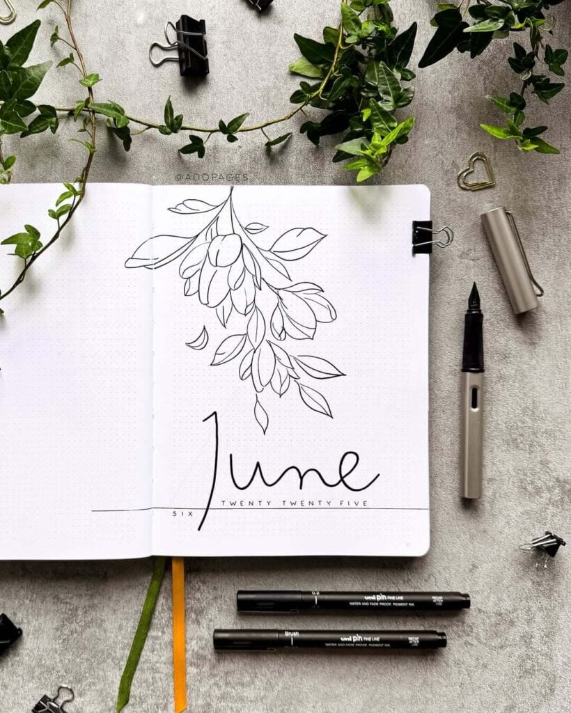
Source: Instagram
This June cover page is proof that simple can still feel absolutely stunning. The delicate black ink leaves cascading from the top create such an elegant, airy look, while the oversized handwritten “June” adds a soft modern touch without overpowering the page. I love the monochrome palette here because it feels calm, clean, and effortlessly sophisticated — like the kind of journal spread that instantly makes you want to organize your entire life while sipping iced coffee near an open window.
To recreate this layout, use a fine liner or brush pen to sketch long flowing botanical branches across the page. Keeping the linework thin and slightly imperfect gives it that relaxed hand-drawn feel. For the title, try using a brush pen with slow, confident strokes to create smooth calligraphy lettering. The tiny spaced-out text underneath balances the composition beautifully and keeps everything looking polished and minimal.
You could also personalize this spread with soft gray watercolor shadows, pressed leaves, vellum overlays, or tiny gold foil accents for a more luxurious look. Adding subtle green shading to the leaves would make the page feel even more alive without losing its minimal aesthetic. And honestly, layouts like this always make me feel 10 times more productive… even if I’m still procrastinating with stationery shopping afterward.
4. Garden Patch June
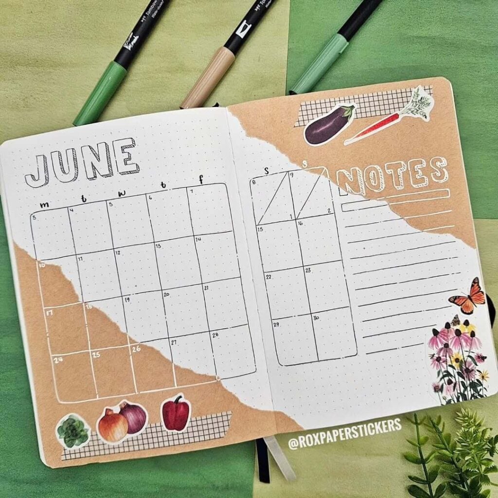
Source: Instagram
Okay, this spread has the cutest little farmer’s market energy. The torn kraft-paper effect mixed with veggie stickers and tiny floral details makes everything feel warm, creative, and a little bit vintage scrapbook-inspired. I really love how the layout stays functional and clean while still feeling artsy and layered. The soft earthy tones paired with the simple black calendar lines create such a cozy balance — like planning your month while sitting in a sunny greenhouse surrounded by plants you’re trying very hard not to accidentally kill.
To recreate this style, start by tearing pieces of kraft or beige scrapbook paper and glue them diagonally across the pages for that organic collage look. Draw your calendar with a black fineliner, then add outlined block letters for the month title. Layer in stickers, grid-pattern washi tape, botanical cutouts, or tiny illustrations to make the spread feel collected and personal. Using white gel pen details on darker paper sections helps everything pop beautifully.
You could also add pressed herbs, mini seed packet ephemera, vintage recipe paper scraps, or green watercolor splashes for even more garden-inspired charm. A few handwritten quotes or tiny doodled bees would fit perfectly here too. Honestly, layouts like this make productivity feel suspiciously adorable.
5. Little Habit Galaxy
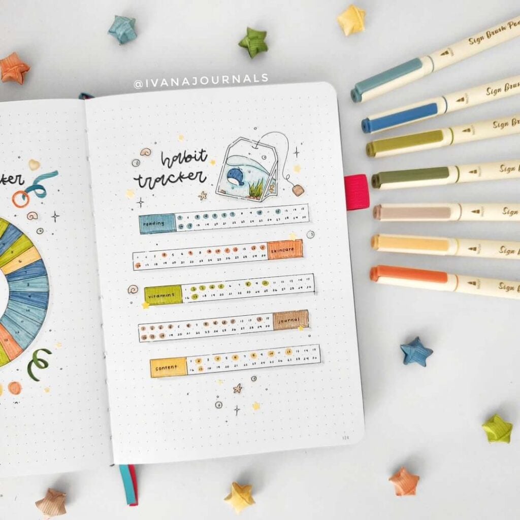
Source: Instagram
Something about this habit tracker feels so calm and satisfying, like tiny daily wins floating around on the page. The soft pastel color palette mixed with the delicate doodles gives the whole spread a cozy “slow productivity” vibe instead of feeling overwhelming. I’m obsessed with the little tea bag illustration at the top — it makes the page feel playful and personal without distracting from the clean layout. And those tiny stars and dots scattered around? Such a simple detail, but they make everything feel a little magical.
To make a similar page, start by drawing thin rectangular trackers with a black fineliner and divide them into small daily sections. Use muted markers for each habit category so the spread stays colorful but still soft on the eyes. Adding tiny circle check-ins instead of fully coloring boxes keeps the design airy and neat. The handwritten title works perfectly here because it adds warmth and makes the page feel less rigid.
You could easily customize this idea with mini moon doodles, tiny constellation lines, watercolor splashes, or translucent stickers for extra texture. Metallic gel pen stars would also look adorable, especially on evening or self-care trackers. Honestly, pages like this almost trick my brain into believing habit tracking is relaxing instead of me aggressively negotiating with myself to drink more water.
6. Strawberry Picnic June
Source: Instagram
I can’t get over how happy and nostalgic this spread feels — it’s giving childhood summers, strawberry candy, and tiny fairy gardens all at once. The bright reds and soft pink gingham instantly make the pages feel playful, while the winding strawberry vines add so much movement and charm. And that little mushroom house at the bottom? Absolutely the main character. The whole layout feels cheerful without being too busy, which honestly is such a hard balance to nail in colorful bullet journal themes.
To recreate this spread, begin with a simple pencil sketch of the strawberry vines and tiny doodles, then outline everything with a fineliner before adding color with markers or brush pens. The gingham title box is surprisingly easy — just draw a light pink rectangle and layer thin white lines over it to create the checkered effect. Keeping the weather tracker and gratitude section minimal helps the decorative elements stand out beautifully. Tiny sparkles and butterflies scattered around the pages make everything feel extra whimsical.
You could make this theme even cuter with strawberry washi tape, lace borders, tiny polaroid-style memory frames, or glossy gel pen highlights on the berries. Soft watercolor clouds or little picnic blanket patterns would also fit perfectly. Honestly, this spread feels like it should come with strawberry lemonade and a playlist full of happy summer songs.
7. Watermelon Sugar June
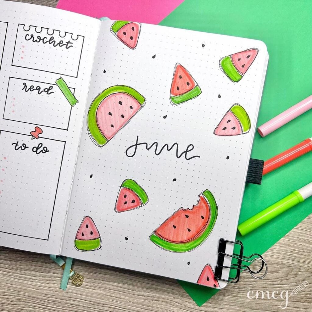
Source: Instagram
This page is basically summer vacation in bullet journal form and I’m completely here for it. The bright watermelon slices scattered across the spread make everything feel fresh, playful, and super energetic without needing tons of extra decoration. I love how the simple black cursive “June” balances all the bold colors so the page still feels clean and easy on the eyes. And the little bite mark on the watermelon slice? Such a cute detail — tiny things like that make a spread feel so much more alive and personal.
To recreate this theme, sketch different watermelon slice shapes lightly in pencil first, then outline them with a black fineliner for that doodled effect. Use pink, coral, and bright green markers to color the fruit, and leave subtle lighter areas for highlights so the slices don’t look flat. Tiny black seed doodles scattered around the page help fill empty space while keeping the layout fun and cohesive. Pairing colorful illustrations with minimal lettering works really well here because it lets the artwork shine without overwhelming the spread.
You could also add fruity washi tape, neon highlighter accents, picnic-inspired gingham patterns, or tiny lemonade doodles to make the whole theme even more summery. A glossy gel pen over the watermelon flesh would look adorable too. Honestly, this layout feels like it should be accompanied by flip-flops, sunshine, and someone reminding me not to leave watermelon juice all over my journal pages again.
8. Secret Garden June
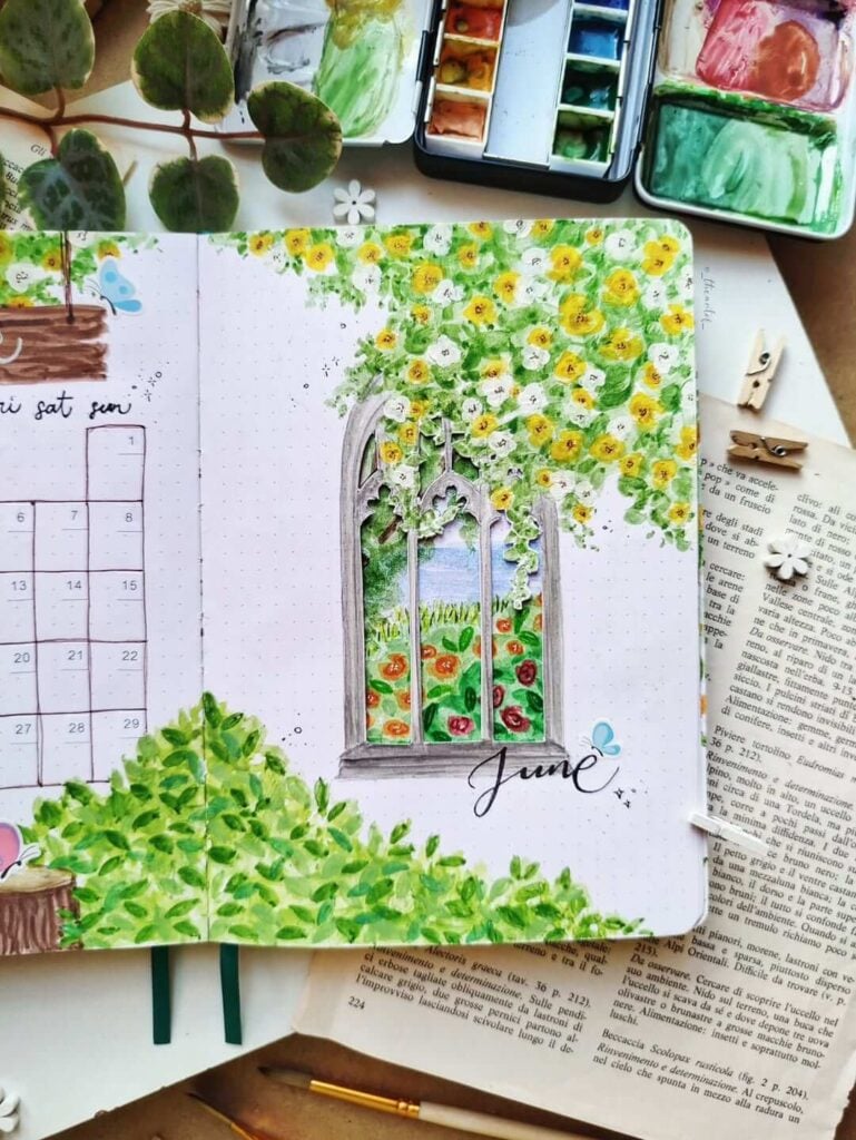
Source: Instagram
This spread feels like stepping into an old storybook garden hidden behind a vine-covered window. The watercolor greenery is so soft and dreamy, and those tiny yellow flowers spilling across the top make the whole page feel alive and sunlit. I absolutely love the vintage window illustration in the center — it creates this magical “looking into another world” feeling that makes the layout extra special. The mix of loose painting and delicate details gives everything such a peaceful, romantic atmosphere.
To recreate something similar, start by lightly sketching the window frame in pencil before outlining it with a fine liner or watercolor pencil. Use layered green watercolor washes for the leaves, then dab in yellow and white flowers with a small round brush for that soft blooming effect. Letting some brushstrokes stay loose and imperfect actually makes the page look more natural and painterly. The elegant handwritten “June” title keeps the composition balanced without taking attention away from the artwork.
You could make this theme even more enchanting with pressed flowers, vintage book paper, butterfly stickers, lace scraps, or soft gold paint splatters. Tiny hanging vines around the page edges would also look gorgeous. Honestly, this is the kind of spread that makes you want to dramatically journal by an open window while pretending you live in a cottage covered in flowers.
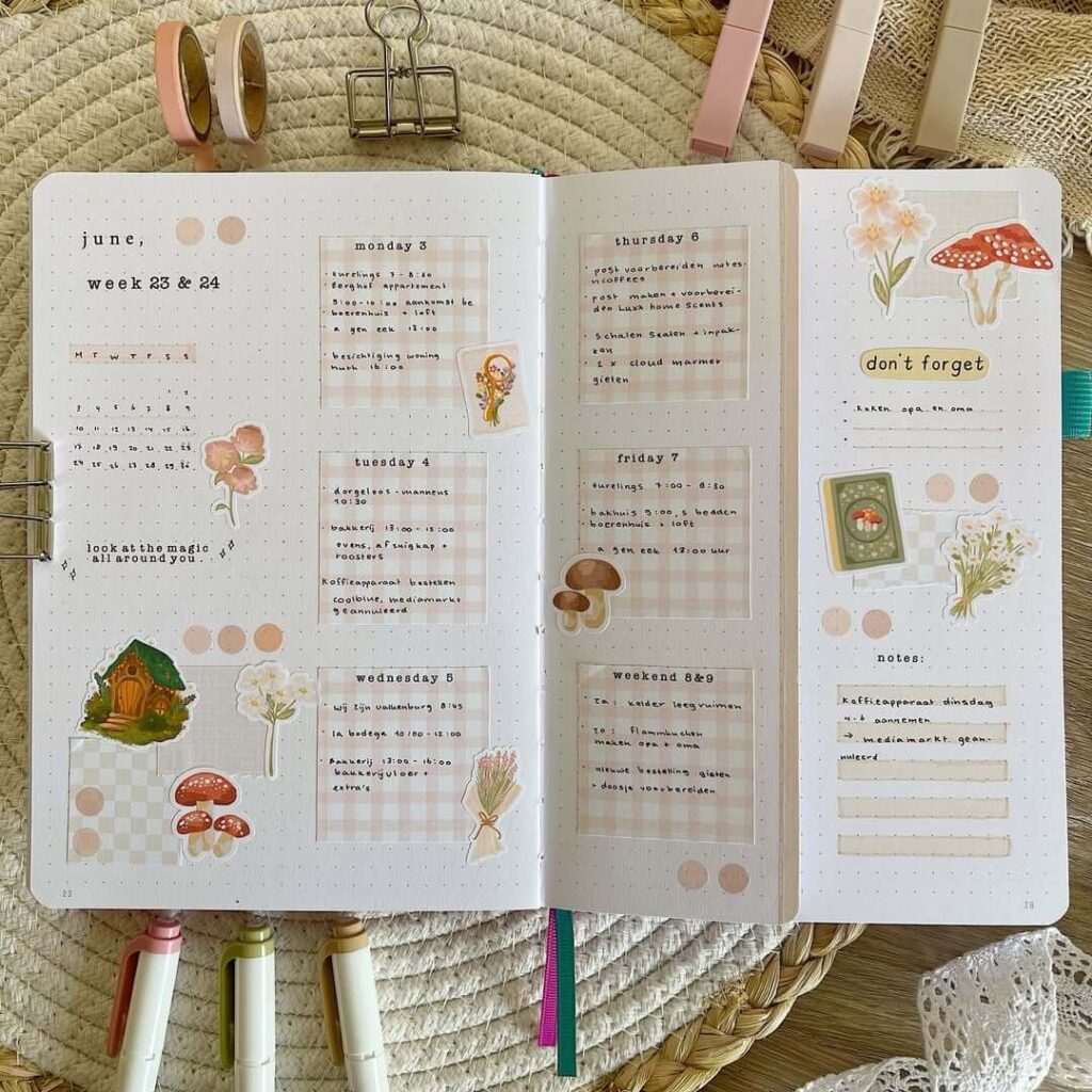
9. Weekend Garden Plans
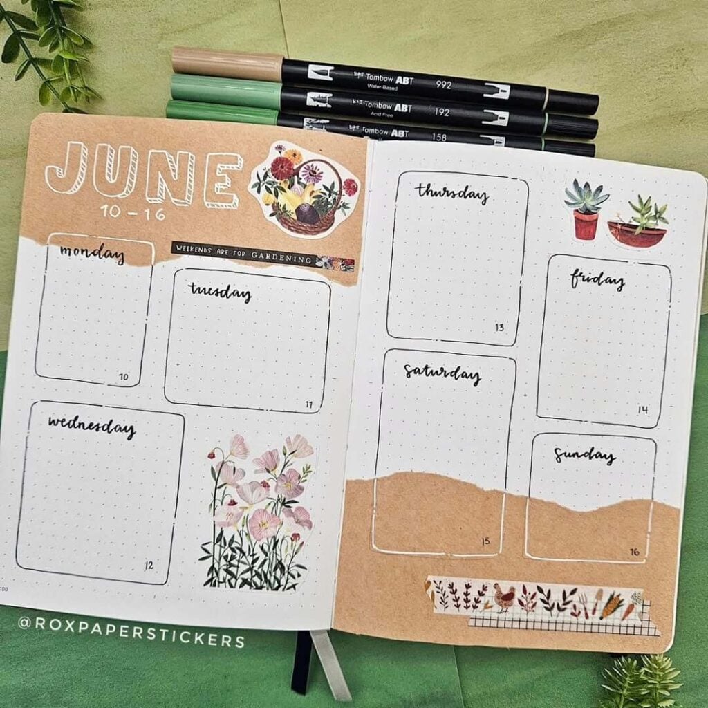
Source: Instagram
I really love how soft and relaxing this weekly spread feels. The torn kraft-paper details mixed with floral and succulent stickers give it such a cozy “slow living” aesthetic, like spending a quiet June afternoon repotting plants and pretending your to-do list doesn’t exist for a few hours. The layout stays wonderfully clean and functional, but the little botanical touches make every section feel warm and personal instead of overly structured. And the handwritten weekday titles add such a lovely casual charm.
To recreate this kind of spread, start by drawing rounded rectangular boxes for each day using a black fineliner. Then layer torn kraft paper across parts of the pages to create that scrapbook-style texture. Adding stickers or cutouts of flowers, plants, and gardening elements instantly gives the layout a cohesive theme without needing complicated drawings. Thin washi tape strips and white gel pen highlights help tie everything together while keeping the spread soft and balanced.
You could also add tiny seed packet pockets, pressed flower pieces, botanical stamps, or pale green watercolor shading around the borders for extra depth. Soft beige and sage green markers would fit beautifully with this palette too. Honestly, spreads like this make planning the week feel less like “tasks and deadlines” and more like organizing a peaceful little cottage life fantasy.
10. Citrus Grove June
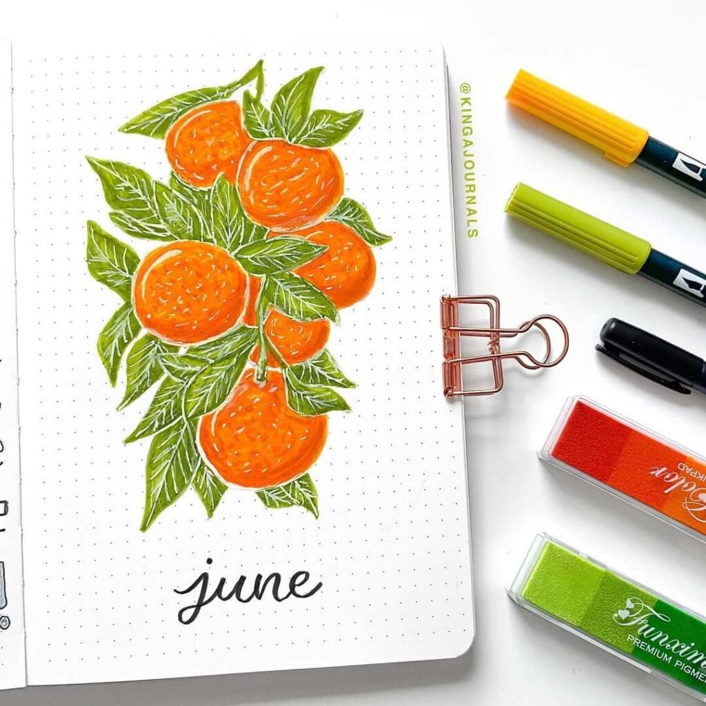
Source: Instagram
The bright oranges and leafy greens in this spread are such a perfect match for June — it feels fresh, sunny, and full of energy without being overwhelming. I love how the illustration takes up most of the page while still leaving tons of clean white space around it, because it makes the artwork stand out even more. The little white details on the oranges and leaves add so much texture too, almost like a vintage botanical print mixed with a modern bullet journal style. Honestly, this page practically radiates “fresh summer morning” energy.
To recreate this theme, sketch loose orange shapes first and layer different shades of orange marker or watercolor to give the fruit more dimension. Then fill the surrounding space with overlapping green leaves to create that lush, full composition. Using a white gel pen for tiny highlights and leaf veins makes the whole drawing pop beautifully against the bold colors. Keeping the “June” lettering simple in black cursive works perfectly because it balances all the bright illustration details.
You could also add citrus-themed washi tape, watercolor splashes, fruit market ephemera, or tiny handwritten summer quotes around the borders. A soft yellow background wash would make the oranges glow even more. And honestly, looking at this spread makes me feel like I should be journaling outside with iced tea and aggressively optimistic summer plans.
11. Koi Pond June
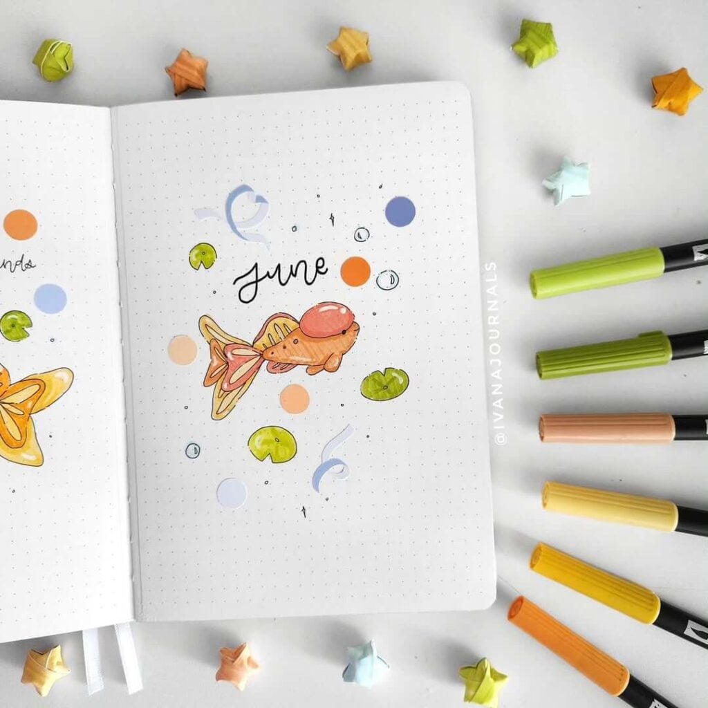
Source: Instagram
There’s something so peaceful and dreamy about this little koi fish theme. The soft peachy-orange colors mixed with the floating lily pads and tiny swirls make the whole page feel light and calming, almost like watching ripples on water during a quiet summer evening. I really love how minimal the composition is too — the centered illustration leaves plenty of breathing space, which makes the tiny details feel even more delicate and magical. It’s simple, playful, and oddly relaxing all at once.
To recreate this page, begin by sketching a small koi fish in pencil and outline it with a fine liner before coloring with warm oranges, soft yellows, and blush tones. Add floating lily pads, bubbles, and loose ribbon-like doodles around the page to create movement without overcrowding the design. Keeping the title small and handwritten works beautifully here because it lets the illustration stay the focal point. Tiny dot details and sparkles scattered around the page also help give that soft underwater atmosphere.
You could easily expand this theme with watercolor blue backgrounds, gold gel pen accents, lotus flower stickers, or subtle wave patterns along the borders. Transparent vellum circles would also look gorgeous layered over the page like floating water reflections. Honestly, this spread feels like the visual equivalent of taking a deep breath after a chaotic week — peaceful, cute, and quietly magical.
12. Cozy Cottage Weeks
Source: Instagram
I’m honestly obsessed with how soft and comforting this weekly spread feels. The neutral blush tones, gingham boxes, and tiny woodland stickers make everything look like pages from a fairytale planner tucked inside a little forest cottage. The layout is beautifully organized, but the layered paper textures and mushroom illustrations keep it warm and creative instead of overly structured. And those tiny decorative circles scattered around the pages? Such a simple detail, yet they tie the whole spread together so perfectly.
To recreate this style, start by creating soft beige or blush checkered boxes for each day using patterned paper, printable scrapbook scraps, or hand-drawn grids. Use a typewriter-style font or neat lowercase handwriting for the headings to keep the spread feeling delicate and minimal. Layer mushroom, floral, and cottage-themed stickers around the edges of the boxes, then add washi tape or vellum paper underneath for extra depth and texture. Leaving lots of white space helps the decorative pieces stand out without making the spread feel crowded.
You could also add lace paper edges, tiny faux postage stamps, pressed flowers, or mini kraft-paper tags for an even cozier junk journal vibe. A soft brown ink instead of black would make everything feel extra vintage too. Honestly, this looks like the kind of planner spread someone would use while baking bread and talking to their plants like roommates.
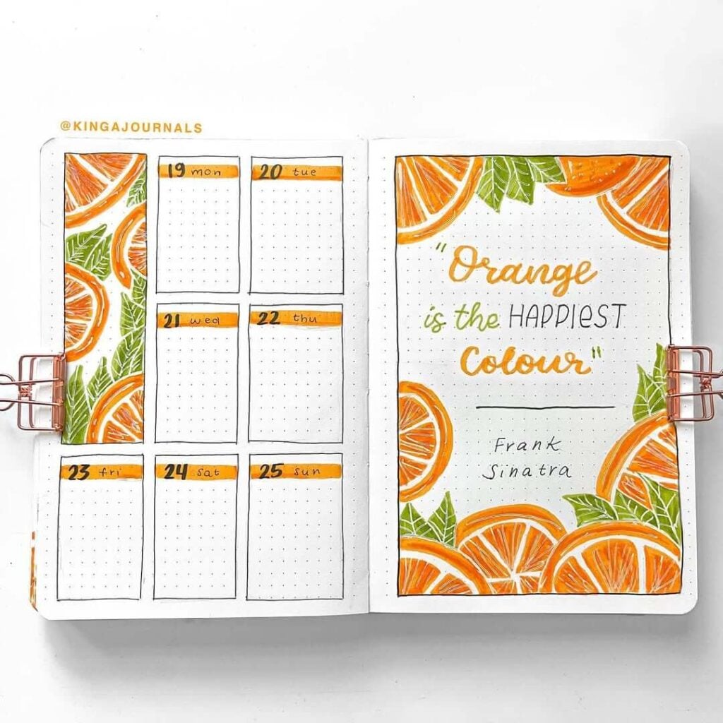
13. Orange Slice June
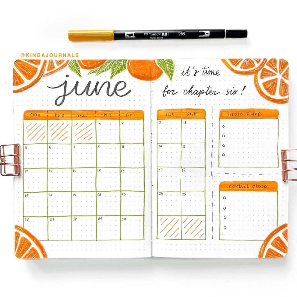
Source: Instagram
The bright citrus theme here feels so fresh and energizing — like opening the windows on a sunny June morning with a cold glass of orange juice nearby. I love how the orange slices frame the pages without making the layout feel crowded, and the combination of vibrant orange with soft green lines gives everything such a clean, summery look. The handwritten “it’s time for chapter six!” adds such a cute motivational touch too, like a little reminder that June is a fresh start wrapped in sunshine.
To recreate this spread, start by sketching simple orange slices around the page corners using pencil first, then outline them with a fineliner before layering orange marker shades for depth. Use light green lines for the calendar boxes to keep the layout feeling soft instead of harsh. Adding diagonal stripes inside a few date boxes gives the spread extra visual interest without overwhelming the clean design. A brush pen works beautifully for the large flowing “June” title, especially paired with smaller handwritten notes and headings.
You could also add citrus-themed stickers, yellow watercolor splashes, tiny leaf doodles, or transparent washi tape for extra layering. A few gold sparkles or summer quote stickers would fit perfectly too. Honestly, this spread feels like the kind of page that convinces you June is going to be productive, healthy, organized… and somehow full of aesthetic fruit at the same time.
14. Cherry Pop June
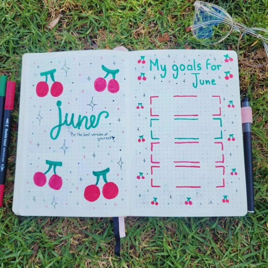
Source: Instagram
This spread is so bright, playful, and full of happy summer energy. The bold pink cherries paired with the vibrant green lettering make the whole layout feel fun and youthful without needing tons of complicated details. I really love how the tiny sparkles and doodles scattered across the pages keep everything lively and whimsical, while the goals page still stays super functional and easy to use. It honestly feels like the kind of journal spread you’d make while sitting outside in the grass with music playing and zero intention of going back indoors anytime soon.
To recreate this theme, start with large simple cherry doodles using pink and green markers, then add soft highlights or darker outlines for a little dimension. Bubble-style lettering works perfectly here because it matches the playful aesthetic, and tiny stars or sparkle doodles help fill empty space without cluttering the spread. Keeping the layout minimal allows the bright colors to stand out beautifully against the clean dotted pages.
You could also add neon washi tape, fruity stickers, gingham borders, mini heart doodles, or glitter gel pen accents for even more summer charm. A pastel pink background wash behind the goals section would look adorable too. Honestly, this layout feels like drinking cherry soda on a warm afternoon while convincing yourself that writing down goals automatically means you’ll achieve all of them immediately.
15. Pastel Header Parade
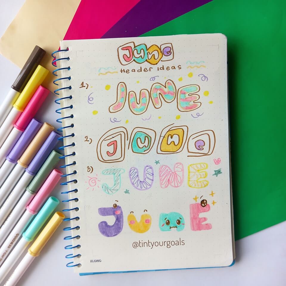
Source: Instagram
Okay, this page is basically pure serotonin for stationery lovers. The soft pastel palette, chunky bubble lettering, and playful doodles make every single “June” header feel like its own tiny personality. I love how each style has a completely different vibe — some feel retro, some look candy-inspired, and the little kawaii faces at the bottom are honestly impossible not to smile at. It’s creative without feeling intimidating too, which makes it such a fun idea for experimenting in your journal.
To recreate a page like this, start by sketching different lettering styles in pencil first so you can play around with shapes and spacing. Use pastel markers or mildliners to color each title differently, then outline them with brown or black fineliners for that soft illustrated look. Adding tiny sparkles, dots, stars, swirls, and mini doodles around the headers helps fill the page and gives everything extra personality. Mixing patterns like stripes, blobs, checkerboards, or squiggles inside the letters also makes the designs feel more dynamic and unique.
You could easily expand this idea with seasonal color palettes, fruit-themed letters, tiny stickers, metallic gel pen highlights, or watercolor shadows behind the words. Keeping a whole page of title ideas is honestly so useful too when your brain suddenly forgets how to decorate a spread the second you open your journal.
16. Blue Lantern June
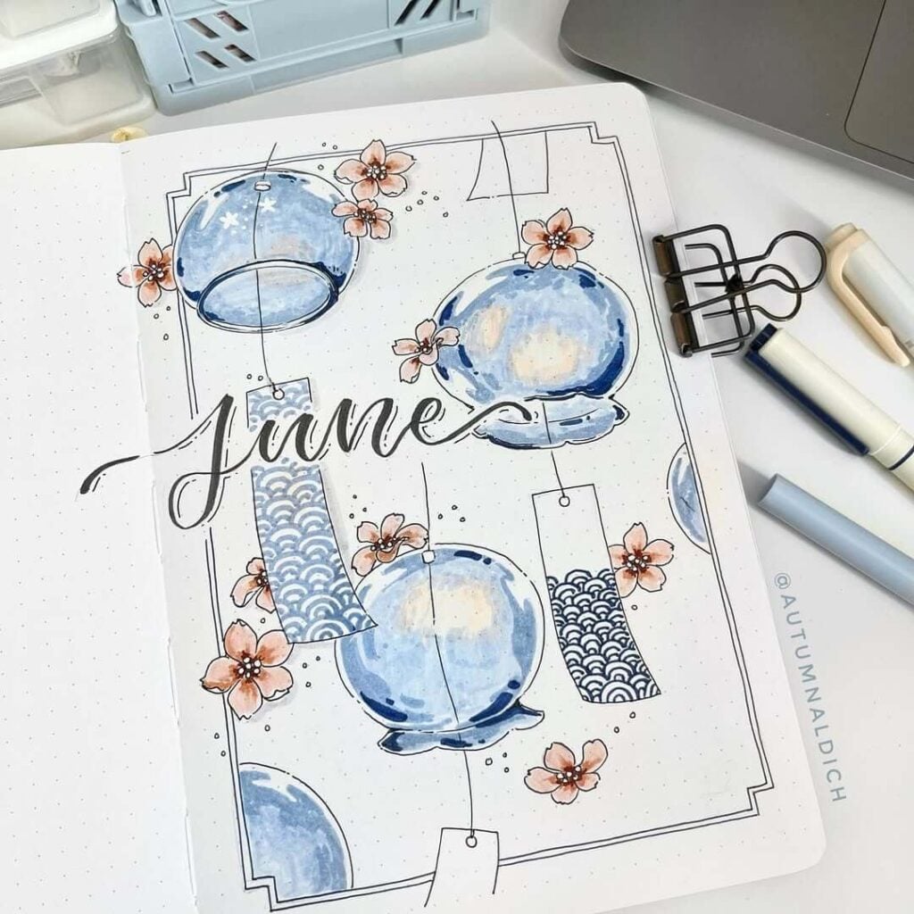
Source: Instagram
This cover page feels so elegant and peaceful, like a quiet summer evening festival lit by glowing lanterns. The soft watercolor blues paired with the delicate cherry blossoms create such a dreamy contrast, and I love how the hanging lantern illustrations guide your eyes across the whole page. The thin black borders and patterned paper details give everything a subtle vintage touch too, almost like a handmade postcard from another world. It’s artistic, calming, and seriously stunning without feeling overly complicated.
To recreate this look, sketch the lantern shapes lightly in pencil first, then paint them with layered blue watercolor washes to create that glossy glowing effect. Using a darker blue around the edges and leaving soft white highlights in the center helps the lanterns feel round and luminous. Add tiny floral doodles around the composition for softness, and use patterned washi tape or hand-drawn repeating wave designs for extra detail. The flowing brush-lettered “June” title ties everything together beautifully while keeping the page elegant and balanced.
You could also add gold gel pen stars, translucent vellum pieces, Japanese-inspired paper scraps, or pale watercolor splashes in the background for more depth. Tiny hanging strings or tassel details would look gorgeous too. Honestly, this spread feels like the kind of page that makes you want to romanticize your entire life for at least the next three weeks.
17. Blush Rose June
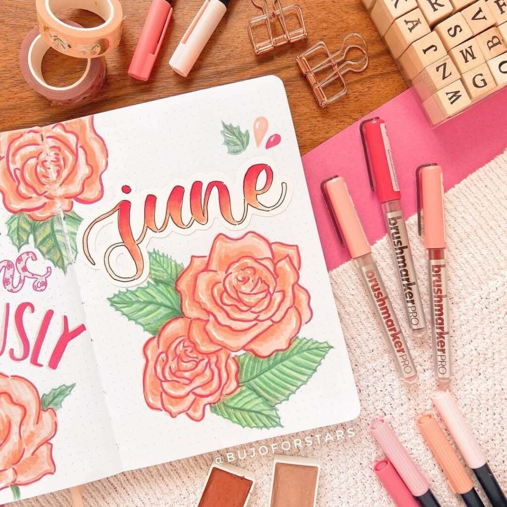
Source: Instagram
This spread feels so soft, romantic, and beautifully feminine without being overly complicated. The peachy-pink roses paired with the warm gradient lettering give the whole page such a gentle summer glow, almost like golden hour sunlight pressed into a journal. I really love how the floral illustrations fill the space while still keeping everything airy and elegant. And the layered marker shading on the petals adds so much depth — the roses almost look like they’re blooming right off the page.
To recreate this theme, sketch loose spiral shapes for the rose centers first, then slowly build outward petals with soft curved lines. Layer different shades of pink, coral, and peach markers to create dimension, blending lighter tones toward the petal edges for that delicate watercolor-like effect. Green colored pencils or markers work perfectly for adding texture to the leaves with tiny vein details. For the title, try blending two warm shades together in brush lettering to match the floral palette and keep the whole spread cohesive.
You could also add floral washi tape, pearl stickers, vellum overlays, lace paper scraps, or tiny gold sparkles for extra romantic detail. Soft blush watercolor washes behind the flowers would make the page feel even dreamier too. Honestly, this is the kind of spread that makes you want to buy fresh flowers, reorganize your stationery, and suddenly become the main character in a cozy summer movie.
18. Circus Cutie June
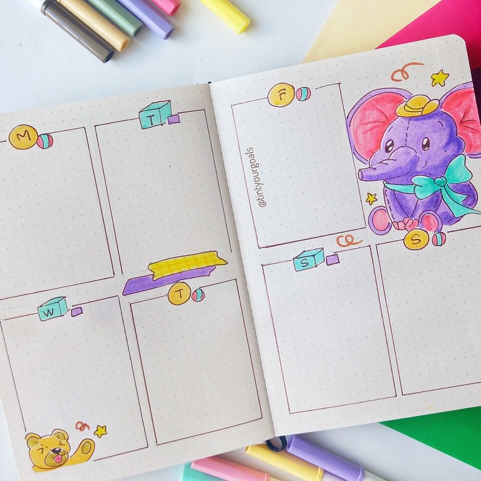
Source: Instagram
This weekly spread is pure playful chaos in the best possible way. The pastel circus colors, tiny toy-block details, and adorable little elephant instantly make the whole layout feel cheerful and nostalgic, like pages from a childhood storybook. I love how the weekly boxes stay super simple while the decorations bring all the personality. The bright purples, yellows, and pinks make everything pop without feeling too overwhelming, and honestly… that tiny elephant with the bow tie completely steals the show.
To recreate this style, start by drawing clean rectangular boxes for each weekday using a thin fineliner. Then add small colorful doodles like toy blocks, balls, stars, ribbons, or tiny confetti details around the corners to keep the spread playful. For the elephant illustration, sketch basic rounded shapes first and layer soft pastel markers for shading and dimension. Using bold outlines around the character helps it stand out beautifully against the minimal background.
You could also add carnival-inspired washi tape, pastel checkerboard patterns, mini ticket stubs, or glitter gel pen sparkles for extra fun. Tiny clouds, balloons, or circus tent doodles would fit perfectly with this theme too. Honestly, this spread feels like the kind of planner page that reminds you productivity can still be cute, colorful, and a little bit silly sometimes.
19. Duck Pond Days
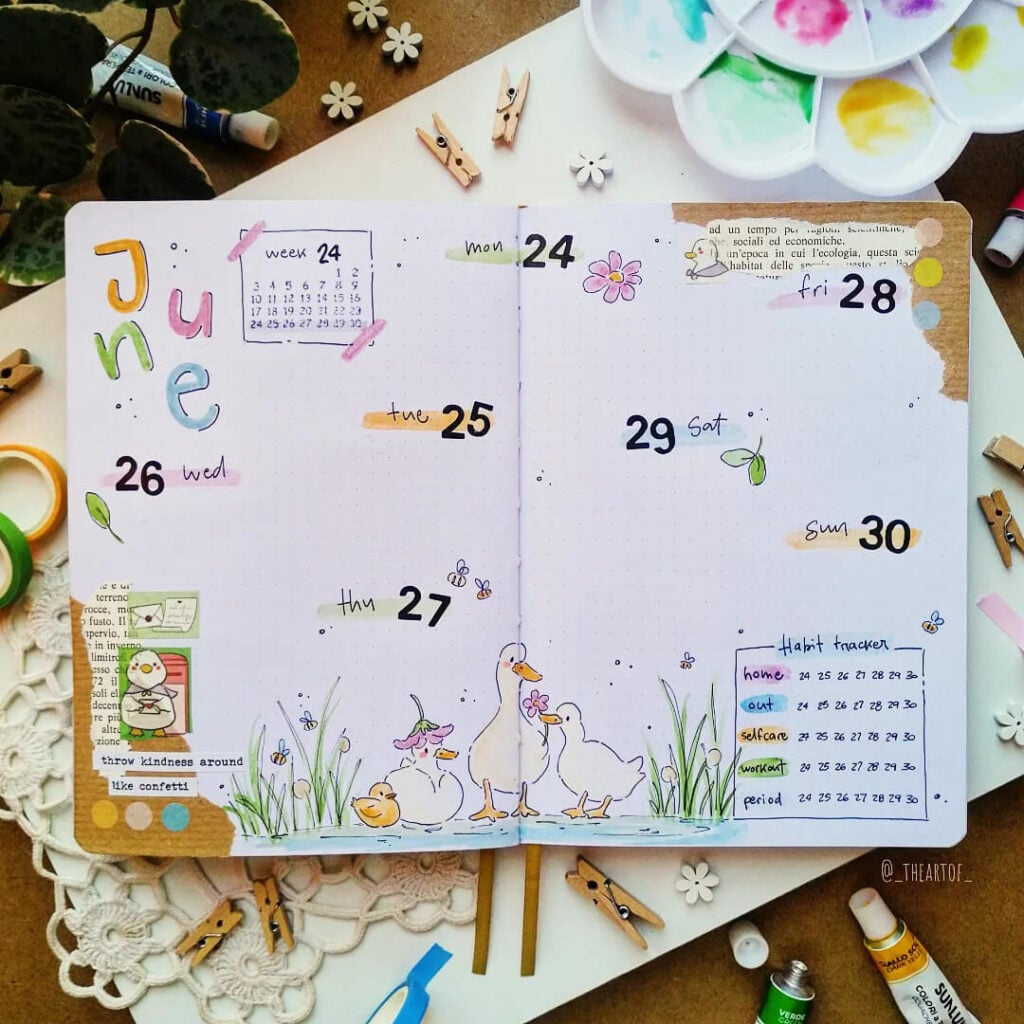
Source: Instagram
This weekly spread feels so soft, happy, and peaceful — like a tiny watercolor afternoon by the lake. The little duck family at the bottom completely melts my heart, and the pastel “June” lettering gives the whole page such a light playful mood without making it feel cluttered. I really love how the open layout leaves lots of writing space while the tiny bees, flowers, and paper scraps keep everything creative and full of personality. It’s cozy, gentle, and quietly cheerful in the sweetest way.
To recreate this spread, start by lightly sketching your weekly layout with plenty of open space between the dates to keep everything airy. Use watercolor paints or soft markers for the pastel title letters, then add tiny doodles like bees, flowers, leaves, and grass to bring the page to life. The duck illustrations work beautifully with loose sketchy outlines and soft yellow shading instead of super detailed drawing. Layering torn book paper, washi tape, or scrapbook scraps around the corners adds extra texture while keeping the spread relaxed and handmade-looking.
You could also add pond ripple doodles, lily pads, tiny cloud sketches, or pressed flower pieces for even more storybook charm. Soft blue watercolor splashes around the ducks would look adorable too. Honestly, this layout feels like the kind of page that makes you want to slow down, sit outside for a while, and romanticize even the tiniest parts of your week.
20. Orange Sunshine Spread
Source: Instagram
Everything about this layout feels bright, fresh, and ridiculously cheerful. The bold orange slices wrapping around the pages instantly bring summer energy, while the little green leaves keep the whole spread feeling balanced and lively. I really love the quote page too — it gives the layout personality without making it feel overcrowded, and the handwritten mix of fonts adds such a fun artistic touch. Honestly, this looks like the kind of weekly spread that could improve your mood before you’ve even written anything in it.
To recreate this theme, sketch simple orange slice shapes around the borders first, then fill them in with layered orange and yellow markers to create juicy-looking dimension. Add thin white highlights using a gel pen to make the fruit pop even more. Keeping the weekly boxes minimal with black outlines helps the decorative citrus details stand out beautifully. Mixing cursive lettering with simple block fonts also gives the quote page that modern handmade journal aesthetic.
You could make this spread even more vibrant with citrus-pattern washi tape, watercolor splashes, tiny lemon doodles, or translucent stickers layered into the corners. A pale peach background wash behind the quote would also look gorgeous. Honestly, pages like this make me want to pretend my entire life is organized, healthy, and powered exclusively by sunshine and fruit.
21. Melon Mood Tracker
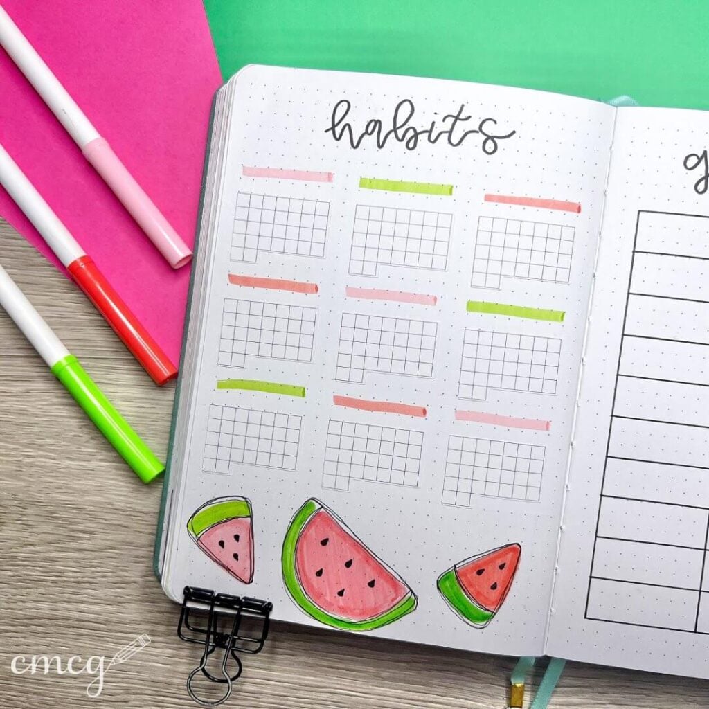
Source: Instagram
This habit tracker is so simple, fresh, and summery in the cutest way possible. The tiny watermelon slices along the bottom instantly make the page feel playful, while the clean grid layout keeps everything neat and super functional. I really love the soft pink and neon green accents too — they add just enough color to make the spread feel bright without distracting from the tracking boxes. It’s giving “trying to stay productive while mentally already on summer vacation,” honestly.
To recreate this page, start by drawing small monthly tracker grids with a ruler and thin black fineliner to keep the layout crisp and organized. Add soft pastel brush strokes or highlighter swatches above each tracker section for quick color coding. The watermelon doodles are easy to make with simple triangle and half-circle shapes, then layered with pink and green markers plus tiny black seed details. Leaving plenty of white space helps the whole page feel clean, airy, and easy to use every day.
You could also add fruity washi tape, mini popsicle doodles, neon checkmarks, or little sunshine icons to make the tracker even more fun. A pale pink watercolor shadow behind the title would look adorable too. Honestly, habit trackers like this almost convince me that checking off daily tasks is a cute relaxing hobby instead of a tiny monthly battle with myself.
22. Little Gecko June
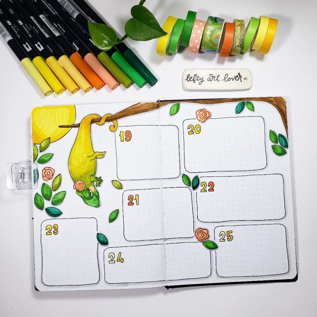
Source: Instagram
How cute is this tiny gecko theme? The bright greens and sunny yellow tones make the whole spread feel warm, tropical, and full of playful energy. I love how the little lizard hanging from the branch instantly becomes the star of the page while the leaves and tiny flowers soften everything around it. The layout itself stays really practical and easy to write in, but the nature-inspired doodles give it so much personality. Honestly, this feels like the kind of spread that belongs in a journal packed for a summer adventure.
To recreate this page, sketch a simple branch across the top first, then lightly draw the gecko using rounded shapes before outlining everything with a fineliner. Layer greens and yellows with markers or colored pencils to create soft shading and dimension, especially on the leaves and tail. Keeping the weekly boxes rounded helps the spread feel more organic and relaxed instead of overly structured. Tiny floral doodles and scattered leaves are perfect for filling empty spaces without making the page look crowded.
You could also add jungle-themed washi tape, tropical plant stickers, watercolor splashes, or little sunshine doodles for extra summer vibes. Gold accents on the leaves would look gorgeous too. Honestly, spreads like this make me want to name the gecko something dramatic and pretend he’s personally supervising my weekly plans.
23. Sprinkle Sweet June

Source: Instagram
This donut-themed spread is giving full bakery-window happiness and I’m honestly obsessed with it. The soft pink icing, pastel blue stripes, and tiny sprinkle details make the whole page feel playful, cozy, and a little bit nostalgic — like weekend mornings and sugary treats wrapped into one journal theme. I really love how the scattered sprinkle doodles fill the background without making the page feel busy, and the simple black cursive title keeps everything balanced and clean. It’s cute in that effortless “I definitely spent way too much time making this adorable” kind of way.
To recreate this layout, start by sketching large donut circles with a pencil, then add dripping icing shapes and simple glaze patterns before outlining everything with a fineliner. Use soft pastel markers for the frosting and leave little white highlights to make the donuts look glossy and fluffy. Tiny sprinkle doodles scattered across the page instantly tie the theme together and help fill empty space in a fun subtle way. A bold cursive “June” title works perfectly here because it contrasts beautifully with all the soft rounded illustrations.
You could also add bakery-themed stickers, gingham backgrounds, coffee cup doodles, or tiny menu-card style labels for extra charm. Glossy accents or glitter gel pen sprinkles would make the donuts look even sweeter too. Honestly, this spread feels like the visual equivalent of buying a cute pastry “just as a little treat” and somehow leaving the café with three more.
24. Orange Grove June
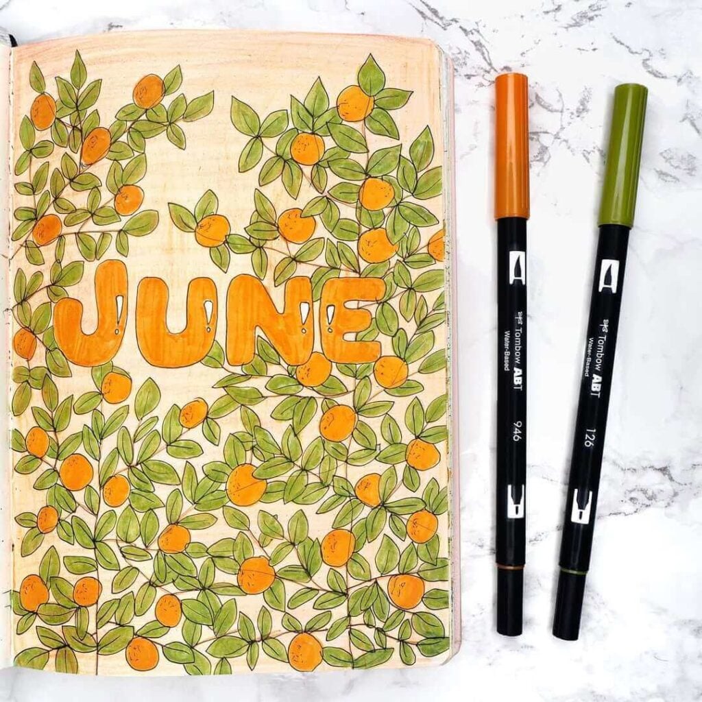
Source: Instagram
This page feels like wandering through a sunlit citrus garden in the middle of summer. The overflowing branches packed with tiny oranges and soft green leaves make the whole spread feel lively, warm, and almost storybook-like. I really love how the bold chunky “June” lettering stands out in the center while still blending perfectly into the illustration. The soft peachy background shading ties everything together beautifully too — it gives the page such a cozy golden-hour glow instead of leaving the background completely plain.
To recreate this theme, start by sketching loose winding branches across the page and slowly build up layers of small leaves around them. Add little orange circles throughout the composition, then use darker orange and green details to create depth and texture. A colored pencil or light watercolor wash works perfectly for the soft warm background because it makes the illustration feel fuller and more finished. Keeping the title large and rounded helps balance all the tiny detailed leaves surrounding it.
You could also add botanical stamps, vintage fruit labels, tiny bees, or citrus-pattern washi tape for extra detail. Gold ink splatters or soft yellow highlights would make the page feel even sunnier too. Honestly, this spread looks like it smells faintly of oranges, warm air, and the dangerous confidence that maybe you could keep a plant alive this summer.
25. Honey Bee June
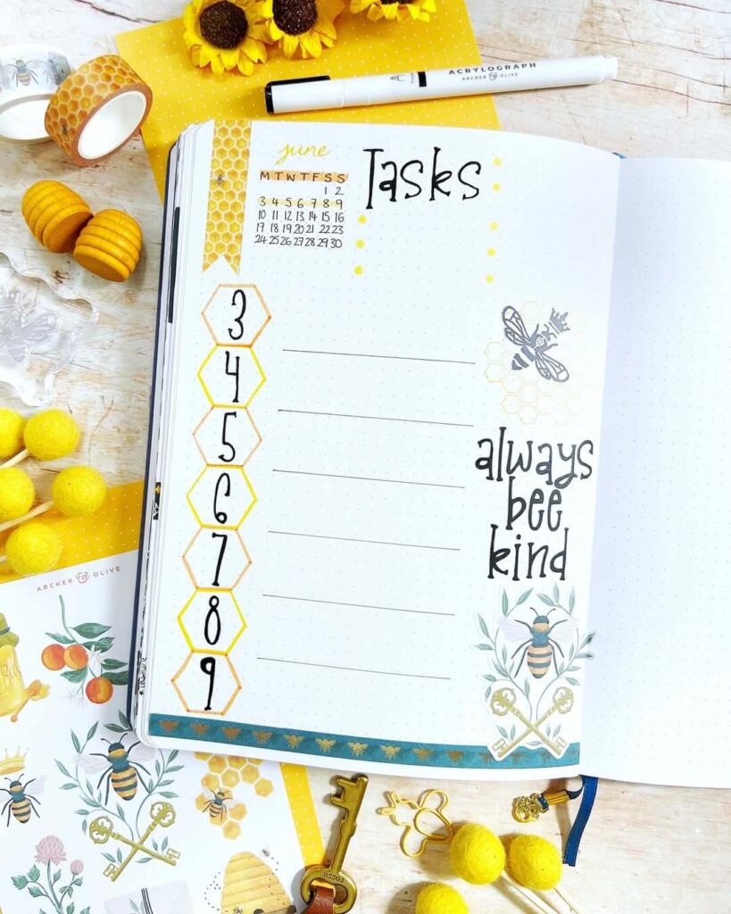
Source: Instagram
This spread is such a sunshine-filled little mood booster. The bee theme mixed with honeycomb shapes and warm yellow accents makes everything feel cheerful, cozy, and super uplifting without being too busy. I really love the “always bee kind” quote because it gives the page personality while still fitting perfectly into the aesthetic. The soft black lettering balances all the bright yellow details beautifully, and the tiny bee illustrations make the whole layout feel playful in the sweetest way. Honestly, this page radiates happy summer afternoon energy.
To recreate this theme, start by drawing simple hexagon shapes down the page to mimic a honeycomb pattern, then outline them with yellow or gold markers for a softer look. Use thin black lines for the task sections to keep the layout clean and functional. Adding bee stickers, tiny dotted trails, and little honeycomb doodles around the page helps tie everything together without overcrowding the design. A mix of handwritten fonts works perfectly here because it keeps the spread feeling warm and handmade instead of overly structured.
You could also add sunflower stickers, gold foil accents, torn kraft paper, or soft watercolor splashes in pale yellow for extra texture and warmth. Honey-drip doodles or tiny daisy illustrations would look adorable too. Honestly, spreads like this make productivity feel way cuter than it has any right to be.
26. Lavender Daydream June
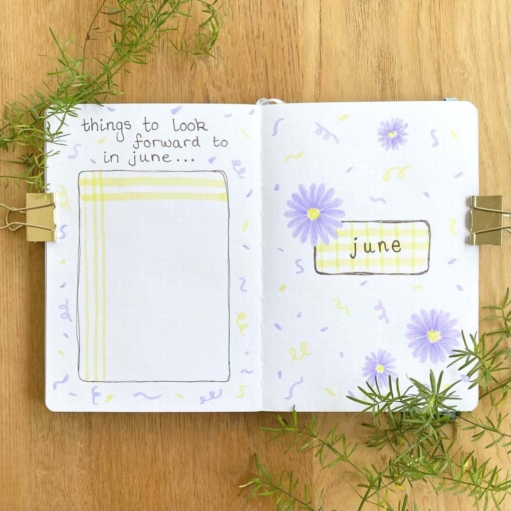
Source: Instagram
This spread feels so soft and calming, like a slow June afternoon with open windows and fresh flowers on the table. The pastel purple daisies paired with the pale yellow plaid details create such a gentle dreamy color palette, and I really love how minimal everything stays while still feeling creative and cozy. The little squiggle doodles scattered around the pages add such a fun playful touch too — they make the spread feel lighthearted without taking attention away from the flowers. Honestly, this layout feels like journaling in pajamas while pretending life is completely under control.
To recreate this theme, start by sketching simple rectangular boxes with rounded corners, then add soft plaid patterns inside using pastel highlighters or mildliners. The flowers can be made with loose petal strokes around a tiny yellow center, keeping the doodles slightly imperfect for that relaxed handmade look. Tiny squiggles, dots, and confetti-like marks scattered across the background help fill empty space while keeping the spread airy and balanced. Using thin black handwriting for the headings keeps everything soft and cohesive.
You could also add lavender washi tape, pressed flower stickers, translucent vellum scraps, or tiny gold sparkles for extra charm. A pale lilac watercolor wash around the flowers would look beautiful too. Honestly, this page feels like the visual version of a calm deep breath after a busy week.
Why June Is One Of My Favorite Months For Bullet Journaling
I honestly think June might be one of the easiest months to get creative with.
There are so many directions you can go:
- fruity summer themes
- cottagecore aesthetics
- botanical pages
- soft pastel spreads
- picnic-inspired layouts
- bees, flowers, strawberries, mushrooms, oranges…
- basically everything cute suddenly works together somehow
And unlike January spreads that sometimes feel overly “productive,” june bullet journal ideas can feel softer and more personal.
This is usually the month where I stop trying to make my journal look perfectly organized and start focusing more on creativity, comfort, and enjoying the process again. Some of my favorite pages have slightly messy doodles, uneven lettering, random washi tape placement, and watercolor smudges that absolutely were not planned.
Ironically, those imperfect pages always end up becoming my favorites.
Tips For Creating Beautiful June Bullet Journal Spreads
Don’t Overcomplicate Your Layouts
One thing I learned the hard way: not every page needs to look like a professional art project.
Some of the prettiest june bullet journal ideas are actually very simple:
- a clean title page
- a few doodles
- soft colors
- one cohesive theme
That’s it.
Sometimes adding too many stickers, colors, and decorations can make the page feel stressful instead of relaxing. I’ve definitely had moments where I spent two hours decorating a weekly spread… only to have zero space left to actually write anything.
Not my proudest moment.
Pick 2–3 Main Colors
If your pages often feel visually chaotic, limiting your palette helps so much.
For June, some of my favorite combinations are:
- pink + red + green
- sage green + beige
- lavender + yellow
- orange + peach
- blue + soft gray
Keeping a smaller color palette instantly makes your journal look more cohesive and aesthetic, even if your doodles are super simple.
And honestly, sometimes a single mildliner and a black pen can carry an entire spread.
Mix Functional Pages With Creative Pages
I used to think every page needed to be ultra productive.
Now I purposely include pages that are just fun:
- doodle practice
- quote pages
- memory pages
- mini scrapbook collages
- playlists
- summer bucket lists
- random tiny drawings that serve absolutely no organizational purpose whatsoever
Those pages usually become the most meaningful later.
Your bullet journal doesn’t have to be perfectly efficient all the time. It can also just make you happy.
Use Pinterest For Endless Bullet Journal Inspiration
Whenever I feel creatively stuck, Pinterest saves me every single time.
I love searching for:
- cozy journal themes
- fruit doodles
- minimalist weekly spreads
- scrapbook journaling ideas
- cottagecore bullet journal inspiration
If you want more ideas beyond this post, you can browse my favorite inspiration boards on Pinterest too. I’m constantly collecting new creative layouts there because apparently I physically cannot stop saving cute journal spreads.
Beginner-Friendly Supplies You Can Use
You absolutely do not need expensive supplies to create beautiful june bullet journal ideas.
Some of my most-used favorites are:
- black fineliners
- mildliners
- pastel highlighters
- a white gel pen
- simple washi tape
- scrapbook paper scraps
- stickers
- colored pencils
Honestly, creativity matters so much more than having perfect supplies.
Some of the most charming spreads look handmade and slightly imperfect, and that’s part of what makes bullet journaling feel personal instead of overly polished.
Final Thoughts On These June Bullet Journal Ideas
I genuinely hope these june bullet journal ideas gave you fresh inspiration for your next spread.
Whether you love soft cottagecore themes, fruity summer doodles, minimal botanical pages, or chaotic sticker layering that somehow still works beautifully, the best part about bullet journaling is making it feel like you.
And honestly, your journal does not need to look “perfect” to be creative.
Some of my favorite pages happened completely by accident:
- marker smudges
- crooked lettering
- random doodles
- stickers placed in panic five minutes before bed
Somehow those pages always end up feeling the most alive.
If you try any of these ideas, I’d genuinely love to see them. Feel free to tag me on Instagram at @cozymomjournal or share your favorite spreads over on my Pinterest page so we can inspire each other.
Also tell me in the comments:
Which June theme would you actually use in your own journal?
Because personally… I’m still emotionally attached to the mushroom spreads.