November bullet journal ideas are one of my favorite things to collect when the weather turns colder and I suddenly want my notebook to feel as cozy as the rest of my home. There is something about November—the darker evenings, warm drinks, crunchy leaves, oversized sweaters, and that first hint of the holiday season—that always makes me want to sit down with my journal and create something just for fun.
I also know the other side of it, though. Sometimes you open a fresh November page, stare at all that empty dotted paper, and somehow every creative idea you have ever had disappears immediately.
That is exactly why I put together this collection of November bullet journal ideas. Whether you want an elaborate illustrated cover, a simple monthly calendar, a cozy weekly spread, or a practical tracker that still looks beautiful, there are plenty of different directions to try.
And you absolutely do not need to copy any of these layouts line for line. I usually get the best results when I take one detail I love—a color palette, a tiny doodle, a lettering style, or the structure of a calendar—and turn it into something that fits the way I actually use my journal.
If you are still fairly new to journaling and want to understand the system before decorating everything in sight, start with my guide to what a bullet journal is and how creative planning works. It will give you a useful foundation before you dive into the November inspiration below.
I collected these beautiful ideas from incredibly talented creators, and you will find the original source credited beneath each image. If one of the designs catches your eye, please visit the creator’s page for even more inspiration and to support their work.
1. Cozy Fox November Monthly Calendar
Source: Instagram
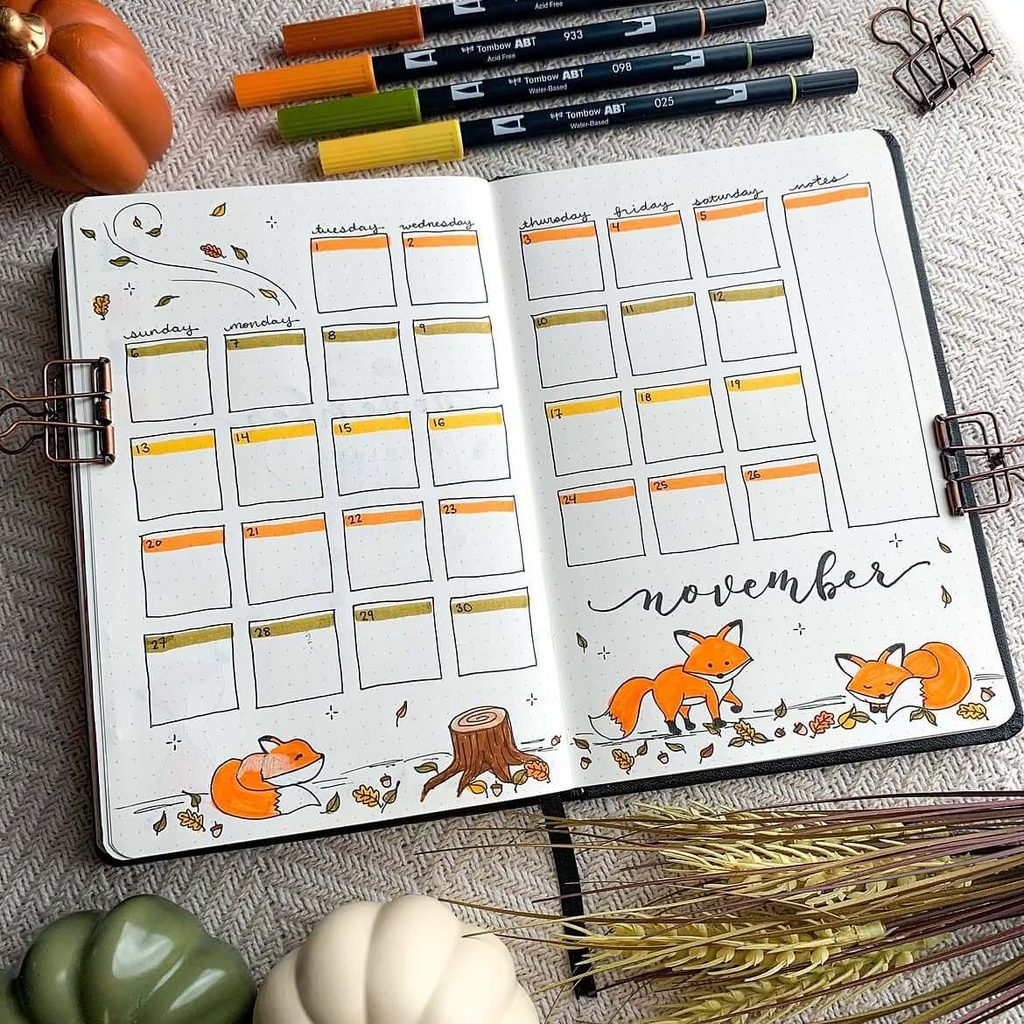
Bring a playful woodland feel to your November bullet journal with a full-month calendar surrounded by tiny foxes, fallen leaves, and warm autumn shades. The combination of burnt orange, mustard yellow, olive green, and brown gives the spread a seasonal look without making the calendar itself feel too busy.
Keep the daily boxes simple and use a thin strip of color along the top of each one to separate the weeks visually. You can also leave a narrow notes column on the side for reminders, monthly goals, appointments, or important dates that do not fit neatly into a single box.
To recreate the theme:
- Draw two or three foxes in different poses rather than repeating the same illustration.
- Scatter a few small leaves around the edges to connect the artwork across both pages.
- Add a tree stump, acorns, mushrooms, or bare branches if you want to expand the woodland theme.
- Use your brightest orange only for small accents so the layout stays easy to read.
If drawing animals feels intimidating, simplify the foxes into basic rounded shapes or use small stickers instead. A large handwritten “November” near the bottom also works well as a focal point and helps balance the structured grid above it.
2. Coffee Lover November Cover Page
Source: Instagram
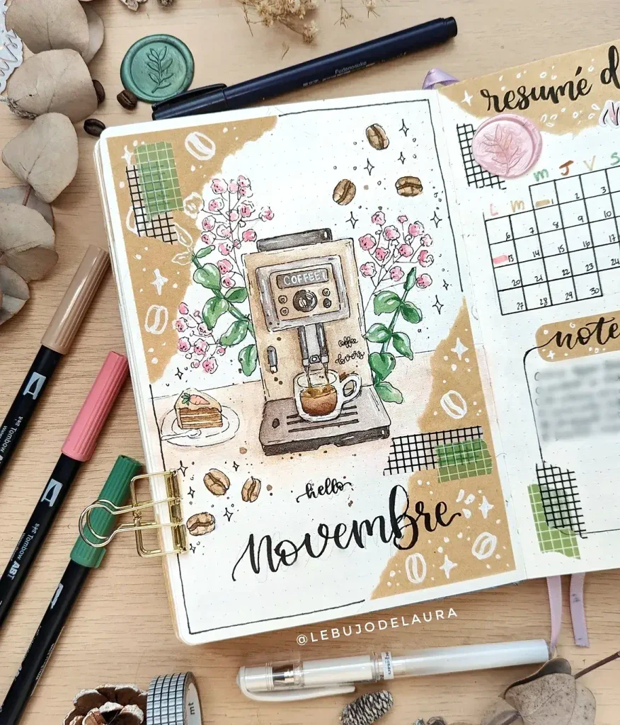
November practically begs for warm drinks, so a coffee-themed cover page is a fun way to lean into that cozy feeling. A detailed coffee machine makes a strong centerpiece, while coffee beans, leafy branches, and soft pink flowers keep the composition from looking too heavy or overly brown.
Try building the page around a limited palette of kraft brown, muted green, blush pink, and black. Torn-paper shapes, grid-pattern washi tape, or small white doodles can add a scrapbook effect without competing with the main illustration.
A few ways to personalize it:
- Swap the espresso machine for a moka pot, French press, or favorite coffee mug.
- Add a tiny slice of cake, cinnamon roll, or cookie beside the drink for a café-inspired touch.
- Scatter a few coffee beans around empty areas instead of filling every gap with leaves or stars.
- Use a brush-lettered “November” at the bottom to soften the more structured shapes above.
If you enjoy drawing detailed objects, this is also a great theme to carry through the month. Smaller coffee cups, takeaway cups, beans, café signs, or simple drink icons can later become headers, habit tracker symbols, or decorative accents on your weekly spreads.
3. Acorn and Plaid November Monthly Spread
Source: Instagram
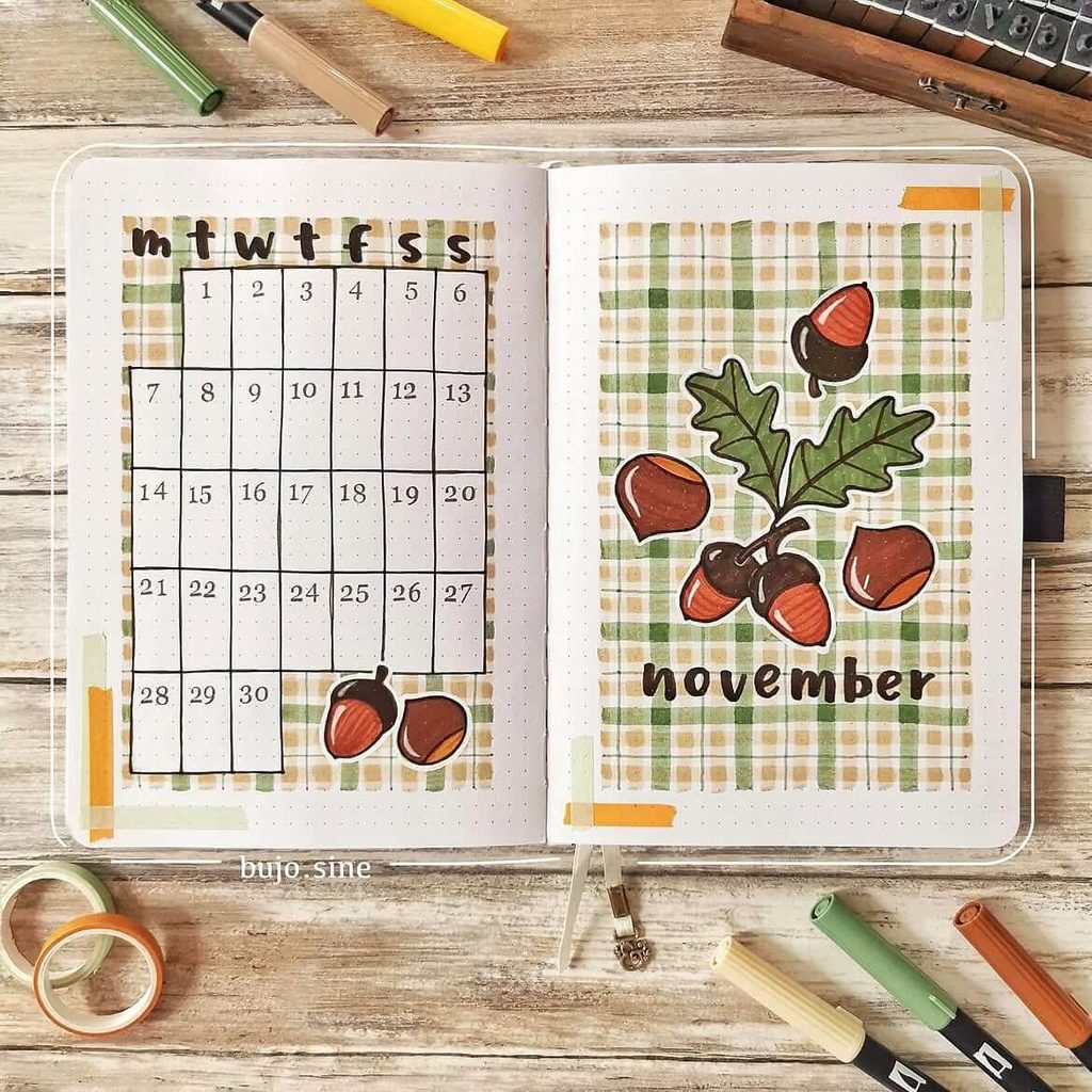
If you love classic fall patterns, this acorn-inspired monthly spread is an easy way to make November feel cozy without overcomplicating the layout. The plaid background adds warmth and texture, while the acorns and oak leaves bring in a seasonal detail that feels charming and a little rustic.
A design like this works especially well if you want your calendar to stay functional. The grid is clean and roomy, and the decorative elements are kept mostly to the edges, so there is still plenty of space for appointments, birthdays, and reminders.
To recreate the look, focus on a soft autumn palette:
- sage green
- tan or beige
- warm brown
- muted orange
You can draw the plaid by hand with light marker strokes, or fake the effect with washi tape if you want a faster version. Keeping the lines slightly imperfect actually makes the spread feel more relaxed and handmade.
For extra details, try:
- adding a few more acorns in empty corners
- using tiny leaf doodles as bullet points on nearby pages
- repeating the plaid pattern in your weekly spreads for a cohesive monthly theme
- lettering “November” in a chunky lowercase style for a cute, casual finish
If you want to simplify the page, skip the full background and use plaid only as a framed block behind the calendar or title. That keeps the same cozy vibe, but cuts down the time and ink needed to pull it together.
4. November Goals and Autumn Wreath Spread
Source: Instagram
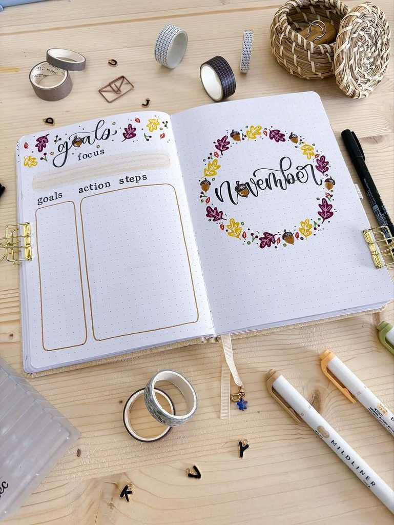
Pairing a decorative cover page with a practical goal-setting section makes this spread especially useful at the start of the month. The leafy wreath gives November a strong seasonal identity, while the facing page keeps your priorities organized with dedicated spaces for goals, action steps, and a main focus.
The wreath is easy to customize because it relies on small repeated elements rather than one complicated drawing. Burgundy, mustard yellow, olive green, and warm brown create a rich late-fall palette, and a few acorns tucked between the leaves help break up the pattern.
You could adapt the left page into:
- personal and work goals
- three priorities for the month
- projects and next steps
- a “what matters most” section
- a short November bucket list
For the wreath itself, lightly sketch a circle in pencil first, then build the leaves around it so the shape stays balanced. Varying the direction and size of the leaves will make it feel more natural, and leaving a little white space between clusters keeps the border from becoming too dense.
A nice extra touch would be to reuse one tiny leaf or acorn motif beside each goal as a check-off symbol. That creates a visual connection between the decorative and functional sides of the spread without adding much extra work.
5. Cozy November Doodle Cover Page
Source: Instagram
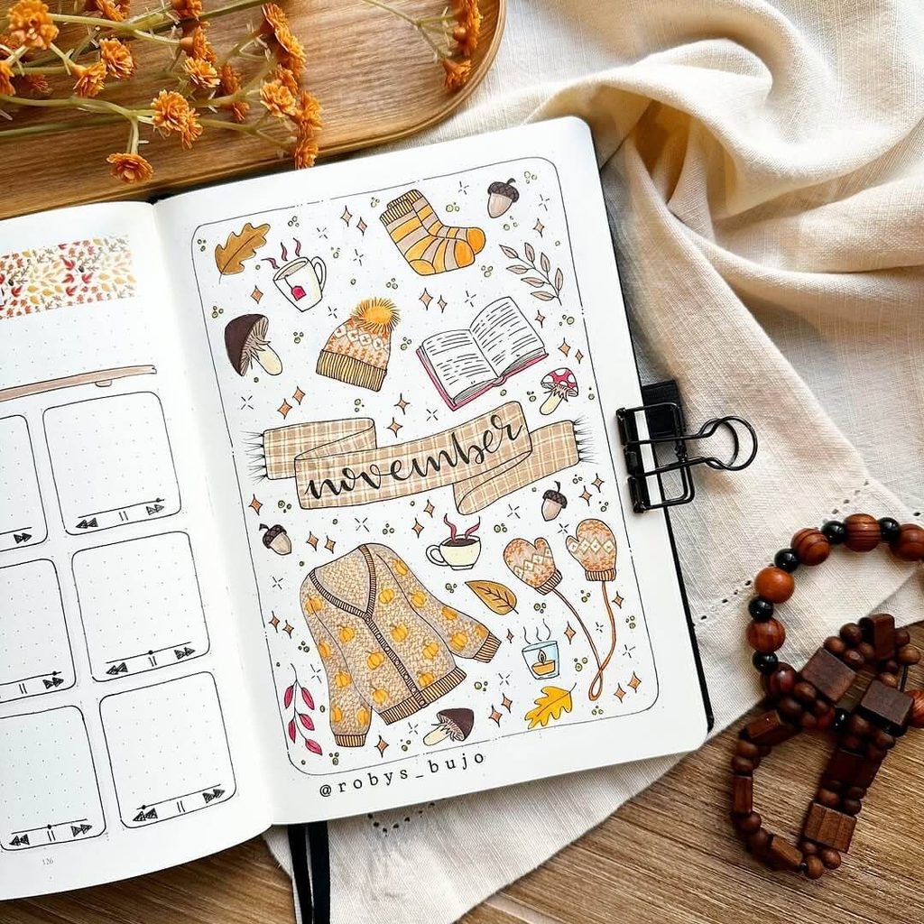
A collection of small seasonal doodles is a fun way to capture everything that feels cozy about November in one page. Sweaters, mittens, warm drinks, books, mushrooms, acorns, socks, and falling leaves create a playful collage that feels detailed without relying on one large centerpiece.
The easiest way to build a page like this is to start with the larger objects first, then fill the empty spaces with tiny stars, dots, leaves, or acorns. Keeping the illustrations in a warm palette of mustard, rust, cream, brown, and muted red helps all the different elements feel connected.
Ideas you could include in your own version:
- a favorite sweater or cardigan
- a mug of tea, coffee, or hot chocolate
- an open book or journal
- chunky socks and knitted accessories
- mushrooms, acorns, and oak leaves
- candles or a tiny stack of books
The plaid banner across the middle is especially useful because it gives the eye somewhere to rest among all the smaller drawings. You could use the same idea with gingham, kraft-paper shading, or a simple solid ribbon if you want something quicker.
For a more personal spin, replace a few generic fall doodles with things you genuinely associate with November, such as your current read, favorite seasonal drink, or a sweater you wear all the time. That makes the cover feel less like a themed template and more like a little snapshot of your month.
6. Minimal November Calendar With a Vintage Collage Feel
Source: Instagram
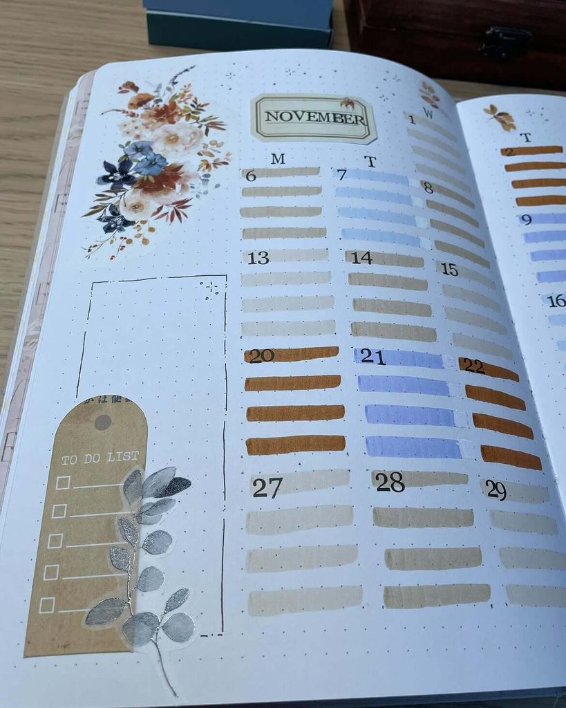
For a softer, more grown-up take on a November bullet journal, this layout mixes a practical calendar with delicate florals, neutral labels, and simple color blocking. The result feels part planner, part scrapbook—perfect if you like seasonal pages but do not want every spread covered in pumpkins and leaves.
The calendar itself is especially easy to recreate: instead of drawing full boxes, use short horizontal marker strokes for each day and alternate a few muted shades such as taupe, dusty blue, caramel, and warm gray. That keeps the structure visible while making the page feel much lighter.
To get a similar collage effect, try combining:
- floral stickers or printed botanical cutouts
- kraft-paper labels
- translucent washi tape
- a small neutral-toned to-do list
- one metallic or silver botanical accent for contrast
One smart detail here is the large open section beside the calendar. Rather than filling every inch, leave that space for monthly notes, deadlines, meal ideas, or a running “don’t forget” list.
If you want the page to feel even more cohesive, choose just one vintage-style font or label design for your headings and repeat it elsewhere in your November setup. The mix of soft florals and clean planning space makes this a great option for anyone who prefers an elegant fall theme over a more playful one.
7. Terracotta Tile November Cover Page
Source: Instagram
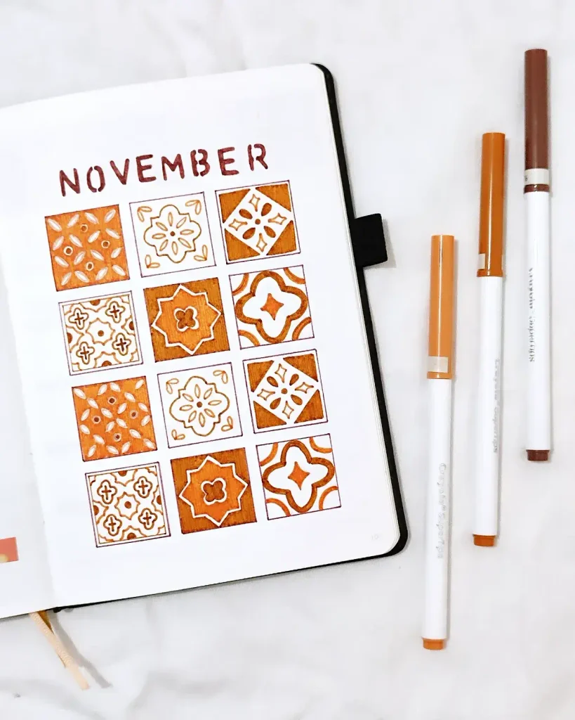
For a November cover that feels warm but a little different from the usual leaves and pumpkins, try a geometric tile-inspired design in earthy shades. The repeated squares create a bold focal point, while the rust, terracotta, cream, and brown palette still fits beautifully with the season.
The key to making this style work is consistency rather than perfect drawing. Sketch a simple grid first, then fill each square with a different floral or geometric motif, repeating a few patterns so the page feels intentional instead of random.
You could experiment with:
- Moroccan-inspired shapes
- simple floral medallions
- tiny stars, diamonds, or petal motifs
- alternating filled and outline-only squares
- two or three shades of orange instead of one flat color
A ruler helps keep the grid neat, but the patterns themselves can stay slightly hand-drawn. That contrast between structure and imperfect details gives the page more personality.
If you want to carry the theme through the rest of November, reuse one or two of the tile motifs as small corner decorations, habit tracker markers, or weekly headers. It is an easy way to make the month feel cohesive without redrawing the entire pattern again.
8. Cross-Stitch Pumpkin November Spread
Source: Instagram
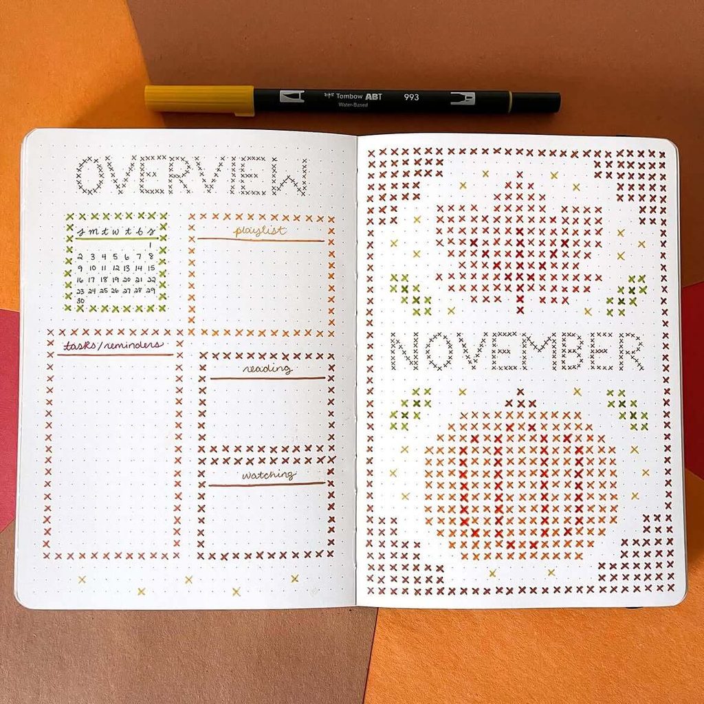
This is such a clever way to give a November bullet journal a handmade feel without needing traditional illustrations. The tiny X-shaped marks mimic cross-stitch embroidery, turning pumpkins, leaves, borders, and even the “November” lettering into a cozy stitched pattern.
Start by lightly mapping out the main shapes on the dot grid before adding color. A limited palette of burnt orange, mustard yellow, olive green, and deep brown keeps the design easy to follow and gives it a warm late-fall look.
You can use the same cross-stitch technique for:
- pumpkins and gourds
- maple or oak leaves
- acorns
- simple flowers
- initials or short quotes
The left side also shows how well this style can work with practical planning sections. Small stitched borders around your calendar, playlist, reading list, or task area make even basic boxes feel decorative without taking up much writing space.
For a cleaner result, keep each X roughly the same size and use the journal dots as your guide. If a full-page stitched design feels too time-consuming, try just one pumpkin motif in the corner and repeat smaller stitched accents throughout your November spreads.
9. Cute November Doodle Cover With a Hedgehog
Source: Instagram
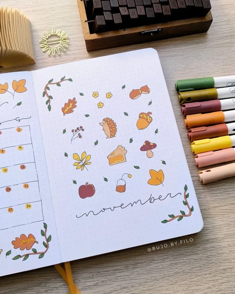
A simple doodle collection can make a November cover feel playful without turning into a crowded collage. Here, the tiny hedgehog becomes the star of the page, surrounded by acorns, mushrooms, leaves, flowers, an apple, and a cozy drink in warm earthy shades.
The layout works because the drawings are spaced out rather than packed together. Leaving plenty of white space between each motif keeps the page light and makes even very simple doodles look polished.
For a similar setup, choose a handful of easy fall icons such as:
- a hedgehog or squirrel
- acorns and chestnuts
- mushrooms
- apples or pears
- tea bags or mugs
- slices of pie
- scattered leaves and tiny flowers
Try using one darker green for the small leaves to balance all the orange and yellow tones. A few curved branches in opposite corners can also frame the page nicely without creating a full border.
The loose handwritten “November” at the bottom is a good choice for this style because it does not compete with the illustrations. If you prefer an even faster version, pick just five larger doodles and let the empty space become part of the design.
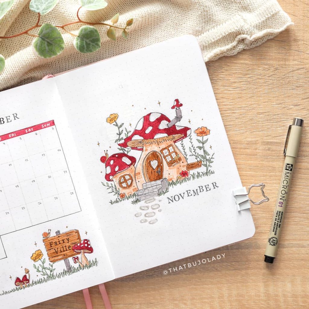
10. Whimsical Mushroom House November Cover Page
Source: Instagram
A mushroom cottage gives November a storybook feel that is cozy without relying on the usual fall leaves and pumpkins. The red-and-white caps, tiny windows, flowers, and winding path make the page feel like a miniature fairy village, while the warm orange and earthy brown details keep it connected to the season.
For a similar look, sketch the mushroom shapes lightly first and build the house around them with simple doors, windows, and a few uneven architectural details. The charm comes from the slightly imperfect, hand-drawn look, so there is no need to make every line perfectly straight.
You could add:
- a tiny chimney with a curl of smoke
- stepping stones leading to the door
- miniature lanterns or a mailbox
- little snails, ladybugs, or woodland creatures
- clusters of grass and tiny flowers around the base
Try keeping the background mostly open so the illustration has room to stand out. A few sparkles or dots around the cottage are enough to suggest a magical atmosphere without making the page feel crowded.
If you want to continue the theme through the month, turn different mushrooms into small weekly icons or create matching “fairy village” details for your trackers and notes pages.
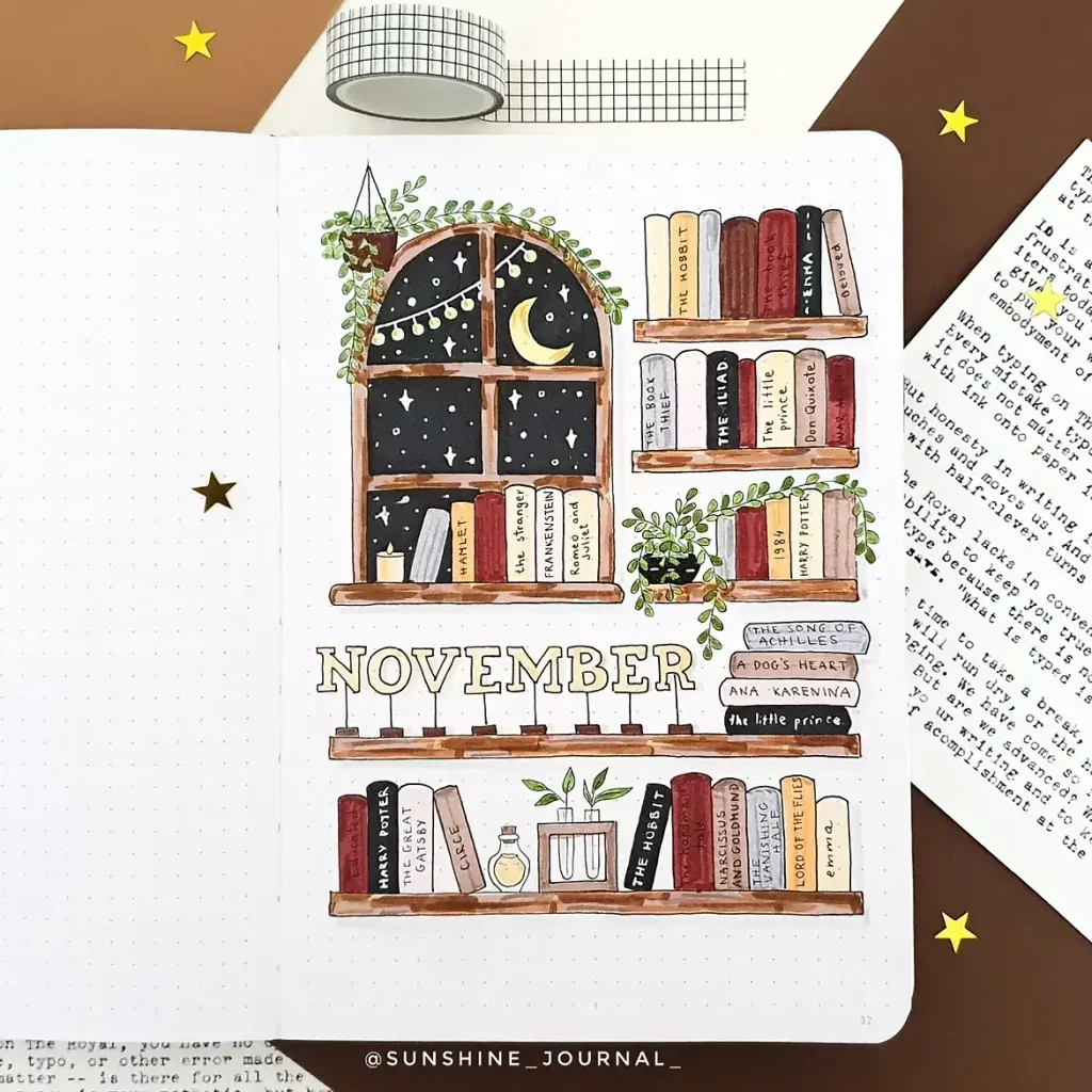
11. Cozy Bookshelf November Cover Page
Source: Instagram
A bookshelf theme is perfect for November if you want something cozy and seasonal without using traditional fall imagery. The arched window, crescent moon, trailing plants, and stacked books create the feeling of a quiet reading nook on a chilly evening, while the warm browns, creams, muted reds, and soft greens keep everything inviting.
The fun part is making the shelves personal. Instead of filling them with random book spines, add titles you love, books on your TBR, or even fictional favorites that fit the mood of the month.
You could also include:
- a tiny candle or reading lamp
- potion bottles or little jars
- hanging plants
- stars and moons outside the window
- stacked books used as decorative accents
- one or two favorite quotes tucked onto a spine
To keep the page balanced, use the shelves as horizontal anchors and place the “November” title somewhere between them rather than squeezing it into the top. The window adds a nice vertical shape, so the rest of the layout can stay fairly structured.
If you want to turn this into a full monthly theme, each weekly spread could feature a different shelf section, book stack, or nighttime window scene. That way, the month stays cohesive without every page looking exactly the same.
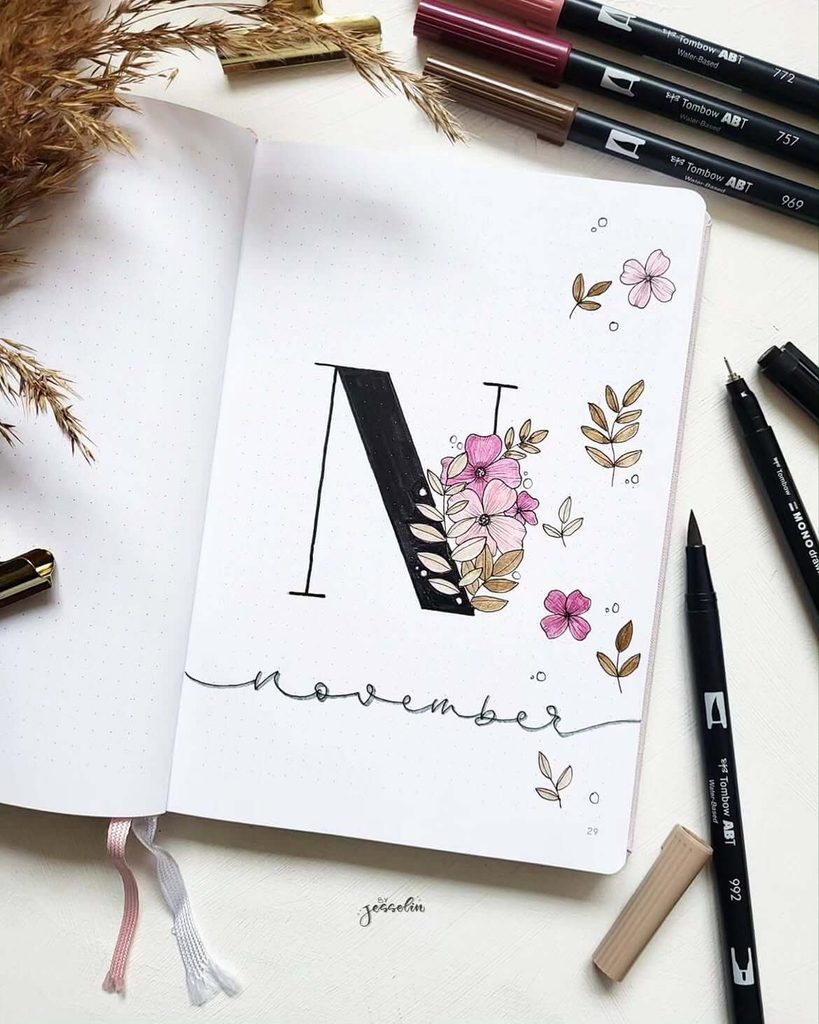
12. Elegant Floral “N” November Cover Page
Source: Instagram
A large monogram can make a November cover feel instantly polished, especially when it is paired with delicate florals instead of heavier seasonal illustrations. The oversized black “N” creates a strong focal point, while the pink flowers and soft brown leaves keep the overall look feminine, airy, and easy on the eye.
This style is especially useful if you prefer a cleaner journal aesthetic. You only need one dramatic letter, a few floral clusters, and a simple handwritten “November” underneath to make the page feel complete.
To recreate the look:
- sketch the large letter in pencil before filling it with black
- place the main flower cluster where it overlaps the letter for more depth
- use two or three flower sizes so the arrangement feels natural
- keep the leaves in muted tan or beige to soften the contrast
You can also scatter a few tiny petals, circles, or leaf sprigs around the page rather than filling every empty area. That bit of breathing room is what gives the design its elegant feel.
For a different take, switch the pink flowers for burgundy, mauve, or dusty orange blooms. You could also repeat the monogram idea for future months, changing the botanical details each time to create a cohesive series of cover pages.
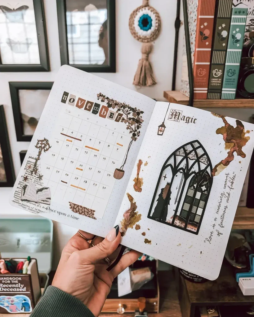
13. Dark Academia November Calendar Spread
Source: Instagram
A moody, bookish theme works beautifully for November, especially if you like vintage details, old-library colors, and a touch of mystery. The monthly calendar stays clean and functional, while the torn-paper accents, antique-style key, botanical elements, and gothic window give the spread a layered dark academia feel.
The contrast is what makes this layout interesting. Keep the calendar itself light and simple, then concentrate the decorative details around the edges so the page does not become difficult to use.
To create a similar look, combine:
- muted brown, olive, black, and cream
- torn book-page scraps or printed text
- vintage keys, labels, or ticket-style stickers
- dried-flower or botanical illustrations
- architectural details such as arched windows or lanterns
A few irregular paint or ink marks can help the spread feel aged and atmospheric, especially if they are placed asymmetrically rather than in perfect corners. You could also use coffee-stained paper or brown watercolor washes to get a similar effect without buying extra supplies.
For the title, mismatched letter cutouts are a great alternative to hand lettering and fit the vintage collage style naturally. If you want to extend the theme, use literary quotes, old book covers, candle sketches, or library-card-inspired trackers on the following pages.
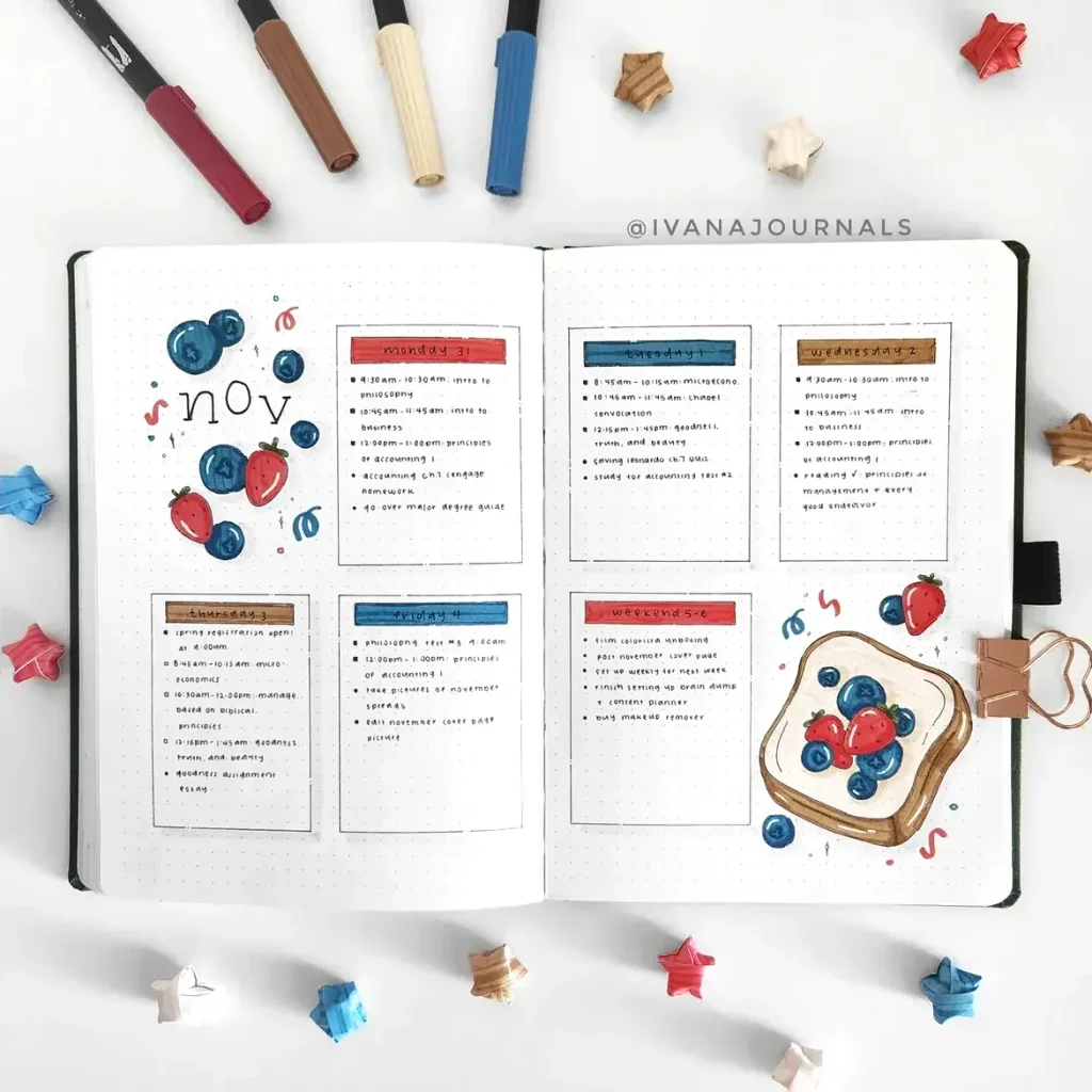
14. Berry Toast November Weekly Spread
Source: Instagram
Not every November layout has to lean heavily into traditional fall colors. This weekly spread uses strawberries, blueberries, and a playful slice of berry toast to bring in a brighter, fresher look while still keeping the overall page neat and seasonal.
The weekly boxes are simple and structured, which makes the illustrations feel like accents rather than distractions. Using the same red, blue, brown, and cream tones in both the headers and doodles helps everything feel connected.
You could adapt the idea with:
- toast topped with berries, jam, or peanut butter
- tiny fruit clusters in the corners of each day
- matching red and blue headers for important tasks
- a breakfast or meal-planning section for the week
- small sparkles or squiggles to fill awkward gaps
One of the best things about a food theme is how easy it is to personalize. Swap the berries for apples, pears, figs, cinnamon rolls, or whatever cozy breakfast food feels most “November” to you.
If you prefer a more minimal version, keep the larger toast illustration in one corner and use just a few scattered berries elsewhere. That way, the spread still feels fun and themed without sacrificing writing space.
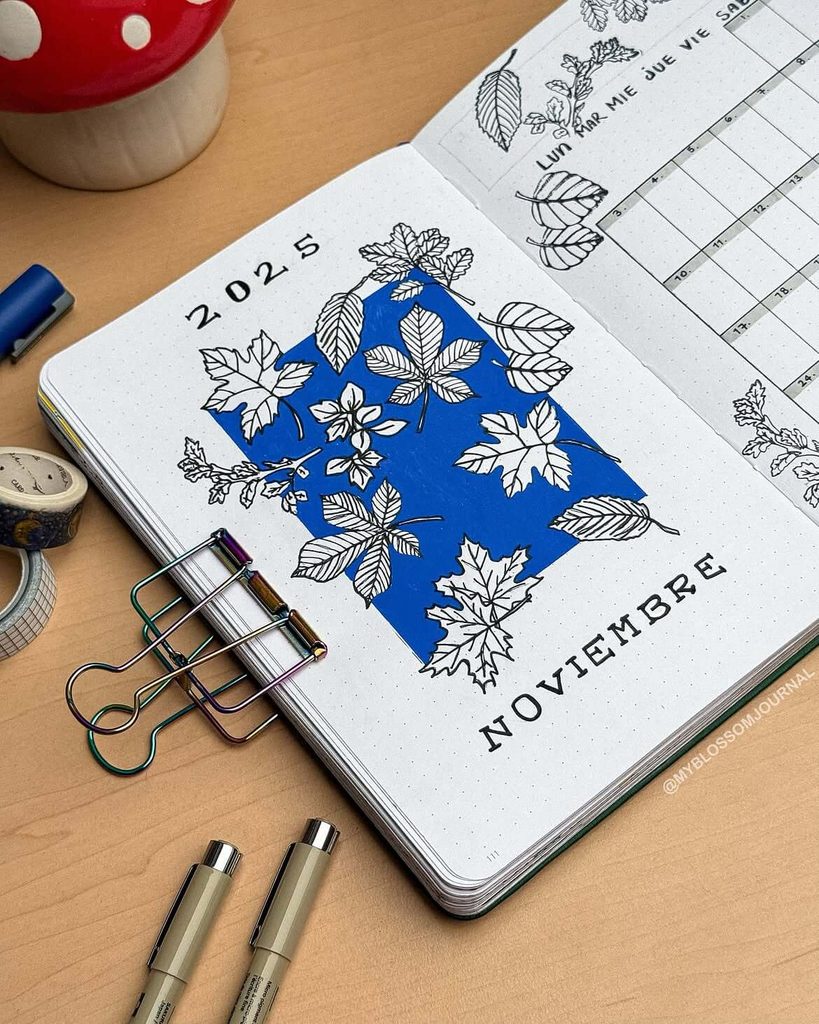
15. Bold Blue November Leaf Cover Page
Source: Instagram
A deep cobalt background gives this November cover a completely different mood from the usual rust-and-brown fall palette. The crisp white leaf drawings stand out beautifully against the blue, making the page feel modern, graphic, and a little unexpected while still keeping the seasonal theme clear.
To recreate the effect, color in one large irregular shape first, then layer different leaf outlines over the top. Mixing maple, oak, beech, and chestnut-style leaves adds variety and keeps the composition from looking too repetitive.
A few details that can make this style work even better:
- leave some leaves partly outside the colored block
- vary the scale so a few larger leaves anchor the design
- keep the veins thin and detailed for contrast
- use black lettering outside the blue area so the title stays easy to read
You can also swap the blue for forest green, burgundy, charcoal, or even a muted plum if you want the same graphic look with a different mood. This kind of design is especially useful if you enjoy botanical themes but want something cleaner and more contemporary than a traditional fall wreath.
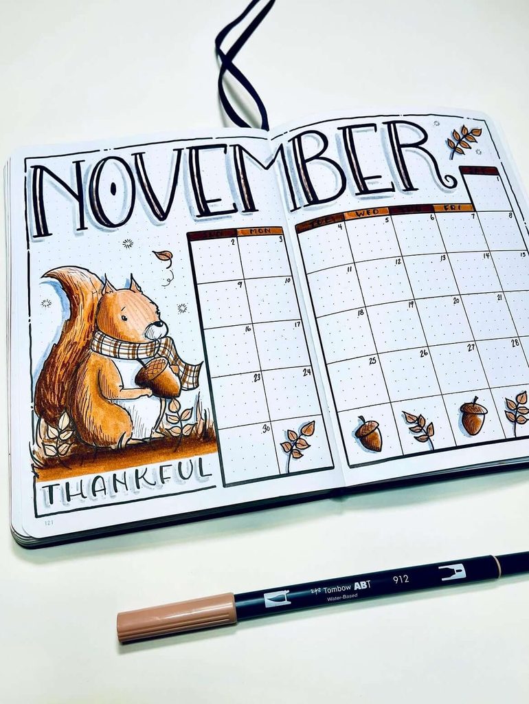
16. Thankful Squirrel November Calendar Spread
Source: Instagram
A squirrel-and-acorn theme is a natural fit for November, especially when you want to bring in a subtle Thanksgiving feel without turning the whole spread into a holiday page. The oversized squirrel illustration adds personality, while the calendar itself stays clean and easy to use.
The scarf is a nice detail because it immediately makes the character feel cozier and more seasonal. You could repeat the plaid pattern elsewhere in the month as a header strip, divider, or small decorative block.
To build a similar spread:
- keep the squirrel illustration to one side so the calendar has plenty of space
- use warm browns, caramel, rust, and muted orange
- add acorns and tiny leaf sprigs along the bottom edge
- use simple hand-drawn borders instead of heavy decorative frames
- save your darker colors for the title and calendar lines
The “Thankful” section at the bottom is especially easy to adapt. You could turn it into a gratitude prompt, a one-line daily gratitude habit, or a short list of things you want to appreciate more intentionally that month.
If you want a less Thanksgiving-specific version, replace “Thankful” with “November Notes,” “Little Joys,” or “Monthly Highlights” while keeping the same cozy woodland artwork.
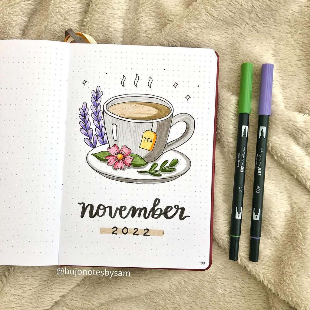
17. Cozy Tea Cup November Cover Page
Source: Instagram
A steaming cup of tea makes an instantly cozy November theme, especially when paired with soft florals and simple greenery. The large mug creates a clear focal point, while the lavender, pink flower, and leafy sprigs keep the page from feeling too plain or heavy.
This is also a great option if you want a seasonal cover that is quick to recreate. You can keep the composition centered, add just a few small sparkles or steam lines, and let the empty space do most of the work.
Try personalizing it with:
- your favorite tea flavor written on the tag
- a patterned mug instead of a plain one
- cinnamon sticks, dried orange slices, or herbs nearby
- softer muted florals for a calmer look
- a short cozy quote underneath the title
The gray mug is a smart choice because it allows the brighter flowers and greenery to stand out. If you prefer a warmer palette, beige, terracotta, dusty rose, or deep green would also work beautifully for November.
For an extra functional touch, you could continue the tea theme with a small “cozy moments” tracker later in the month and jot down simple things like reading time, evening tea, or screen-free nights.
18. Cozy Sweater November Weekly Spread
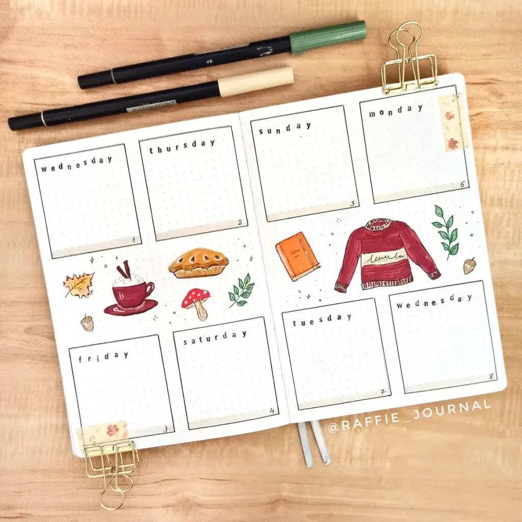
Source: Instagram
This weekly layout captures that late-fall feeling with a mix of simple planner boxes and cozy seasonal doodles. A chunky sweater, steaming cup, slice of pie, mushroom, book, leaves, and acorns give the spread plenty of personality without taking over the writing space.
The burgundy, orange, cream, and green palette feels warm and relaxed, while the thin black boxes keep everything organized. It is a good example of how a weekly spread can still feel decorative even when most of the page is reserved for practical planning.
Try adding details like:
- a favorite sweater pattern or small embroidered motif
- a handwritten book title on the tiny notebook
- a different warm drink for each week
- pie, cookies, or other seasonal treats
- small leaf clusters between the day boxes
The open center area is also useful for placing the larger illustrations because it separates them from your schedule. If you need more functionality, that space could easily become a mini meal plan, weekly priority list, or “this week” section instead.
For an even quicker version, choose just three larger doodles and repeat their colors in the day headers. That keeps the spread cohesive while cutting down on drawing time.
19. Autumn Leaves November Habit and Mood Tracker
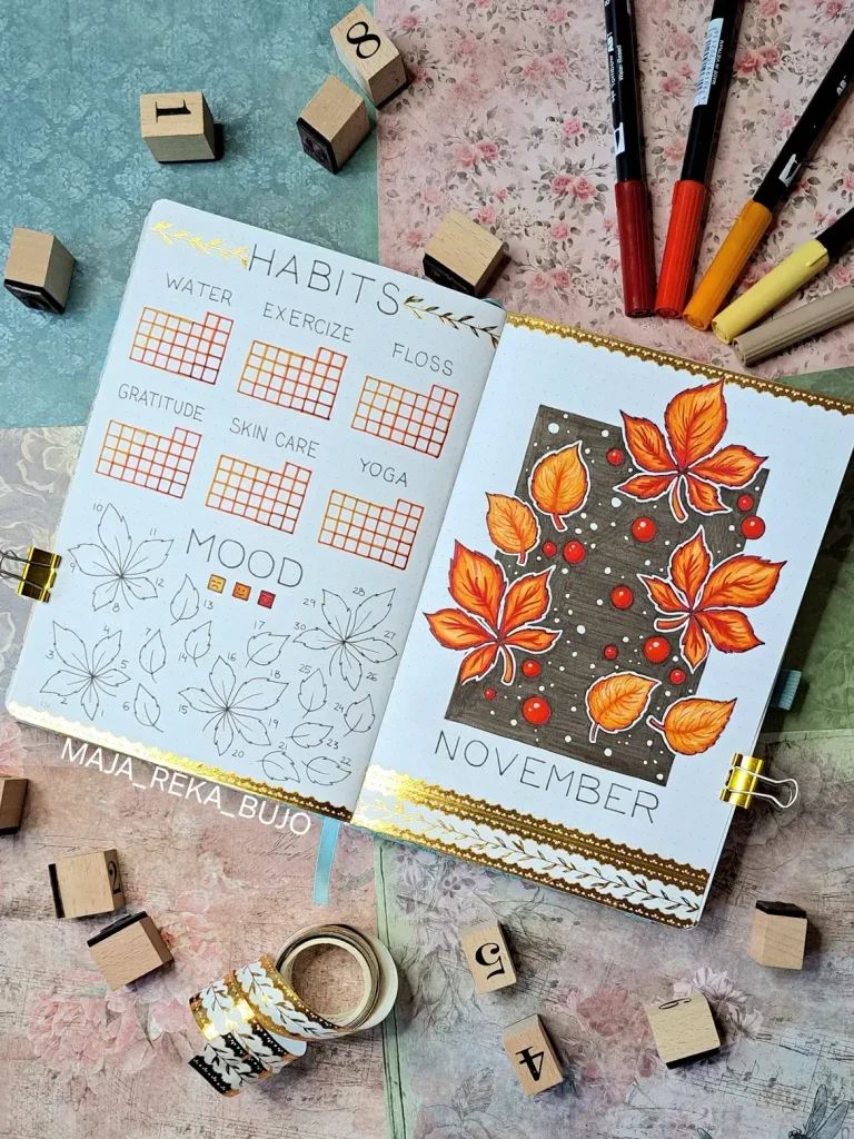
Source: Instagram
This spread combines a bold seasonal cover with two genuinely useful trackers, making it a great choice if you like your November setup to be decorative and practical at the same time. The glowing orange leaves against the dark background feel dramatic and autumnal, while the habit and mood sections keep the facing page structured and easy to use.
For the habit tracker, small monthly grids work well for routines you want to check off quickly. You could track things like:
- water intake
- exercise
- skincare
- reading
- gratitude
- stretching or yoga
The mood tracker is especially creative because the days are worked into different leaf shapes. Instead of filling simple squares, you can color each leaf according to a small mood key and end up with a complete fall illustration by the end of the month.
To recreate the cover, start with a dark rectangular block and layer bright orange, yellow, and red leaves over it. White dots and small berry-like circles help break up the darker area and make the warm colors stand out even more.
A metallic gold border or botanical washi tape can add a finished look, but it is completely optional. If you prefer something simpler, keep the border plain and let the contrast between the dark background and bright leaves do all the work.
20. Coffee Machine November Cover Page
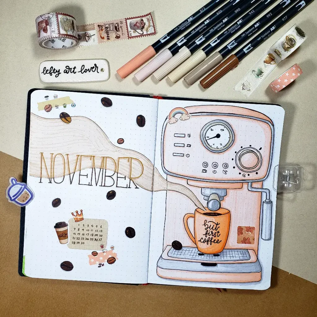
Source: Instagram
For anyone who basically runs on coffee once the colder months arrive, this oversized espresso machine makes a fun statement cover. The soft peach and cream colors keep the illustration cozy rather than industrial, while the scattered coffee beans and tiny calendar details add just enough decoration around it.
Because the machine takes up most of one page, the opposite side can stay much simpler. A wavy neutral background behind the “November” title creates movement across the spread without competing with the main drawing.
To personalize the idea, you could:
- write your usual coffee order on the mug
- add a tiny café logo or seasonal cup design
- turn the mini calendar into a countdown for an important November date
- decorate with cinnamon, star anise, or a few chocolate squares instead of extra coffee beans
- change the machine color to sage, burgundy, or vintage cream
If drawing an entire espresso machine feels ambitious, break it into basic rectangles, circles, and rounded corners before adding the smaller controls. The little rainbow detail on top is also a good reminder that a November palette does not have to be exclusively brown and orange.
For a fun companion page later in the month, you could make a “coffee shop favorites” list or rate the seasonal drinks you try throughout November.
How to Choose a November Bullet Journal Theme You’ll Actually Enjoy
After looking through twenty different November bullet journal ideas, it can be tempting to suddenly want foxes, coffee, mushrooms, books, plaid, leaves, and an entire miniature fairy village in the same notebook.
I have definitely had months where I liked so many ideas that choosing one became harder than creating the actual spread.
The easiest solution is to decide what kind of feeling you want your November bujo to have before you choose the drawings.
Ask yourself:
- Do I want something warm and traditional with leaves, acorns, and pumpkins?
- Would I rather create something cozy and everyday, like coffee, tea, books, or sweaters?
- Am I in the mood for something whimsical, such as mushrooms, woodland animals, or fairy houses?
- Do I want a cleaner aesthetic with florals, geometric patterns, or minimal color?
- Do I actually have time for a detailed theme this month?
That last question matters more than people admit.
A gorgeous two-page illustrated spread is wonderful when you genuinely enjoy spending an evening drawing it. It is much less wonderful when you are still coloring leaves at 11:47 p.m. and wondering why you did not just use three strips of washi tape.
Choose the amount of detail that sounds fun—not the amount you think a bullet journal is supposed to have.
Pick a Small Color Palette Before You Start
One of the easiest ways to make a November setup look intentional is to limit your colors.
You do not need twelve perfectly coordinated markers. In fact, I often think a page looks stronger when it uses only three or four shades and repeats them throughout the design.
For a classic November palette, try:
- burnt orange + mustard + brown
- burgundy + beige + olive green
- rust + cream + dark green
- caramel + dusty rose + warm gray
But there is no rule saying your November bullet journal ideas have to be brown and orange.
The bold blue leaf cover in this collection is a great reminder that unexpected colors can make a seasonal theme much more interesting. Plum, navy, deep teal, mauve, and even soft pastel combinations can still feel completely right for November when you pair them with seasonal motifs.
Make Your November Bujo Pretty Without Losing Writing Space
This is probably the biggest mistake I make when I get carried away with decorating: I create a lovely weekly spread…and then realize I have nowhere to write Tuesday’s actual plans.
The easiest fix is to decide where the functional areas will go first.
Lightly sketch your:
- daily boxes
- calendar
- habit tracker
- task list
- notes area
- meal plan
Then decorate the spaces that remain.
I find this especially helpful for weekly layouts because those pages need to survive real life. Your November bujo can absolutely be beautiful, but it should still have room for appointments, random reminders, groceries, deadlines, and that mysterious task you have moved forward for four weeks in a row.
If you enjoy functional pages with seasonal details, you may also like these fall mood tracker ideas. They are a nice way to add artwork to your journal while still giving the page a clear purpose.
What If You Cannot Draw?
You can still make a beautiful bullet journal.
Seriously.
Some of my favorite layouts rely more on composition and color than complicated illustrations. A strip of patterned washi tape, a kraft-paper label, one large letter, a few simple leaves, or a colored rectangle behind your title can completely change a page.
If drawing is the part that stresses you out, try:
- stickers
- washi tape
- printed illustrations
- scrapbook paper
- stamps
- simple geometric shapes
- one-line botanical doodles
- lettering as the main decoration
You can also simplify complicated pictures into basic shapes.
A mushroom house does not need perfect architecture. A fox can be made from a few rounded shapes. An acorn is basically an oval wearing a tiny hat.
That is one of the reasons I love collecting November bullet journal ideas from different creators: they show how many completely different ways there are to make a page feel special.
Use One Theme in Different Ways Throughout the Month
You do not need to reinvent your entire design every week.
Actually, repeating small details usually makes a journal look more cohesive.
If your November cover has acorns, use one tiny acorn beside your weekly headers. If your theme is coffee, turn little coffee beans into bullet points. If you chose a bookshelf cover, draw one small stack of books in the corner of your habit tracker.
You could repeat:
- one small doodle
- one accent color
- the same lettering style
- a patterned border
- a tiny icon
- the same type of header
This saves time and makes the whole month look connected without every page feeling identical.
Combine November and Thanksgiving Without Making Everything Thanksgiving-Themed
If you celebrate Thanksgiving, it can be fun to include it in your November setup—but your entire month does not have to become turkeys and pumpkin pie unless that is exactly what you want.
A few subtle details can work beautifully.
Try adding:
- a gratitude section
- a “little things I’m thankful for” list
- one Thanksgiving-themed weekly spread
- a family meal planner
- a recipe page
- a Thanksgiving countdown
- a memory page after the holiday
The squirrel calendar in this collection is a great example because the “Thankful” detail gives the layout a seasonal connection without dominating the entire design.
Create a November Page That Feels Personal
The pages I remember most are rarely the technically perfect ones.
They are usually the pages that include something from my actual life.
Maybe that means drawing the mug you reach for every morning, writing the title of the book you are currently reading onto a tiny bookshelf, copying the pattern from your favorite sweater, or creating a mini illustration of the pie you always make in November.
Those tiny personal details turn inspiration into your own journal.
And if your mushroom looks slightly crooked or your lettering goes off-center? That becomes part of the page too. Handmade pages are allowed to look handmade.
Need More Fall Bullet Journal Inspiration?
If November is not the first fall month you are decorating, take a look at my October bullet journal ideas as well.
October usually leans a little more toward pumpkins, Halloween, and deeper fall themes, while November gives you room to move into softer cozy details, gratitude pages, woodland designs, coffee themes, and late-autumn colors.
I also save plenty of journaling, seasonal, and creative inspiration over on Pinterest, so that is a good place to browse when you want more ideas for future spreads.
A Few Final Tips Before You Start Your November Setup
You do not need to create every traditional bullet journal page just because someone else does.
Pick the pages that will genuinely help you.
For example, your November setup might only need:
- a cover page
- a monthly calendar
- four or five weekly spreads
- a habit tracker
- a notes page
Or maybe you would rather add reading logs, gratitude pages, mood trackers, meal planning, budgeting, or creative collections.
Your journal should work for your life first.
I also recommend testing markers on a spare page before coloring a large illustration—especially if you are using a notebook you have never tried before. There are few journaling heartbreaks quite like finishing a beautiful cover and discovering that your darkest marker has enthusiastically introduced itself to the next three pages.
Final Thoughts on These November Bullet Journal Ideas
I hope these November bullet journal ideas gave you more than just twenty pages to copy. My favorite kind of inspiration is the kind that makes you think, “I love that little detail—but I would do it this way.”
That is where your own style starts to show.
You might fall in love with the cozy fox calendar, the bold blue leaves, the tiny mushroom cottage, the coffee themes, or one of the much simpler layouts. Take the parts that speak to you, change the colors, simplify the drawings, move things around, and make the idea work for your own November.
Most importantly, do not let a perfect-looking page stop you from starting.
A bullet journal is allowed to have uneven lines, slightly strange mushrooms, abandoned trackers, coffee stains, and pages that looked much better in your imagination. Mine certainly would not survive a perfection test—and honestly, that is part of why I enjoy creative journaling so much.
Which of these November bullet journal ideas would you try first?
Come share your favorite with me on Pinterest, or show me your own November spread on Instagram and tag @cozymomjournal. I would love to see what you create.